I have experimented a bit with using textures as anisotropy maps.
I’m really curious, what is the best way to get good results?
I have seen maps in both black & white and color. Is there an advantage of one type over the other?
Also I have heard of anisotropy maps referred to as tangent maps, so are they the same thing? Or is an anisotropy map just a tangent map which is being used for the purpose of controlling the anisotropy?
Further analysis:
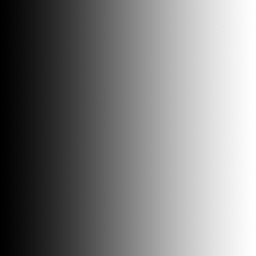
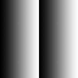
The experimentation I’ve done so far has been only using grayscale textures.
What I’ve gathered is that the specularity follows the direction of the gradient, and in that way solid black and solid white are the same. That is to say if you were to map the anisotropy of a vinyl record for example, black could be at the 12-o-clock position and transition to white in a spun gradient and solid white would meet solid black at the 12-o-clock position.
It’s hard to put into words, but perhaps this graphic says it better:
Attachments