here is a render of the hulk done up like a comic book cover or movie poster. enjoy!
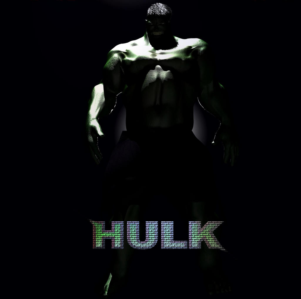
The hulk seems nice but i cant say it because its too dark ^^
and the Hulk lettering is fugly… i´d redo the lettering and take more than 2 mins. it would be a pity to lower the quality of the render with that font with that texture 
But i like what i see from its hair. they look pretty cool.
thanks for assuming i spent only two minutes on the font… you are a ray of sunshine.
well no offense meant, but thats how it looks to me, and i am sure the hulk was a lot of work and in my opinion the font downgrades the overall quality.
I like this version of the hulk. Strange bone structure and stuff. Who said that hulk has a perfect muscular body.
Well, i think that dark lighting is well, but i think that the lettering should be more interesting, and better composed it will make the poster look much better.
Anyways, good work!!
@bigbad:
Who said that hulk has a perfect muscular body.
Lou Ferrigno? ![]()
I have actually meet him person and find him to be the real and only hulk today.
i know this isn’t a works in progress thread…but i decided to take the suggestions and edit this picture further.
Attachments
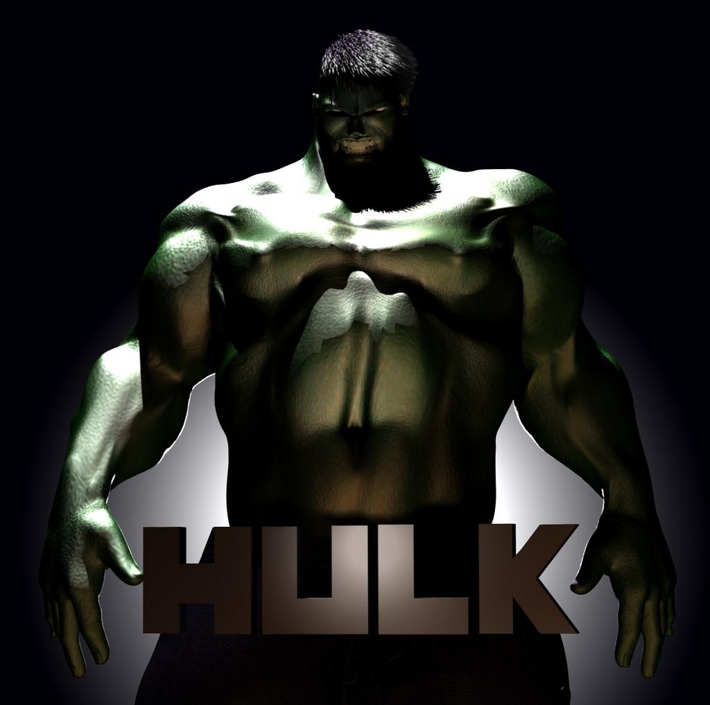
composition looks better definitely. I would move the right hand a little bit out of the H letter.
Maybe adding a light (a kicker maybe) to give volume to the letters, and i would keep the brick texture, maybe trying another approach… 
what’s a kicker?
kicker light. Photography. a light source coming from the back and side of a subject and producing a highlight.
Tweak lighting as it has already been suggested. Your great model and hard work is now little bit ruined by it.