I have two human character designs and I’m trying to decide how to standardize them. Of
the two topologies that I have, which do you prefer? Also, feel free to suggest any improvements that you feel can be made to the models.
Attachments
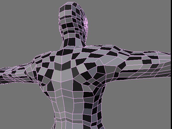
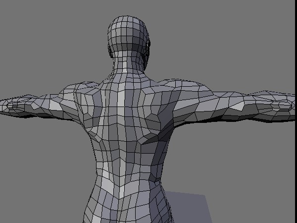
I have two human character designs and I’m trying to decide how to standardize them. Of
the two topologies that I have, which do you prefer? Also, feel free to suggest any improvements that you feel can be made to the models.


me likey the one on the right.
The one on the right looks much better than the one in the left.
I’d also go for the one on the right, but I’d change the elbow a bit, and I think the shoulders are a bit overdone.
To second FreakyDude, the shoulders are overdone. To add to it, it looks as if the shoulders and lats meld into one. The Lattissimus Dorsei muscle (under the shoulders, behind the armpits) are long and smooth and should extend further down the back.
Anatomy for the artist is a good book to purchase for anatomical reference. They go for about 15 bucks and you can find it at any barnes and noble
The one on the left is defined enough. The topology for the spine and scapula seem to be perfect to me. As others have said the shoulders need work ,southpaw gives some excellent advice ,please keep posting I d like to see what you come up with on this
JF
Okay I tweaked the shoulders a bit, how is it now?

No dimples on the bottom of the back? Have to update my model on my own WIP thread. I myself unsure for topology and placement of them.
I think the shoulders look better, but maybe just a bit too pronounced still, I find it hard to judge though when it’s unsmoothed as it could very well look perfect when smoothed ( subdivided. Will you use this as a base for sculpturing or is it for pure poly modeling? Either way it’s good work!
Here it is with the MeshSmoth modifier.
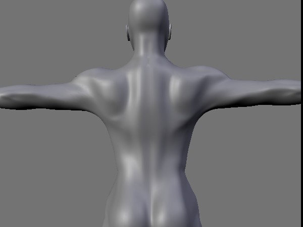
Looking at it smoothed I still think the shoulders are too pronounced.
The shoulders are a bit big, as others have said, and your delts are a bit under done. You have the delts sitting on the back, they make up part of the back and part of your side (under your arm). Check any body builder and you’ll see what I’m talking about. Other than those crits it’s looking pretty good.
could we see the first one smoothed? it might be ok.
I like the first a lot better than the second. The second one has some pretty exagerated shoulders.
Here’s the other back design. Hmm… looking at it smoothed I can’t help but see the lack of definition. I’ll have to fix that.
