aah… finally all icons. great stuff, i can start using this!
one idea… the vertex/edge/face selection icons, how about putting some orange in there, just like you have on “edit mode” icon…
oh, and about the transform widgets… i liked the number 3 -version best too…
and this is a very good example how voting is not the best option always… i didn’t even notice that there was voting going on
The third variant is an illustration of the transform widgets,
the second variant is more universal than the third,
these icons can also be used as an alternative for G,R,S shortcuts.
Deinfinitely it won’t be in 2.43, at last until You install it yourself. CVS is frozen now and nothin new will be commited with exception for bugfixes.
I have had a quick talk with Broken and he considers commiting the icon set when CVS will be open again.
Since it is fairly sure that next Blender relase will have refreshed UI, I’m going to invesigate how current icons could be improved. Conclusions will be posted here.
jendrzych <- I very like yours icons design !!! Look very professional and adequate. You have used orange colors in icons and this great refer to Blender logo ! In my opinion yours icons should be default icons set in Blender…
P.S. Now we have also orange Smilies on this Blender forum ;). hehehe… great
Regards
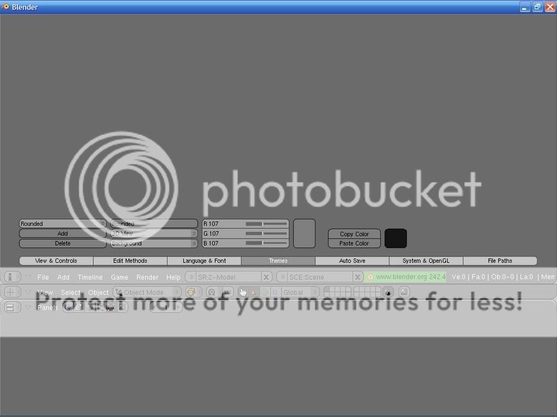
Use latest RC. Create directory “icons” inside “.blender” directory in Your Blender’s RC installation. Copy the icon set there. After You run the RC enter “Themes” in “User preferences” window. Make “Specify theme for…” to display “UI and Buttons” and choose “Icon FIle” from “Current color” list. Now You can browse icons that are in mentioned “icons” dir and use Your favourite one.
The directory name is just ‘icons’ without the dot.
You have to select ‘UI and Buttons’ from the drop down selection that reads ‘3D View’ and after you did this you can select ‘Icon File’ from the drop down selection that’s named ‘Outline’. A new selection next to ‘UI and Buttons’ will appear and you can select your icon set there.
Hope this helps.
Edit: Ah, you found it out - maybe my description helps somebody else…
These icons are great. They have a consistent style and are far more logical ond convey more meaning to the end user.
However, I do have a few crits:
First of all, as others have pointed out the radiosity icon (nuclear sign) doesn’t make much sense. It does not in any way reflect the purpose of the tool. Cire’s idea of a cornel box would be more appropriate.
Second, the object icon of yours (a cube) is problematic because it is too specific. There are loads of other object types than polygon meshes, so this adds to confusion. In this particular example, the old icon probably made more sense.
Anyway, good work, and hope to see your icons as defaults in 2.5!
Just joined. Those icons have good form and, despite many posts, I think that the their concepts are very clear. Good job!
I am interested in trying to create my own set of icons. Could someone tell me the organization of the icons on the sheet, please? Also, how much do you have to space them out?


 .
.