Hi. Trying to finish my scene based on IKEA reference.
3 Likes
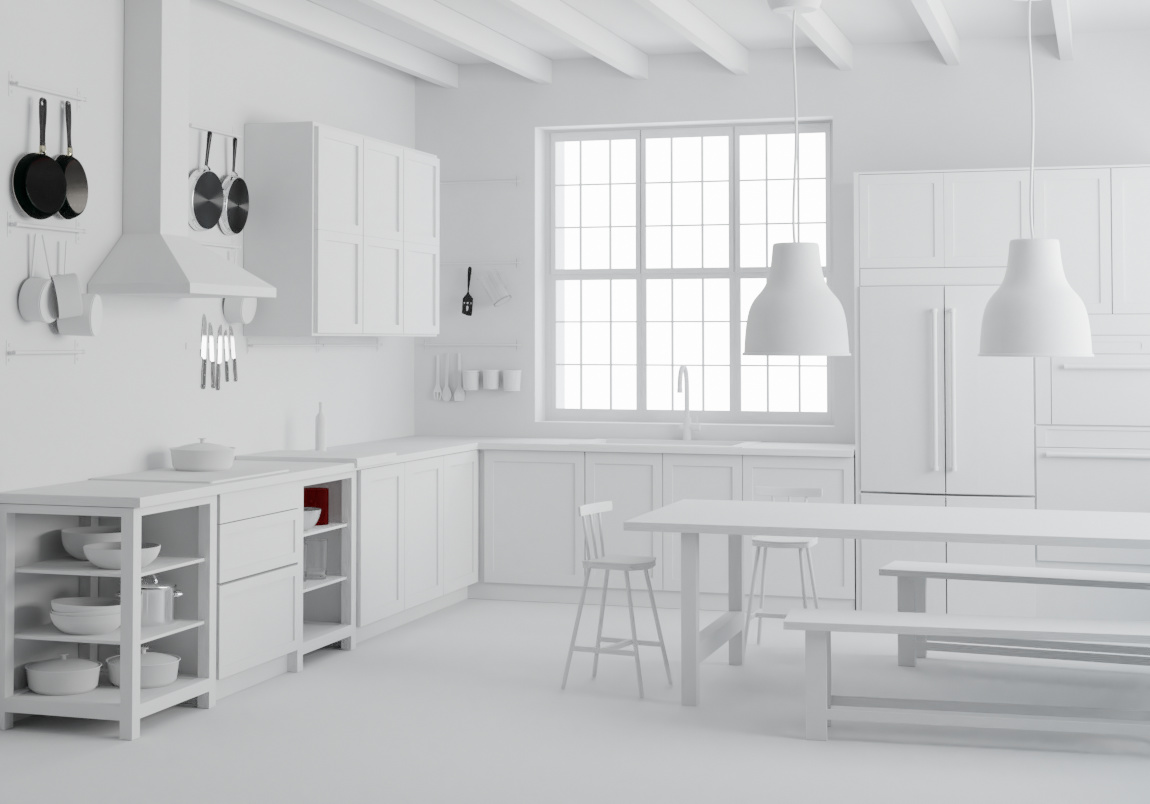
looks good so far. everything seems to be to scale. nice and clean modelling.
1 Like
thanks, I’ll continue to finish the scene
Yeah, what you need to consider now is dramatic lighting that would make this feel like an appealing room to walk into. For one thing, the color-temperature of the lighting will not be “white,” and in fact will not be the same. You’ll need to pay close attention to what you do with the light precisely because so-far everything in this room is black-and-white. (Which is how IKEA generally does everything that they do.) The lighting overall right now is too “hot.”
One thing you might also consider is raising the camera a little more so that we can clearly see into that sink and see the countertop on which it sits. (In fact, more generally speaking, “where should I put the camera?” is a more-than-trivial question.
That is – unless your purpose is to match existing IKEA advertising copy . . .
1 Like
Thanx for the advice, need to work with lighting.

I used some dishes found here https://www.blendswap.com/blends/view/88155, https://www.blendswap.com/blends/view/88254, https://www.blendswap.com/blends/view/26617, made by users fransteddy, ShadowG, Jay-Artist (https://www.blendswap.com/user/fransteddy, https://www.blendswap.com/user/ShadowG, https://www.blendswap.com/user/Jay-Artist)
1 Like

Nice, I like the modelling effort. However I think the materials needs some work because they look quite flat. Do you use the diffuse shader? I would recommend using the principled shader instead with roughness and normal maps. Look for PBR materials. Also the brick wall in the back needs a better UV mapping because as you can see it doesn’t line up on the window edge.
1 Like
Thanx for your advice I should pay more attention to that brick wall.