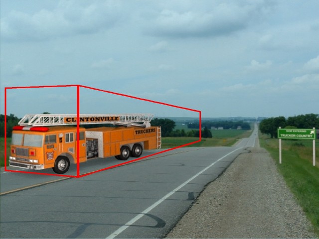
The motion blue makes it look wierd and the lighting is not very good for the image your compositing it too. Too bright on the visible side and too dark on the other side. The sign also looks to bright, as if there is a huge spot light shining on it. If you look at the image, it’s an overcast day so you shouldn’t be using any lamps at full power. Perhaps more ambient light.
Cujo31
I second Khnum, no motion blur.
I think that the firetruck has too much saturation/too strong color.
Same with the sign.
Maybe the fire truck could use some reflections of asphalt and other
things that are on the right of the firetruck.
Maybe slight shininess to the truck with its shader and lights also, eventhough it is a cloudy day.
I said that thinking you want realism.
But there is good about the saturation to mention too, focus is much more
to the truck and sign, than to the photograph.
If you can get some photos from the same spot where the fire truck
is, you could uvmap those into planes and surround the firetruck with them and get the photos environment hence to the truck reflections.
Kind of pain in the neck, but that is how i would do it, if easy enough to get photos.
edit added -> here is a sample where i used the tehcnique i just mentioned http://img423.imageshack.us/img423/5039/postthis4vs.jpg
other edit -> darker shadow would add to realism, i am quite sure
about this, i tested in gimp.
I agree… also your perspective on the truck (camera lenslength and angle) is way off. I’ve posted a little edit to show what I’m talking about. (the red box would be a little closer to matching the pic’s perspective - tho not at all perfect… hope you don’t mind…)
Import your image that you are using as the background AS your background in camera view, then just set up your model so that it looks like it has the right perspective, render and recomposite or render with the image in the background, then touch it up in Gimp/PS.
You may be able to aid the lighting situation by using the image you’re trying to composite onto as an environment map. It can help match the lighting on the firetruck to the lighting of the scene.
I did it recently by merging a screenshot of a game with a silly model I did, it helped with some of the subtle variations and saved me some tinkering with lighting.
Don’t have the renders handy to give examples though, sorry.
Bigger tyres. I’d make them big enough to allmost fill the space they have. Although, still be able to rotate them and not scrape the truck. Now they look like they wouldn’t support a truck that big.
The red lights on top and the white lights at the front bother me. Need more transparency, I’d say.
You got some progress made, definitely.
One but thought, now there is a shadow on the
right lane that is made by one lamp, i would
say get rid of it(the shadow only). And i still think there could
be a darker shadow underneath the fire truck.
You could use shadow only lamp to form the
shadow, this way it would not wash out the top
of the truck and you could use high light intensity to get a
darker shadow, i recommend shadow buffer shadow and
it applied so that it makes a soft shadow.
Darker would help, but the bigger failing of the shadow is it is not “fuzzy” enough. On a grey day like that, it should be a big black blob rather than an outline of the vehicle.