Pretty sure there are cheaper macs(mac mini) than that.
And its always an option to look into getting a used system if a new one is still too expensive. Getting a used quad core with 16gb of ram should be possible sub-$300.
With enough interest from potential userbase you might be able to run a gofundme campaign or such.
Thankfully, @j_claytonhansen has a MacOs and Him and I are working on getting the MacOs build up-to-speed as we speak. With some minor issues to still work out, the port has been successful!
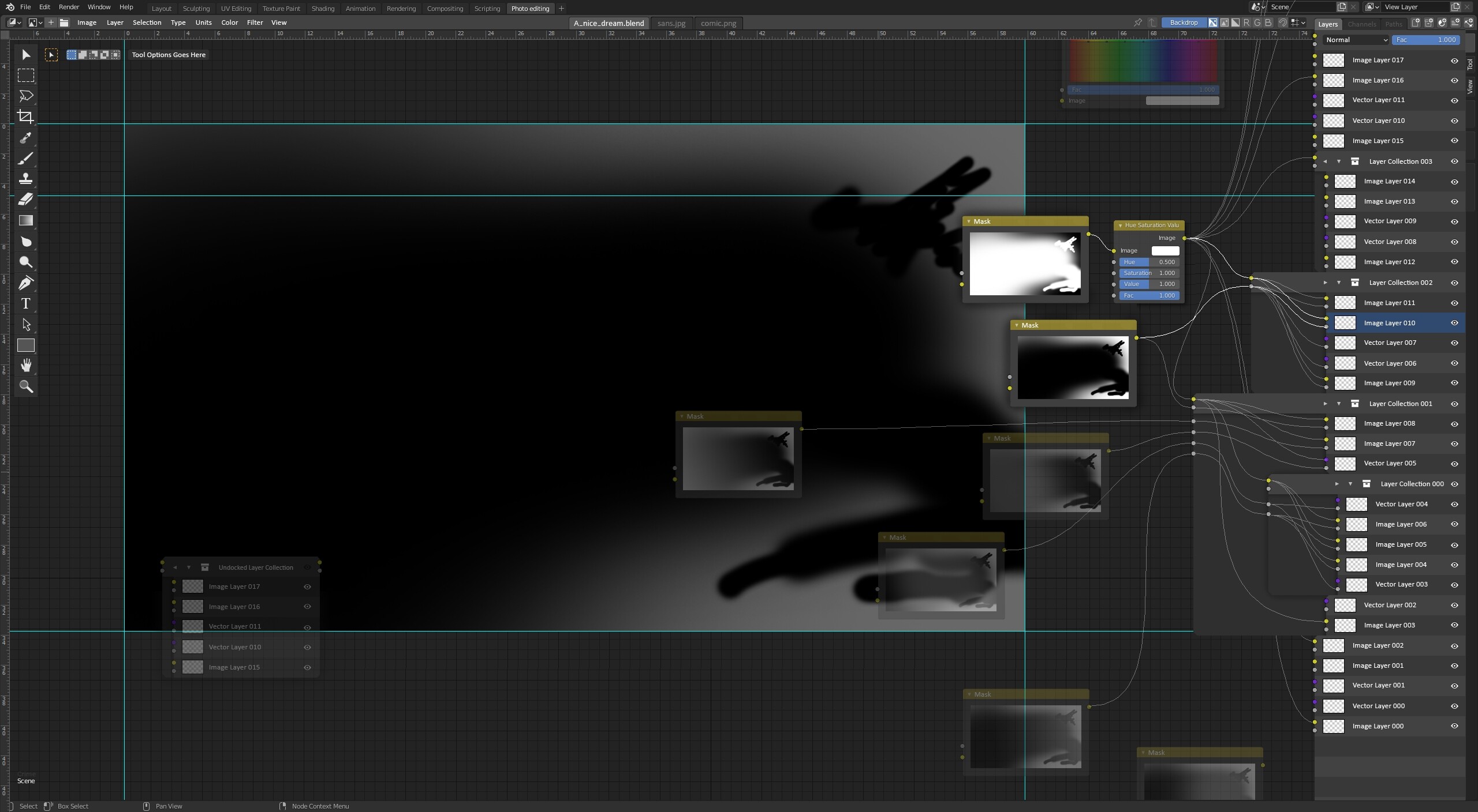
So here is next wild idea. There is a lot going on the mockup, so please let me explain, the best I can:
How the information is flowing, how to read this interface?
The flow is going from bottom left to top right. This decision was made by merging left → right node direction taken from Blender with bottom → top layer stack direction taken from most popular 2D softwares. I think it’s pretty intuitive and overall feels familiar for sameone with basic 2D+3D experience.
Why one window?
The main idea is to not multiply editors and utilise existing solutions - example main layer stack is heavily modified ‘N’ panel, which in theory means - whole layer stack can be easily hidden. One editor window also maximises working area. Missing color palette functionality could be incorporated at the top of layer stack or left for pie-menu-like palette like in Krita. Missing properties are redundant with nodes so this is easily solved.
On the bottom left I can see floating layer section which is undocked from panel on the right, right? Yes. This could serve two purposes. First is to disable group in layer stack, and second one is the ability to incorporate layer groups inside more advanced node trees.
My Lord what are those abominations with wires stickng from layer stack?
Yes I know they are ugly, but bare with me for a sec. For the lack of better term I’ll call them switches. If you don’t use layer groups/collections you won’t encounter them.
The idea is to use these retractable panels for managing complex node connections that otherwise would require a lot of time to set up and would permanently clog the viewport with a lot of wires. Simple example case is connecting adjustment node to multiple layers in a group. With switch you just drag the wire to group color input (yellow) and it automatically connects all layers inside to it. And if you want to exclude one of the layers from adjustment - no problem just expand the switch and disconnect it manually.
In the group header there are 2 arrows - the left one expands/collapses the switch, and the right one expands/collapses layer group in layer stack. Example of collapsed switch state is Layer Collection 003 in the mockup.
Switches also could be resized manually in horizontal direction with draging their left edge.
What about navigation?
Layer stack and node layout can be navigated independently. Node wires will always guide the user where it wants to go.
Visibility?
There could be couple options how to display the node-layer stack as nodes, switches and layer stack could be hidden independently - ideally with shortcuts.
Thanks for the feedback. Well, I agree that this solution is not a common thing.
As a sidenote - Blender is full of confusing things, Some of them are useful, some are not.
What I’m trying to do, is to find a way of editing images with lots of layers without cramming the UI too much. Consider mockup above - there are 35 image layers with easily accesible color and alpha inputs.
Now, try do do similar setup with nodes only.
In above proposal layer stack or individiual image layer can be undocked and serve as traditional node. So I see no point in arguing any potential missing functionality.
In my opinion Blender is just not done for that kind of image processing. The compositor, with all its caveats, is thought for making manipulation to one or more renderlayers.
35 (!) layers pertains more to specific 2d editors
That’s why I specificly didn’t mentioned Compositor here. Only image editor. I agree that Compositor is serving completly different purpose and should not be oriented as pure 2D app/workspace.
Image editor inside Blender on the other hand could benefit greatly from some functionality often found in many basic 2D softwares imho.
I dunno, I kind of think we should work together with the Krita and Gimp people to improve interoperability with Blender before doing something like this.
I already looked into it some time ago. AFAIK Krita so far didn’t show interest in having node-layer interface, but GIMP did!
I even started do do some test mockups, but GIMP UI as a whole requires substantial update so I’m kind of stuck.
I used to chat with the guy who did GEGL (he used to hang out on the blender development IRC). GEGL is the new back-end for GIMP, and it’s actually node based internally. It’s kind of neat.

 .
.