Nothing fancy, I’m just using a pilot ball-point pen on index cards.
I’m using GIMP to color correct and sharpen the images, but I’m not digitally altering the drawings themselves.
Personal Goals
I’m relatively new to 2d in general, and I’m not that great at it because I’ve never built up the motivation to practice and improve. This is a great opportunity to get started!
My goal is to finish every single prompt, even if that means spending a little bit of extra time or making rougher sketches to keep up. I want to get used to practicing sketching every day.
To show some level of development and growth by the end of the month.
Oof, “Wander” is a tough prompt, especially after “path” and “map” are already complete. I’m going to complete it, even if that means making something more abstract, but I have already fallen slightly behind, and I’m working on multiple prompts at once to catch up. If anyone has any ideas, I’d love to hear them!
I’m back, and I haven’t given up! I just got a little bit behind and wanted to catch up before taking the time to process and post the images. Some of them were skipped and completed out of order, but I have successfully gotten back on track and have completed prompts 10-19.
I’m also keeping up with my consistent theme of switching colors every 5 days. It’s refreshing, and it’s also interesting to see how the different colors affect the overall mood of each piece.
Let me know what you think! Though I’m doing this casually, and not currently deliberately apply professional techniques, I’m always looking for feedback so I can improve my future projects.
There are some I quite like, never mind this being a prompt thing – the floating island, mountain, rook, fortune cookie, Pringle all look quite convincing.
I don’t know that I could even get close to hatching that works without seeing the object in front of me in real life.
I’m not sure if the hatching techniques I’m using are conventional, or if I just made them up based on the overall contours and shading in the reference photos. Honestly, I’m really just experimenting and trying out different methods until I find out what works and what doesn’t. Perhaps I can look through all of them in the end and assess the results, then look into what techniques are worth learning in depth.
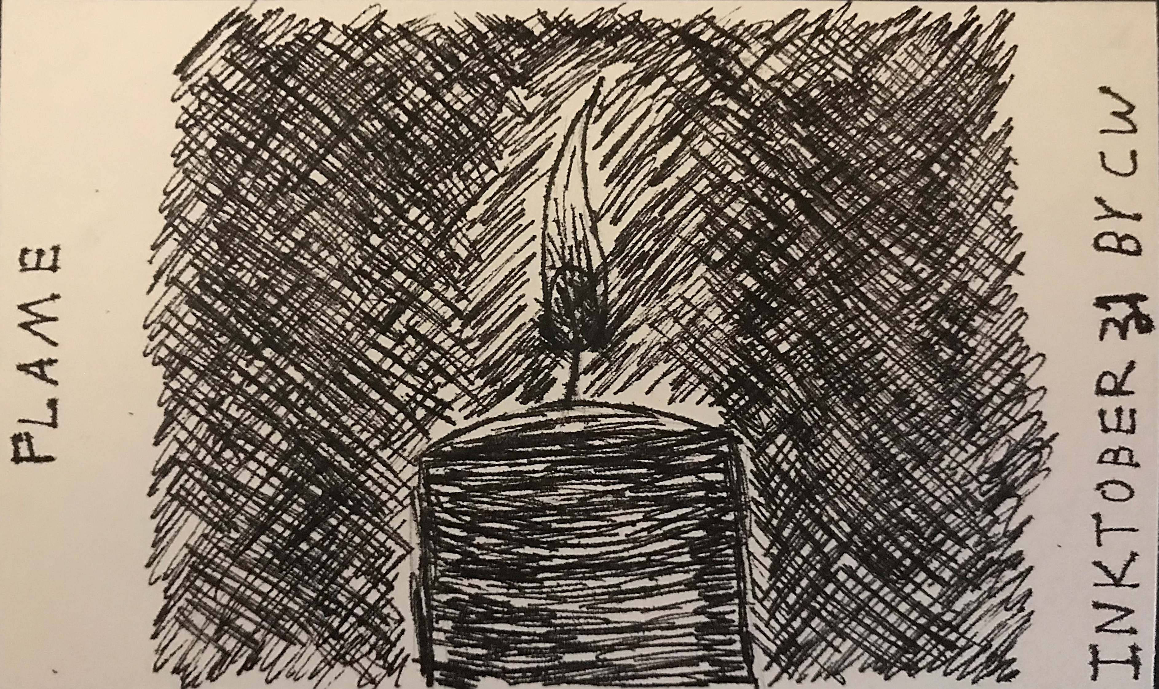
And I think ink is the perfect medium for this kind of practice. When I’m doing a pencil drawing, (or anything digital) I tend to draw and erase every single line that isn’t perfect, and I rarely make any progress. With something more permanent, my lines are actually smoother and I end up making fewer mistakes than usual. Funny how that is So far, the only image I’ve had to redo entirely is the chess rook.
For this reason, I kinda want a blender addon that locks undos during sculpting lol
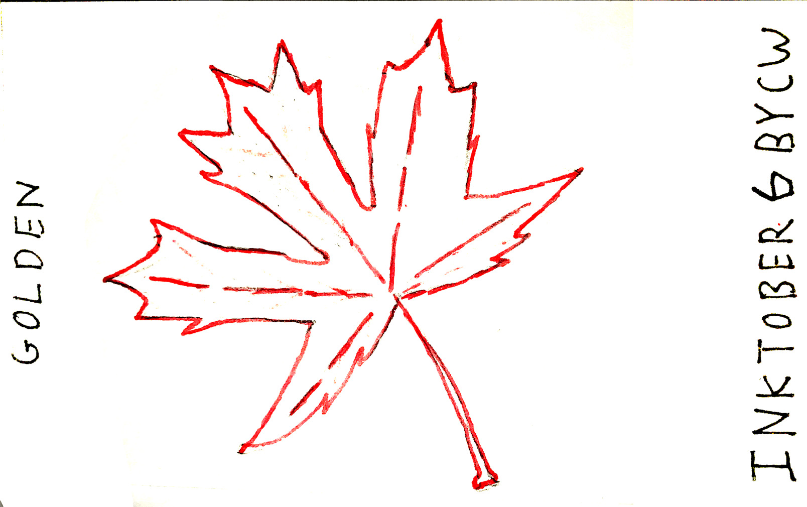
That being said, the pens I’m using are technically “erasable”, though it’s not as good as it sounds. It tends to smudge pencil graphite left over from the pencil sketch, and isn’t always reliable. So I have used it, but very sparingly, and so far, it hasn’t limited my creativity. For example, I originally had an additional level of veins on the maple leaf, but I decided they made the image overcrowded, and it just wasn’t worth leaving them there.
(Sorry about the rant. I’m partially talking to myself here. Now that I’m nearly 2/3rds of the way through, it’s about time for a personal reflection anyways. )
If I may, asking what people think about the results, in the context of what you are doing, is not useful to you.
The premise of such a question would be the agreement on a kind “correct” result.
Such a thing doesn’t exist, per se.
There is a (very broad and full of exceptions) “agreement” on the use of inking on a image, usually drawing or text to make it clearer, more understandable to the viewers; and, traditionally this means sharing, between the artist and the viewers, a group of informations regarding, but not limited, to line, shading composition, armony etc.
Like in any language.
But the path you’ve chosen here is more the one of expression and style, and it could be said that you are less inking and more drawing with ink, and there’s nothing wrong with that! But it also means that other people reading “correctness” (or lack thereof) into your drawings, is meaningless.
You could at that point consider to in fact use each sign on the paper less to “shade” an object, and more to decorate, or intertwine a kind of icon with a weave of signs, both to express playfully, and to search for pleasure in the signs themselves.
You’re right, I’m not following the strict definition of “inking”; however, I don’t believe this means all feedback I receive is pointless.
I’m not asking about the “correctness” of my work, but I understand how others could implicitly compare my work with others that are more closely tied to the overarching context of this challenge. I’m not sure how much of an issue that is here though. There are lots of artists using different styles and mediums here, some of which are even digital.
Either way, my personal evaluation is based on the goals I set for myself. Eventually, I’d like to try traditional inking, but I have to start somewhere. My current definition of a “success” is rather low, but if I can raise the bar, little by little, I’ll eventually get somewhere.
And even if others’ opinions won’t affect what I see as a “success”, it’s nice to have an external reference point or two to help see my work from another point of view.
Just to be sure, mine was just a consideration in general on the topic, especially in the context of inktober. In fact, I would argue that your personal evaluation based on the goals you set to yourself is the only valid one.
Out of the context of commercial publishing, imho, every expression is valid, and precious.
 Medium
 Personal Goals