Something still looks fake to me - any ideas on how to make it look more realistic? Maybe it’s still too clean?
Compositionally, the image looks boring. I think its the lack of a focal element maybe. How can I make it be more interesting? I don’t want to change the structure up too much since its matches what will be constructed. What do professionals do to make the images look good when they can’t change the scene?
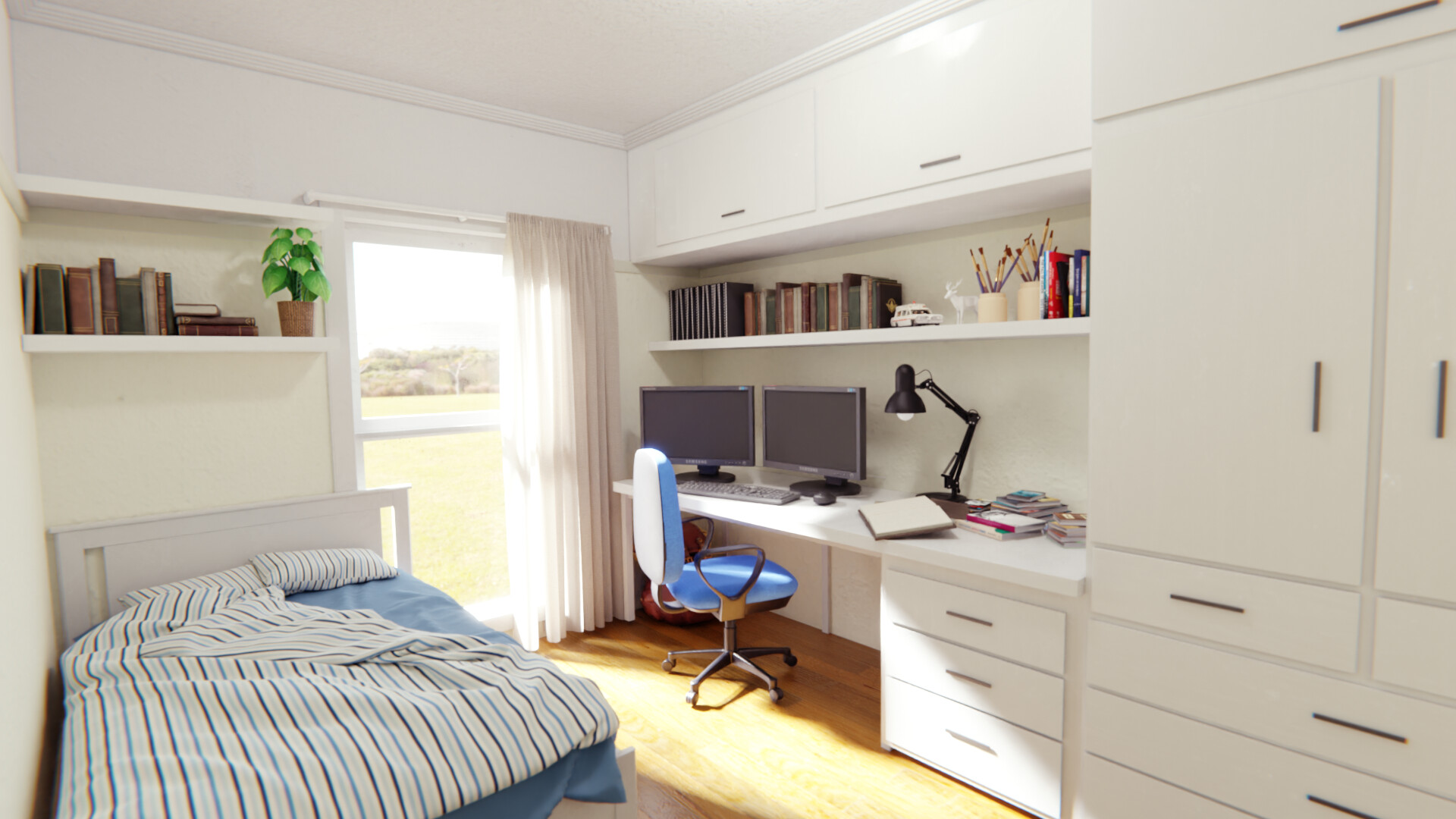
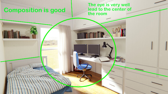
Your overall composition looks good to me, the eye is lead to the center of the room and especially the chair
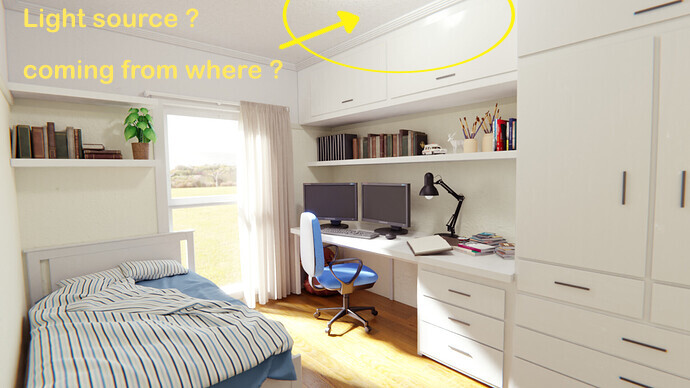
There’s a weird light coming from the ceiling (see screenshot) and I don’t quite understand why there’s a light there, especially if she’s on during the day.
The exterior (I think this is an Hdri ?) looks a little bit weird with a wide grassy plain, maybe try another thing.
And I think at my taste everything is a bit too clean, especially with the storage cabinets
(Maybe) There’s too much white going all over your scene, maybe try to put the wood parquet color somewhere else around the ceiling of the room
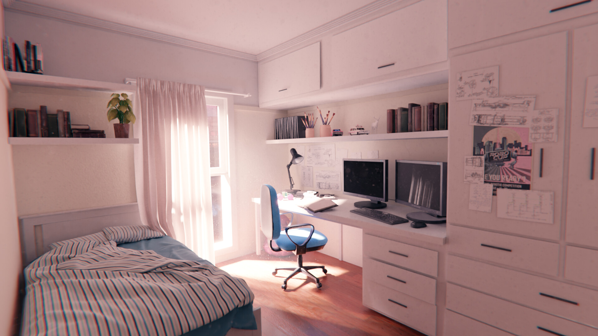
I’ve also tried to re-adjust the image with simple color correction, and I’ve been adding some dust in the air, it’s barely visible but I think it looks more photorealistic
Thanks Kazrarr. I really like that colour correction you did.
I struggle to find good HDRs for interiors - If there’s anything recognisable in the HDR it just looks out of scale. I think its because outdoor HDRs seem to be taken with > 50mm lenses, whereas indoor photography is done with ~20mm lenses. Any suggestions for good HDRs or other tricks?
For the hdri, I’m mostly taking them from https://polyhaven.com/hdris
But I do not know any tips or trick to adjust hdri, and I would also be glad to know about them
I still think the composition isn’t great. I think it’s because the light is brightest and most contrasted thing and is drawing attention away from the main subject (whatever that is? )
Hey that’s cool ! I prefer the previous render !
I think in general you’ve done a great job, if I had to make some little tweaks, maybe the chromatic aberration is a bit too strong, and I’d desaturate/dim a bit the red/blue image next to the papers, it steals a bit the attention drawn to the center of the room.
There are good improvements over the first image, which was already good.
The main subject is the room.
And composition wise, I think it’s ok !
What do you want people to say when they watch your image, or what do you want to tell with it ?
What’s the purpose of all this ?
And what do you think a better composition would bring ?
The colors are greats, the white going all over the place as been break
I love the addition of the paper clutter, it really add to the story, also, the way you put the curtains of the windows really add this feeling of this being a unique room, of a mysterious boy, and people are searching his room in hope to find something about him, or something like that.
The volumetric too add really to the image, I really love that
The most contrasted thing, I think it’s either the screen of the computer, or the legs of the chair, and I think it looks good
For the composition, again, I find it really great, there isn’t any side where there’s more detail than another, it’s well balanced, in terms of color and weight,
Just got told that I have to isolate for two weeks, so, guess I have time to fix those issues now
Reduced aberration
Reduced saturation of poster and magazines
Colour correction done in Blender instead of post-editing - I didn’t realise before that Blender has a colour histogram and vectorscope in its image editor