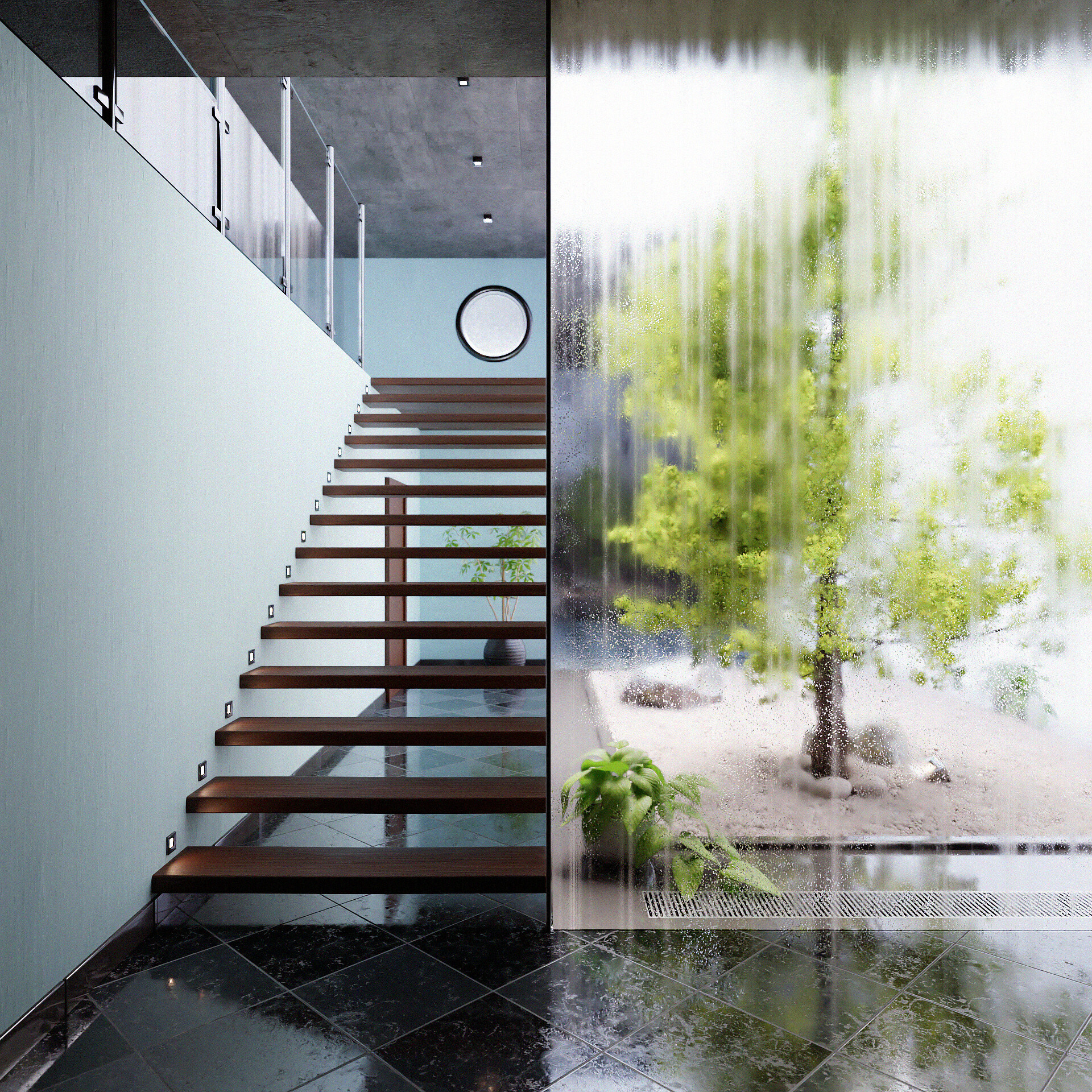
Just trying to create an interior based on this picture of @make_it_visually https://www.instagram.com/p/CGF0Lk-MZ0t/
Focused critique will be much appreciated in how to gain realism in this one.
Happy christimas everyone!
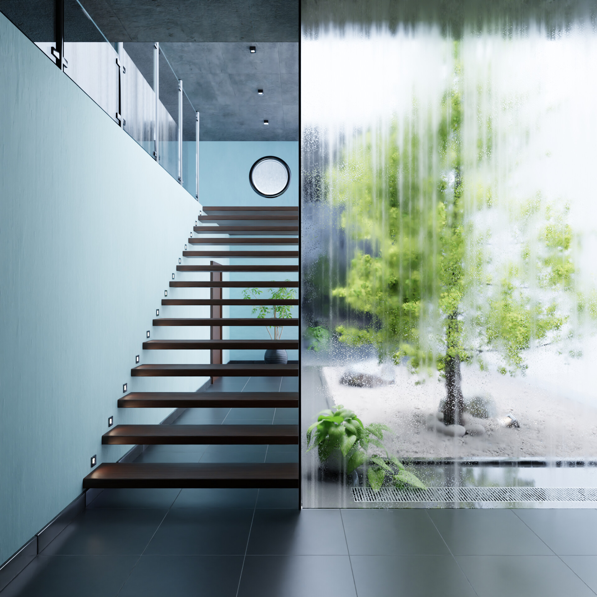
Just trying to create an interior based on this picture of @make_it_visually https://www.instagram.com/p/CGF0Lk-MZ0t/
Focused critique will be much appreciated in how to gain realism in this one.
Happy christimas everyone!
The light in the original is warmer, yours seems white [not sure if it’s on purpose, like to setup floor materials]
it makes the entire wall on the left look mismatched from the ladder and background
the 2nd note is floor reflection, I can see you didn’t add them yet, but I’m not sure if you’re planning to add them or leave it that way, reflection adds a lot of realism
That’s all I have to say, warmer color and bloom + floor reflections and I think it’ll be good to go
I think your render is really nice on the technical side, it could probaly be improved on it’s “narrative”.
I found that the reference has a very sparse, almost brutalist, decoration style: there’s no door or details in the bottom background and even in the foreground outside there’s a big rock instead of another green point.
I think that those things in your render could be distracting the focus from the main green and saturated point in the image, subtracting contrast and importance to the tree.
At the same time it feels less organic because of the different decoration styles: kinda like if a really austere person designed the house and two days ago another guy moved in and just started buying some plants to put in 'cause it felt too much empty.
If I had to do it I would just clean a little the composition by making it less dense and just focus on polishing textures and materials (which are already pretty good) until it feels I can touch it.
To make an example the ceiling in the reference has a lot mor grain and textures in it than the one in your render.
Anyway, I relly like it! I think is a good piece of archviz what you’ve done
Love it! Nice work.
I also like that its not 100% the reference, Its pointless to match the reference 100% anyway.
there is some minor things that I would change though:
*) There should be like 2 centimeter at least gap between the stairs and the window. It will make the stairs look more floating.
*) The floor is too shiny, almost looks wett, I would make it look more “dry” also to contrast inside and outside.
*) The door should be less visible, more aligned to the wall.
*) The Stair lights look a little small, also It might be a good Idea to have it only every second step
*) The image format I would make a little more vertical to see just a touch more of the ceiling.
I think that the first set of floor-tiles is better because it is less “visual clutter.” Also believable in terms of what an architect might actually do. One thing that does strike me, probably due to the flat lighting, is that I get a sense of two flat photographs sandwiched side-by-side. There should be some directional light, causing those steps to cast shaadows on the wall – which doesn’t have to be “white.” Likewise, it would be interesting if the ground in the garden wasn’t “white.” Would there not be a bannister next to that stairway? Might there be some kind of edge-molding on the left side of that glass? A picture hanging on the wall?