This is my first time posting in this thread and I would like some critique on my practice archviz interior scene.
What would you do to improve it?
Two major problems I have with this picture:
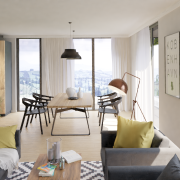
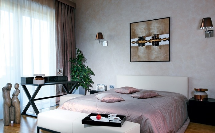
I set HDRI gamma to 1.2 to get more pronounced sun light streaks. It kinda messes up colors on the rest of the image, and the streaks are still too subtle. Like they are underexposed for real-life scenario.
So I reverted gamma to 1, added sun lamp and cranked up intensity. Chose a more steep angle of the sun direction.
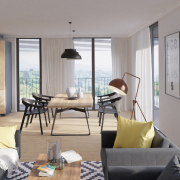
Here is the image:
I thinks this is better, but sun streaks and windows could be more (over)exposed?!
What would be the right approach for achieving this effect? Can I tweak cycles some more or would I do this in post production?
Background image. Is it too bright or too dark comparing to the interior lighting?
Unfortunately I don’t have photographic practice too grade it by the eye.
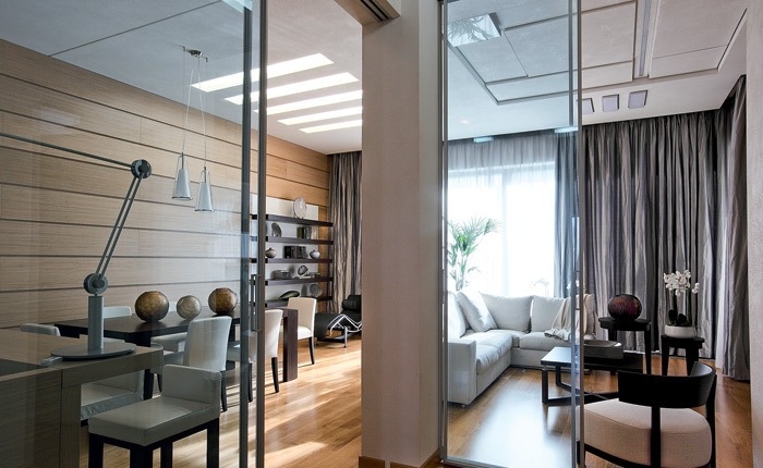
I feel like the scene is too neat. If you look at the first image in the Behance link, everything is crumply, random bumps, many small details that we pick up without even knowing about it. I would start with the table that’s closest to the viewer and work on it, make the chrome thingy less reflective, add noise texture to make it less perfect. Also I think that the yellow pillows are loosing much of the detail, making them look artificial.
Another thing I noticed - is the brass lamp on? I think I’m seeing a reflection inside it (on the white part) from the bulb. If it is, I bet it wouldn’t be on on such a sunny day. Also, the railing on the outside isn’t really connected to the concrete part.
–EDIT–
Oh, I forgot to say that the renders are awesome and I really envy your courge to put your out there for peeps to pick apart. Great job.
The railing is indeed not connected
Don’t know what happened, got it like that.
When you say crumply, you are referring to that fabric being wrinkled?
Yes, that is great effect.
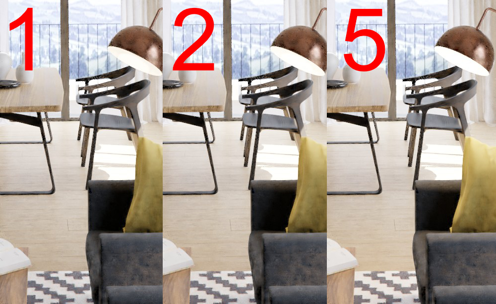
Yes, lamp is on. In the kitchen the effect of light being on is not great but it’s a better than the brass lamp. In professional renderings I see the light turned on even during the day. Is this one too much?
Btw. I can’t seem to find right amount of emission level to simulate lamp being turned on during the day. If I crank it up it just overblows and that is also not looking good. Is the interior too bright for this lamp light to be visible?
I feel like the light should be visible on the whole ‘inside’ of the lamp and not only the bulb being reflected. The lamp has its back to the light from the window, so the lamp shade serves as a small cave - if you light up a bulb in a wet cave, the light will still light up the walls, not only being reflected on one side. If you’re having problems with it being visible, I would change out the light color from cold to warm. It will give more visible castoff inside the lamp shade.
As for the pillows, yes I was referring to the wrinkles on the fabric. I know that the lighting is important to achieving great effects but you need everything to come together to make the scene look good.
Temperature is 4000 Kelvins which is normal for indoor lighting. 1, 2 and 5 are strengths of emission shader. All of them look odd to me. Adding glow around the lamp wouldn’t help much.
EDIT: Btw. what is the highest value of white used for shader that should be used? This walls are 0.8
