Blender+Clycles
50 Samples, 40 min. rendertime on gtx 770

Nice, but the room is quite small for a living room. What about adding skirting? https://www.google.cz/search?q=skirting&client=firefox-b-ab&tbm=isch&tbo=u&source=univ&sa=X&ved=0ahUKEwiL-qCUkL7OAhUCIMAKHbOcAM4QsAQILw&biw=1473&bih=772
Also the windows does not look convincing. Why do they look so industrial (and old) but the room looks so new? Do you have some reference images or did you make them from memory? Always use as much references as possible, your memory is not a good reference.
Only 50 samples? I would have expected it to be much noisier with only that many samples.
50 samples? I don’t understand too. It’s hard to believe. Explain pls.
Branched path tracing and low light bounces maybe.
Branched PT is for CPU - CPU is faster on branched than GPU
as for image - too much AO - room has no shadow depth
So, there is no AO and no branched path tracing in this render. I got less noise because i put the resolution up to 700% and scaled down after. So you can have pretty low samples but get rlly noiseless renders.
I never thought of that - that makes sense. Do you think the extra render time for the larger pic is less than the render time for the actual size with more samples ( I guess you must or you wouldn’t have done it!)
Yes, it’s a lot faster. A render in that quality would take 4-5 hours for me.
Try it with an old scene there you have a reference. Sometimes you can go away with 5-10 samples but
interiors in cycles are a little hard to get noise free so i chose 50 samples. It really depends on the scene.
Very nice overall 
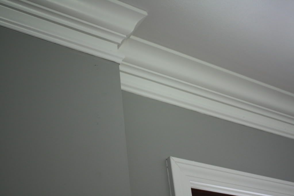
I would improve couple of things next time, though. It would be a good idea to have some sort of a transition from the wall to the ceiling, like this http://i1019.photobucket.com/albums/af318/lizlaw875/5-23-11085.jpg Now they look a bit too simplistic and somewhat wrong.
Carpet is too wavy and hovering, yes)
Сomposition-wise there are too many black heavy things on the right and not much (apart from interesting lamp) going on on the left.
These things are the basic improvement I can propose, otherwise - I like it)
Lighting looks somewhat not natural.
Are there 2 other windows behind the camera? I see the reflections of some light source, so I guess there are other windows.
Also if I had to guess I would say that there is a light source in the ceiling.
IMO the so bright light inside the room doesn’t justify the burned look of the outside.
In few words, I mean that all the light sources are not balanced in a consistent way.
Its one big window on the right.
I like the feeling. good job
Very modern and looking nice except Margenta might have a point about the visual weight. However, if I remember correctly crown molding (wall to ceiling) fell out of favor in the U.S. when I was a boy over seventy years ago. But, baseboard didn’t since it serves a much more practical purpose. Six (6) inches is a good height for baseboard and just a beveled top will do. If you can afford the render time making it glossy is a nice touch.
The hovering rug is something many of our archviz friends are doing simply so it doesn’t hover. And, that is raise it slightly in several places to catch a shadow. I used that myself because without it the rug sure enough was hovering. This hovering rug thing might be something we have to live with. I agree also with LazyVirus in that just the window light might look really nice. Maybe supplemented by a touch of AO. Hell 0.100 might do it. Very nice overall from where I sit just needing a few touches.