This is for the Weekend Challenge.

Comments and ideas welcome.
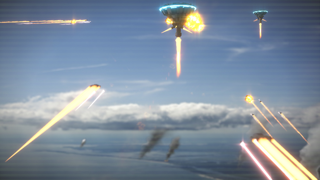
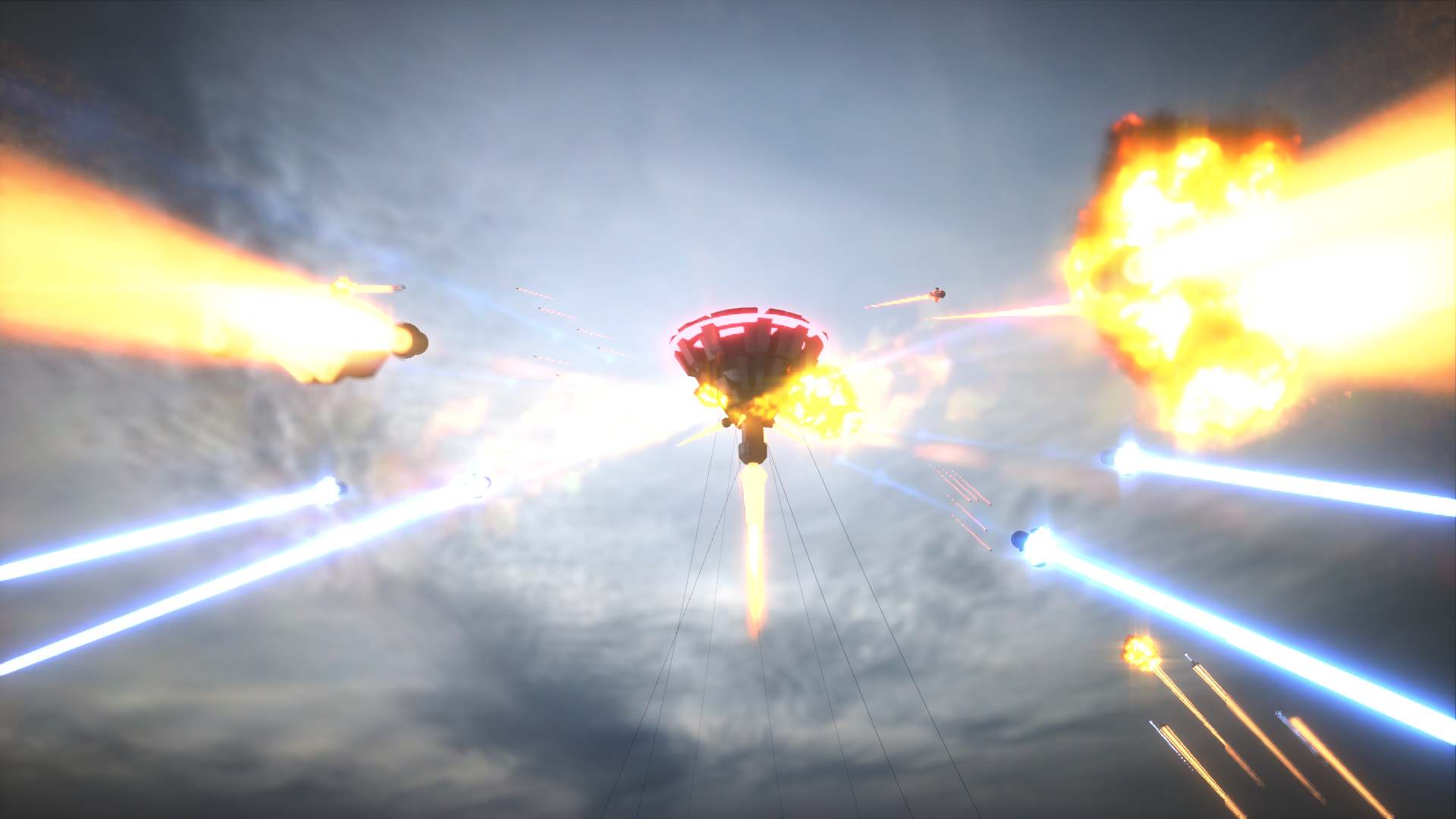
Those ropes/wires suggest that the ship is tethered to
the ground, yet there’s no landscape on the horizon…
The clouds look like we’re really high up - too high for the tethers.
thanks
i’ll see if i can fix it
What I’m missing is a sense of scale: show me whether this main object is supposed to be huge or tiny? Also, a sense of height would help, like a horizon, or smoke, as in a rocket launch. Finally, I would like to see the drama as implied by the title ‘Invasion’. As it looks now, the title might as well be ‘Coming Home’. Who is good and who is evil? Who is going to win? Lose?
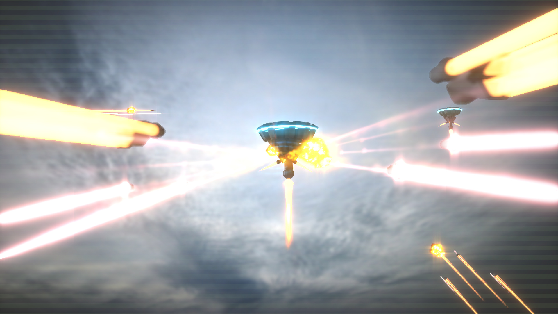
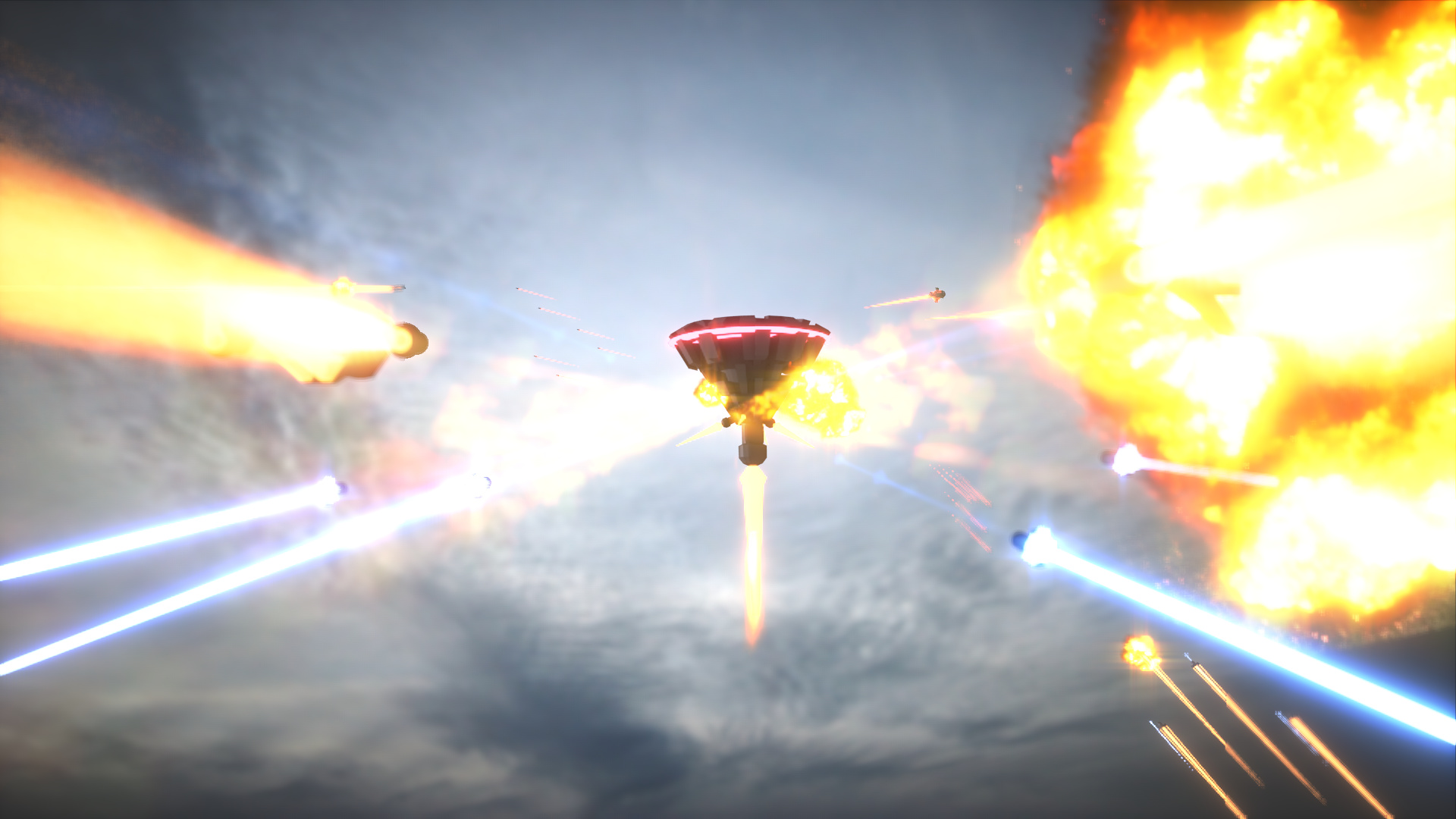
Firstly, there’s no horizon line because the camera perspective is aligned above it. Secondly, there is no maximum tether line length. I really like the first image; It’s neat and it has a balanced composition. The second is too busy as confusing to the eye.
I agree the second one is quite busy
the problem is first one looks like they were coming home not attacking.
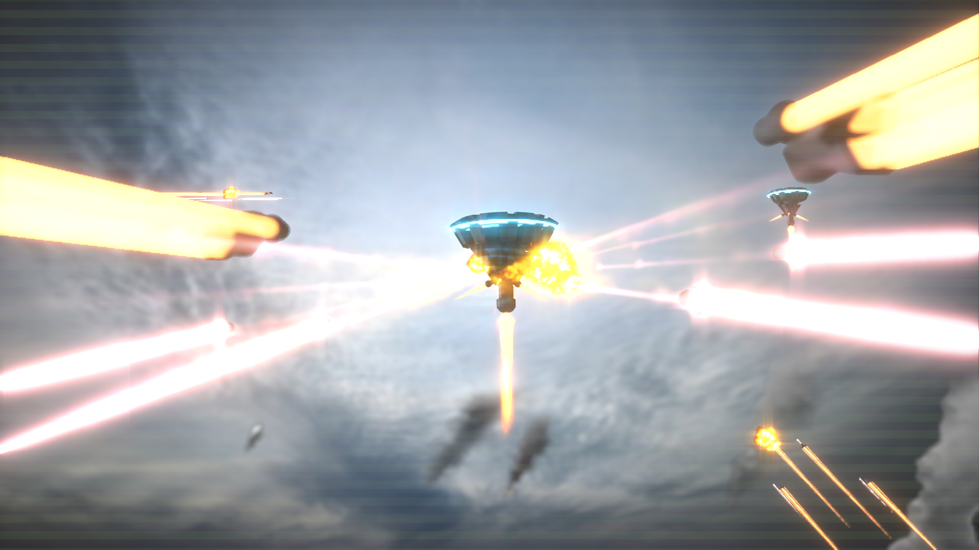
I have updated it again trying to make it more of a war not just flying about
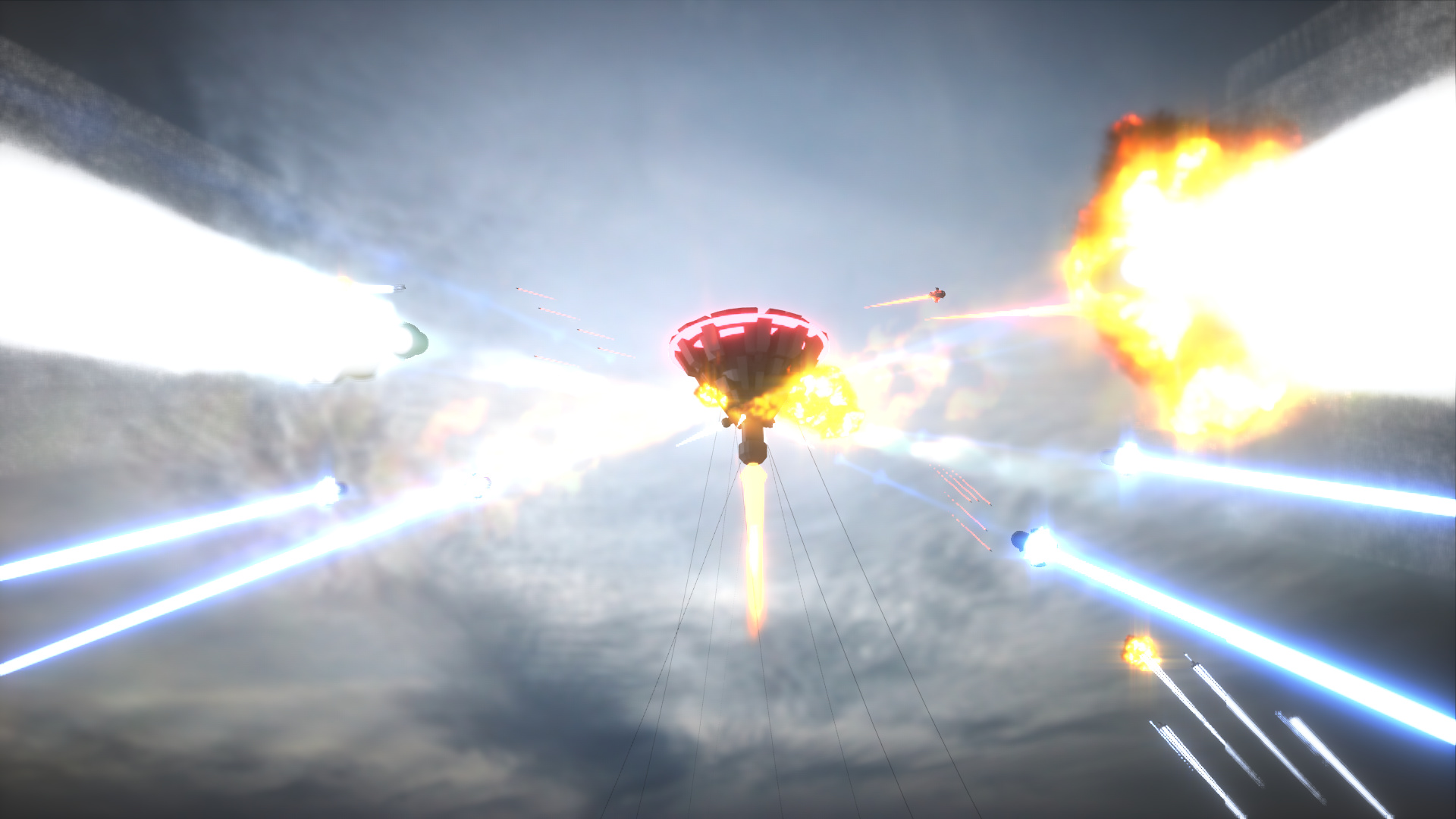
I like the explosions, but the huge mass of clouds clutters things up, and your main subject is in an awkward position, on the edge of the frame. Maybe expand the idea of the smoke down there, like your subject is escaping from a world being destroyed? Also, I loved that spiralling clouds from your first version, it ties your composition together, and I would definitely keep it in…
The last one is awesome. I’d say the rocket thing holding it up looks a little fake - but really this looks awesome. Also the sky texture is quite low-res and has subtle greenish lines going sideways through it.
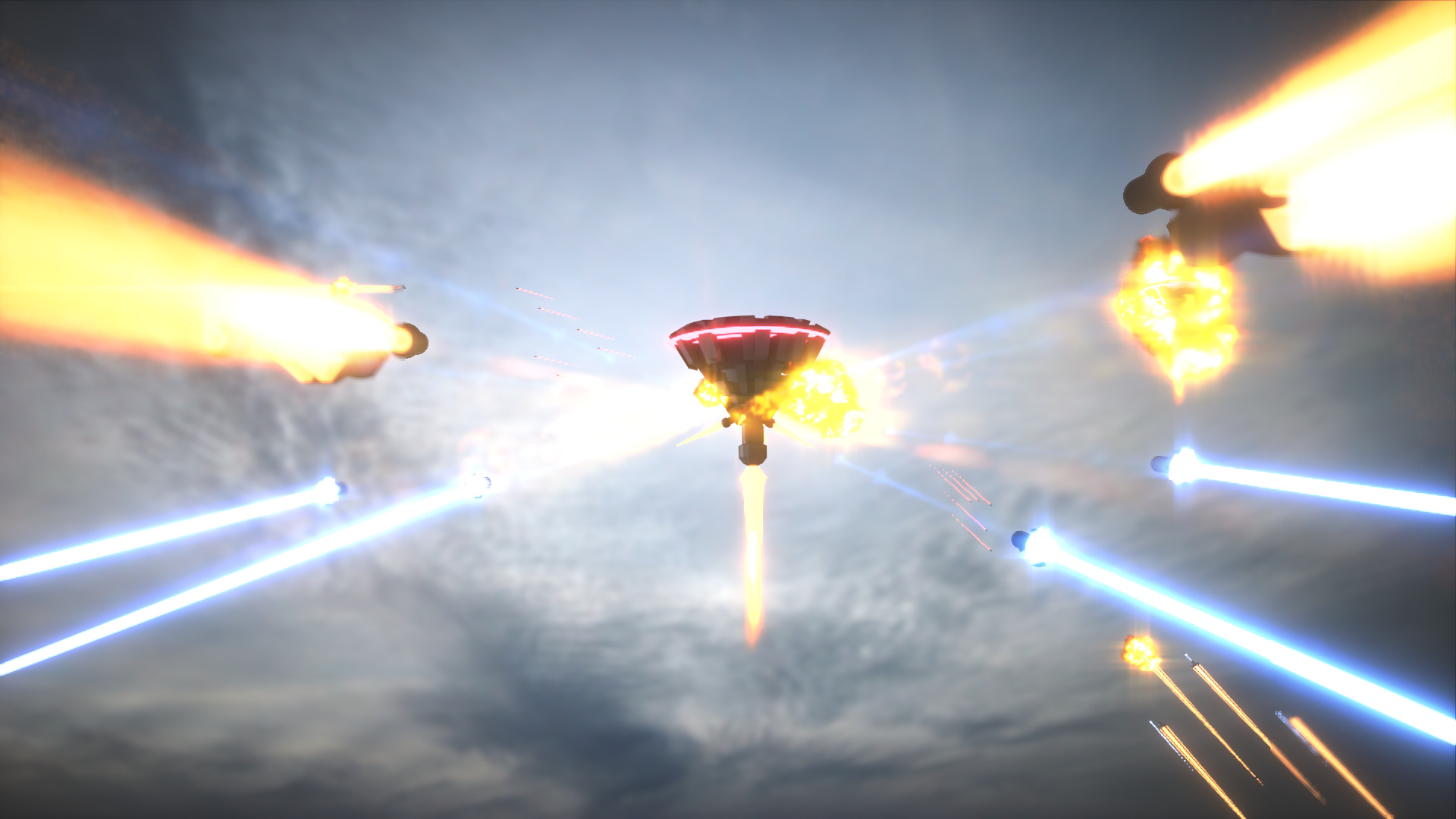
It’s getting there! I like the color contrast of the somewhat cooler purplish effects for some of the the invaders, against the warmer orangish effects of the defender, which suggests a fight between bad guys attacking good guys. You may want to play this out a little more, see what happens if you push it more towards blue or even green? Make the rockets bottom right converge towards target, and get rid of the ones that seem to go perfectly horizontal, coming from left. You may want to pull the target a bit off centre, like 2/3 from the left of the frame, as in the golden section. Finally, the two smoke columns below are two small to work, either get rid of them, or give me enough smoke to burn a world. And finally finally, a foreground may be awesome…
Yes, I’m not feeling the weird banding going through it either. I think it confuses the composition and doesn’t really add anything. The ships coming in straight horizontally seem awkward and don’t flow well with the rest of the ships. Also they seem oddly sharper which makes the effect worse imo. I also found the first image more interesting with the off center ship with the tethers and sharpness of it as well. I also feel the ships in the foreground need a bit more geometry to flesh them out a bit.
@Owldude
I see what you mean by the green line’s
so I got rid of them. it looks much better now
@eezacque
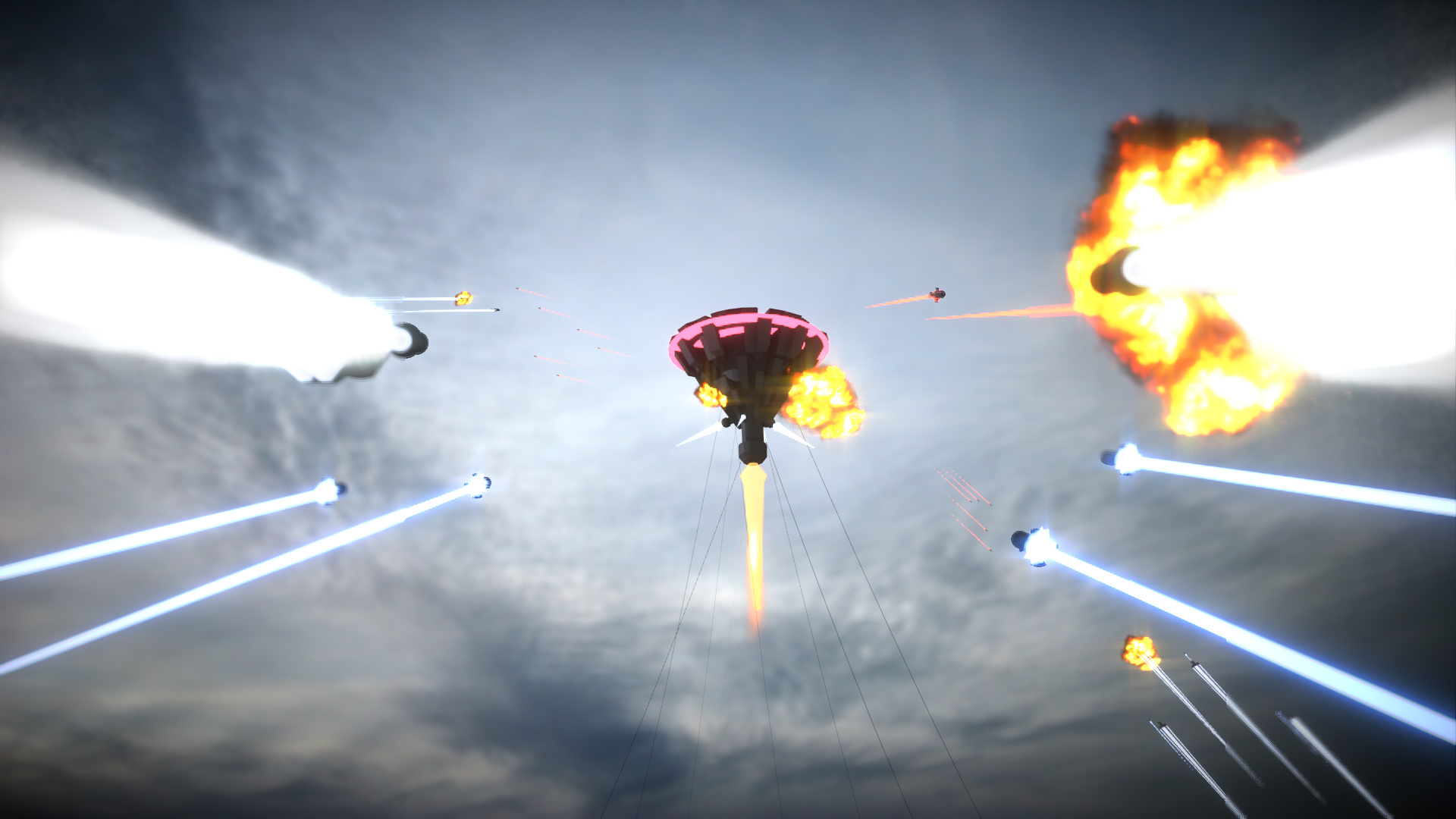
I’ve changed the colors to make the story flow better
and removed the rockets that go horizontal.
You could push the colour contrast further: all invaders are cool, everything defence is warm. Be careful with those huge explosions on the right. it takes away attention from the main center piece…
I agree wth this!
Getting better, although the explosion/trails on the foreground are way to bright.
You might want to add some foreground smoke, to tone these down, and frame your main sbject a bit more?