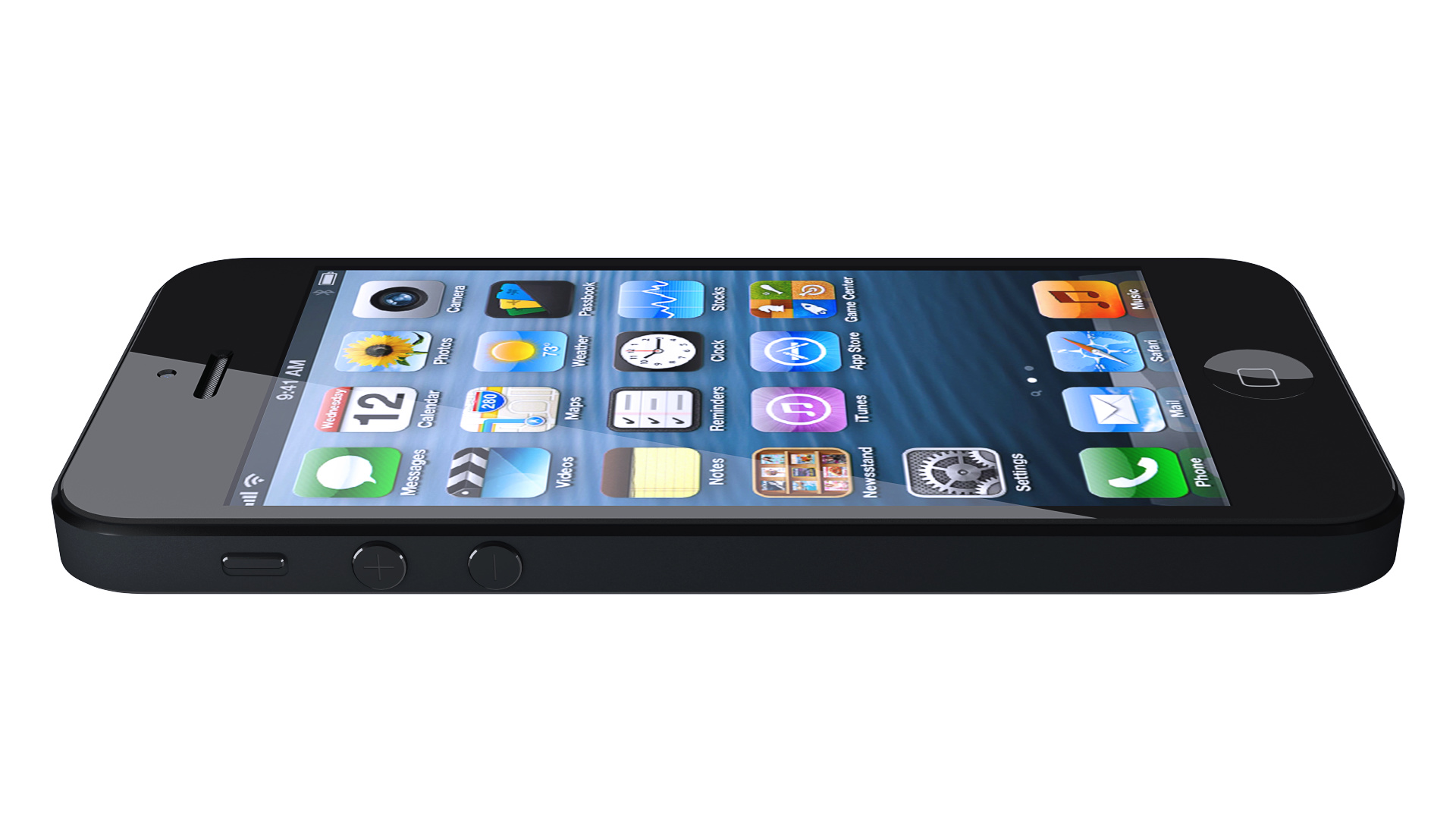
This might seem a bit boring and overused, but I thought it might be a good exercise for my first “project” with Blender (and also cycles). I’m planning on using my model of the iPhone 5 for some still scenes later, but first I wanted to do a simple product presentation.
I would very much enjoy any kind of critique, especially about the lighting and materials.
Are there any guidelines for which camera lense to use? I chose 50mm, but I’m not sure if this is the right amount of perspective for this kind of product.
I know that triangles can sometimes cause problems in meshes, but since I was aware of that, I think, that there is nothing wrong with the way I used them here. Would you agree? All of the beveled edges are quads and smooth areas are almost always quads as well.
you almost choose the worst angle xD from possibles, however if you would crop it one way it would be better. but still not perfect.<br><br>Generaly iphone should be shown from the front. a Z angle change and a bit of lay.
Beauty renders look good but your wireframe could do with serious clean up. I bet you used booleans to create holes, right? An 8-sided (6 or even 4 work too) circle is plenty to make a perfect rounded hole.
Corners are also very densed, a couple of edges + subsurface should do the trick.
I haven’t yet set up my final scene, actually, as I am still experimenting with the right materials. But for now I thought this angle shows a lot of detail.
I actually modelled everything quite “by hand”. So no subsurf or booleans, only some bevel modifiers applied in stack. I found that subsurf produces hundreds of unnecessary faces, so I went with smooth shading and sharp marked edges only.
But I’ll try to go down with the verts on the circles; I didn’t know how much too use to make it appear perfectly round in the final render. I should try modelling everything with a subsurf and less vertices, because I have to admit that my model was far too time consuming for a professional workflow.
Here’s an updated version in a new scene setup. I also reduced the amount of vertices.
As for the moment, it’s as good as I can get it… I’m quite happy about the outcome, but it lacks far behind Apple’s renders…and for now I have no idea how they get the amount of detail and sharpness without making it too contrasty.
My screen texture obviously is to low res, but I couldn’t find any quality images of the default home screen. Does anyone know where to get a screenshot of just the default icons and wallpaper without carrier, battery life or custom things showing?