Is "Filmic Blender" the newest buzzword ever since Andrew Price's new video?

None of it is relevant and I sure don’t mind.

It’s more important that you folks get the software working properly and understand how and why it isn’t. The culture needs to hold the development process’s feet to the fire. Old broken code needs to be fixed and new broken code that doesn’t work from a holistic vantage should not be added.

But again, that’s on the culture. If the culture doesn’t respond, expect that same dumb mistakes and errors. That means that the culture’s knowledge and understanding is paramount here.

It is on you.

1 Like

OK, I hope it will improve the way you’d like to see it. I’m just a sculptor, so color management is not my area of expertise.

There is a simple question that applies to whether or not an image crafter needs to concern themselves with pixel management:

“Does anything I do end up displayed on screen or print?”

If the answer is no, it’s not required.

If the answer is yes, yes you need to care as it impacts every aspect of the final output.

Wood is media. Clay is media. Graphite on paper is media. Pixels are media.

I just stated that color management is not my area of expertise, but I need to render my work as well, so I do care, otherwise I wouldn’t join this discussion. In other words: I’m interested. :slightly_smiling_face:

Yes, and it was a more general statement. Folks tend to err on the side of “it doesn’t matter” without digging into how it impacts the entire pixel chain, right on down to the output that ends up on a display or print.

It’s is damn amazing that these discussions are happening now, as they were very rare prior. That’s a tremendously good sign.

There are some interesting design issues to solve that haven’t yet been solved in other software, so the ability to push the envelope depends on an educated mass of people. The reliability of the software is directly proportional to the audience’s ability to test it and understand the issues. Without an educated audience, it’s all just random garbage that might break or be broken at any given step.

Push and ask, then spread it around and help others.

3 Likes

I would argue that hope is not lost on educating the developers on getting color management as good as possible, I mean Blender 2.8 added a couple of things people thought would never get into Blender because of how dead-set the developers used to be against them (left-click selection by default and colored wireframes).

We need to also get the BF’s big corporate donors on board with the push. Their signing on alone is already prodding the BF into having higher quality development practices.

1 Like

I did not expect my inbox to blow up after posting this so long ago lol. Glad to see people are still talking about it, as I’d like to see it be the best it can be.

Even though it’s been around since 2012, ACEScg is finally becoming a ‘thing’ as it’s trickled down to the masses. WETA have even gone down the spectral rendering path.

ACEScg can now be loaded into Maya as a colour space and VrayNext can transform and render to it. The days of sRGB may well be numbered.

Also, I came across this very interesting blog with loads of useful info on ACEScg in 2.80. Here’s one of the chapters comparing ACES to Filmic

https://www.toodee.de/?page_id=858

ACES has issues. Not the least of which is that it began life as an archival format. When CGI folks tried using the primaries for rendering and graphics work, it was discovered that wide gamut RGB primaries can lead to pretty poor rendering characteristics. Which is what led to ACEScg.

That is, ACES is nothing much more than an overly complicated REC.2020. The jury is still out as to whether or not everyone will get on the train, and it’s rather fractured.

The main bit of ghastly from ACES is that it does only a brute force gamut mapping. That means that at high intensities, the colours clip and skew just like sRGB. Further, the gamut mapping from the wider gamut REC.2020-like primaries of ACEScg are brute force absolute colorimetric mapped to the smaller gamut, which also leads to not super aesthetics.

Spectral of course is most certainly the future, but it too doesn’t alleviate the need for aesthetic gamut mapping in the camera rendering transforms.

1 Like

Thanks for your input. I’m coming from Arnold and have only really dabbled in Cycles. The points you mentioned are surely some of the main reasons that ACES has been around so long and has not really replaced sRGB(Spectral surely will)

A lot of studios are simply applying an ACES hack in post as a LUT in Nuke. The transforms required for texture input might be another reasons artists steered clear(VrayNext does all transforms automatically) After all, it’s only a few years since the confusion among many, many artists has cleared with the whole ‘linear workflow/gamma correction’ mass switch from legacy non-linear practices.

All colour requires transforms. That’s just a fact of life; you have to describe the encoding of the particular buffer to the software or else you’ve mangled your chain. ACES isn’t unique here.

Which loops us back to the key point: it is important that the folks who are doing the work understand what the pixels represent and how they are encoded. While remarkably simple at the core conceptual level, most folks come in on floor 87 of a shambling skyscraper constructed from horrible misinformation and confused legacy “knowledge”.

Sadly, if you read YouTube comments to Price’s video or forums around online, a majority of individuals still haven’t managed to embrace the differences between display referred and scene referred encodings. Linear became one thing somewhere, and few folks stopped to investigate just what it meant.

That means we have plenty more kilometers to travel. It would bode well if the community around Blender led the charge as one of the more informed communities regarding pixel pipes.

If there is UV light, unless you ‘clip’ it how can you see it, as a human being?

Common misconception.

We are literally talking about three uniquely coloured lights that can project at any intensity. Think of it as a note played at a different volume or a particular colour of paint at a different density.

If you think about a simple green tree, the greenish light and the reddish light are projecting, with some blueish in the set to desaturate the mix slightly. Of course, the ratio of light intensity is highest for green, then a splash of red, and a hint of blue.

Perhaps in some random colour space the display referred output RGB intensities would be something like 0.1 0.9 0.02. So what happens if we increase the intensity? Now the green emission has hit its limit, yet the other two channels must increase to keep the chromaticity, or loosely “colour” of the light, the same. Since the green channel can’t represent a more intense green emission, the red and blue climb, with the reddish light climbing rapidly up to match the green. This leads to the dreaded trees and foliage turning yellow. Same happens with light and dark skin tones turning yellow, or skies turning cyan.

Here is a sample photo that Mike Pan found in a Twitter link as an example. It’s excellent because it demonstrates the ghastly yellow issue on skin extremely well.

Gamut mapping along intensity is somewhat of a new thing though, and folks don’t have it very visible on the radar. Gamut mapping along saturation has been engaged with for a long time via the print industry. Heck, even ICCs have gamut mapping baked right into the protocol!

ACES suffers in just the same way as sRGB for this reason, and you end up with the same ghastly skew.

You can do this sort of test on your own. Start with a generic colour wheel mix such as the following:

image

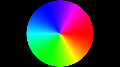
Increase exposure. Presto, nasty skew! See all the mixtures between the pure primaries and how they lose the originally intended colour and skew to the pure primary mixtures of magenta, yellow, and cyan?

When you realize that in a majority of scenes the exposure may have elements that extend beyond the gamut of intensities, this sort of mangling is happening in every image you make.

Filmic has a gamut mapping, albeit a very crude one. It too can be broken, but it isn’t nearly as broken as not having any gamut mapping at all.

This will be an extremely tough nut to crack if you think ACES is broken, as everyone is conditioned to see it as a good understanding of color because they see it applied in all of their favorite movies and video games.

You will have to somehow convince Hollywood itself, as people will believe the studios when they talk about color.

Naw. I don’t need to convince anyone. Too busy.

Best I can do is explain to folks who push pixels around how issues arise and the implications on their own work. Understanding why something manifests puts the image maker back in control.

The rest is fluff.

1 Like

I understand and agree with you formulaically, I understand that the uniform deviate Red is being constrained while the G and B continue to scale in a constant linear fashion toward their maxima. However, because you’re talking about how the system is wrong in and of itself, and the ways in which theory (as in applied physics formula/mathematics, not hypothesis) is currently lacking; it’s important to talk about physical reality, or at least consider it.

So what is a color, in reality? As far as I’m aware there are only photons, and the frequency/amplitude and ‘voltage’ (as in their pressure difference from the previous moment) is what causes the cells in the cones/rods of your eye to tighten or relax, triggering the excitement of neurons in your occipital lobe. Once the frequency is too high, even though there are still photons, your eye will register ‘no light’ as if it simply passed through transparently. Philosophically you could argue that this is a color, but I might argue that color is meaningless outside of the human perception of reality.

I hope that we are on the same page now, and I would kindly ask what color you expect to see once the value for the intensity exceeds human eye strength? Not in any particular algorithm or mathematical representation, but period…

I worked most of my life in the print industry as an origination specialist, eventually direct to plate. I proofed to commercial Epson inkjet. Clients would complain about colour on press proof, I would apply aqueous varnish coat and clients would be happy. This happened so frequently we just worked the extra cost into our quotes. Luckily our Roland had an extra drum for just this task.

I had an insanely expensive Xrite colorimeter and built individual correction curves for each monitor, press, proofer and paper stock. That said, I was probably one of the few people in South Africa in the industry who could be bothered to be that anal retentive…

All I am highlighting is that the intended colour is lost without a gamut mapping along the intensity axis. That is, while the CIE define a gamut as both an area or a volume, I am a volume camp person; the gamut mapping along the intensity is important to maintain a semblance of the intended colorimetry. Anything is better than that ass yellow on skin. ACES doesn’t do anything to solve that problem. While ACES has some brilliant colour science folks behind it, the aesthetic output is rather important, and as a default position, a lack of a more-then-brute-force gamut map is arguably a glaring oversight.

This isn’t terribly nebulous. Colour science took on significant development with the advent of the 1931 CIE XYZ model. It works. It works well. Heck, the basis for all the RGB you stare at all day is derived from it.

I’d say it’s good enough at this juncture to avoid philosophical debates. There’s pretty solid math and good research at work.

It’s a great question. Note that this doesn’t discuss standard observer “strength”, but rather the mapping of a scene to a particular display or output.

What should happen when a very bright colour exceeds the output medium intensity? Should it skew?

That’s the essence of a proper print workflow! Did it work?

1 Like

My biggest problem was perceptual bias. At this level of OCD, things like humidity, temperature, time of day, lighting and individuals (printers, minders and management) made a difference. I would explain gently that I was the one with the measuring device, but often with no effect. So mostly, but no. People wanted things to look like their favorite magazines, so I would end up over-saturating and applying a varnish most times. Also no one ever believed me their monitors were shite…

I’m being literal, what color does it become?
For example in your yellow image, if something can’t be more yellow but you increased the intensity, what is it?

You don’t like the intensity/brightness scaling formula, and maybe I don’t either. I can’t understand what your solution is. In real life if you scale blue high enough, it does become invisible to a human eye. That’s what makes HDRI color ramps so interesting.

What’s the fix to the problem?