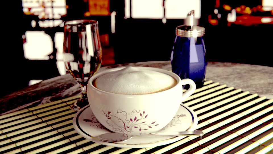
Hello this is my cappuccino scene rendered

Rendered in Blender - Cycles
Texturing - Gimp
Compositing - Blender
I would like to hear your opinion on this scene 
Hello this is my cappuccino scene rendered
Rendered in Blender - Cycles
Texturing - Gimp
Compositing - Blender
I would like to hear your opinion on this scene
Cool! But the bottom right corner is a little overexposed in my opinion.
Realistic as hell!!! superb job!
This reminds me some type of, Flash camera phone photo.
blue glass bottle kinda sux.
Thanks, I still have a lot to learn that’s why I like to hear your critiques, that blue bottle is supposed to be a sugar cup ![]()
yeah i know i just didn’t have the right word for it  they are pretty comon in my country.
Maybe now try to make render in normal daily light.
On a technical level It is rather nice. Very believable. I really like the design on the cup. Decals and designs on can be hard to pull off. It looks like a cup I could actually buy. I also like how the bottom edge of the foam is stained by the coffee. However the image has far too much black and is too desaturated. It gives the image a very clinical feel which is not something you want when you are doing something involving food or drink. It makes it seem very unappetizing.
Here is a version where I did some exposure and color correction to brighten up the image and warm it up some. “Reality is unrealistic.” You often have to exaggerate or fudge things around to get a feeling that is hard to convey with just an accurate image. You can see that it really helped the image feel more “cozy” and making the foam topping look more like something you want to put in your mouth.
Also next time be mindful of your composition. Putting your subject in the center of the frame is usually the least interesting place to put something. Your composition is very even and sterile and that again something you rarely want. A simple way to punch up an image is to use compositional guides to help determine where you want to place your subject… which blender has! Rule of thirds is usually a good and simple guide to work from. Even just having your Subject more to the left or right can help your image seems more “natural.” In 3DCG it is hard enough to get a natural look. We need all the help we can get.
Thank you Alterveve, I agree with you image is too dark, and yeah now i see foam looks really much better there, I think I’ll render again scene with that in mind, move the cup out of centre, and maybe without that sugar cup.