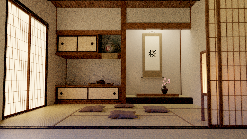
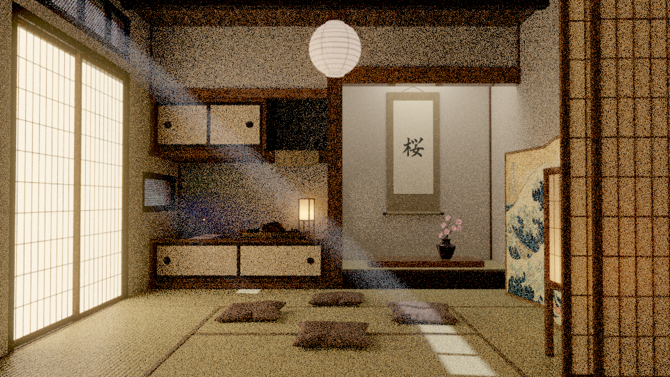
So, I have been learning about architectural visualization and I tried to by myself in this one, no guides, no full tutorials (I only followed one to do the flowers on the render)…
So, the problem is that the render seems off, first of all, when I look at separated parts of the image it looks photorealisitc, but as a whole it doesn’t look very photorealistic despite the fact that I use the Principled Shader with PBR textures (Diffuse, specular, roughness and normal map, made by me (from scratch or from a single diffuse image)) and everything has bevel so they aren’t sharp corners.
Separate renders:
The other thing is that it feels empty and boring, but when I look at the reference pictures this kind of rooms usually are so empty and they don’t look boring at all.
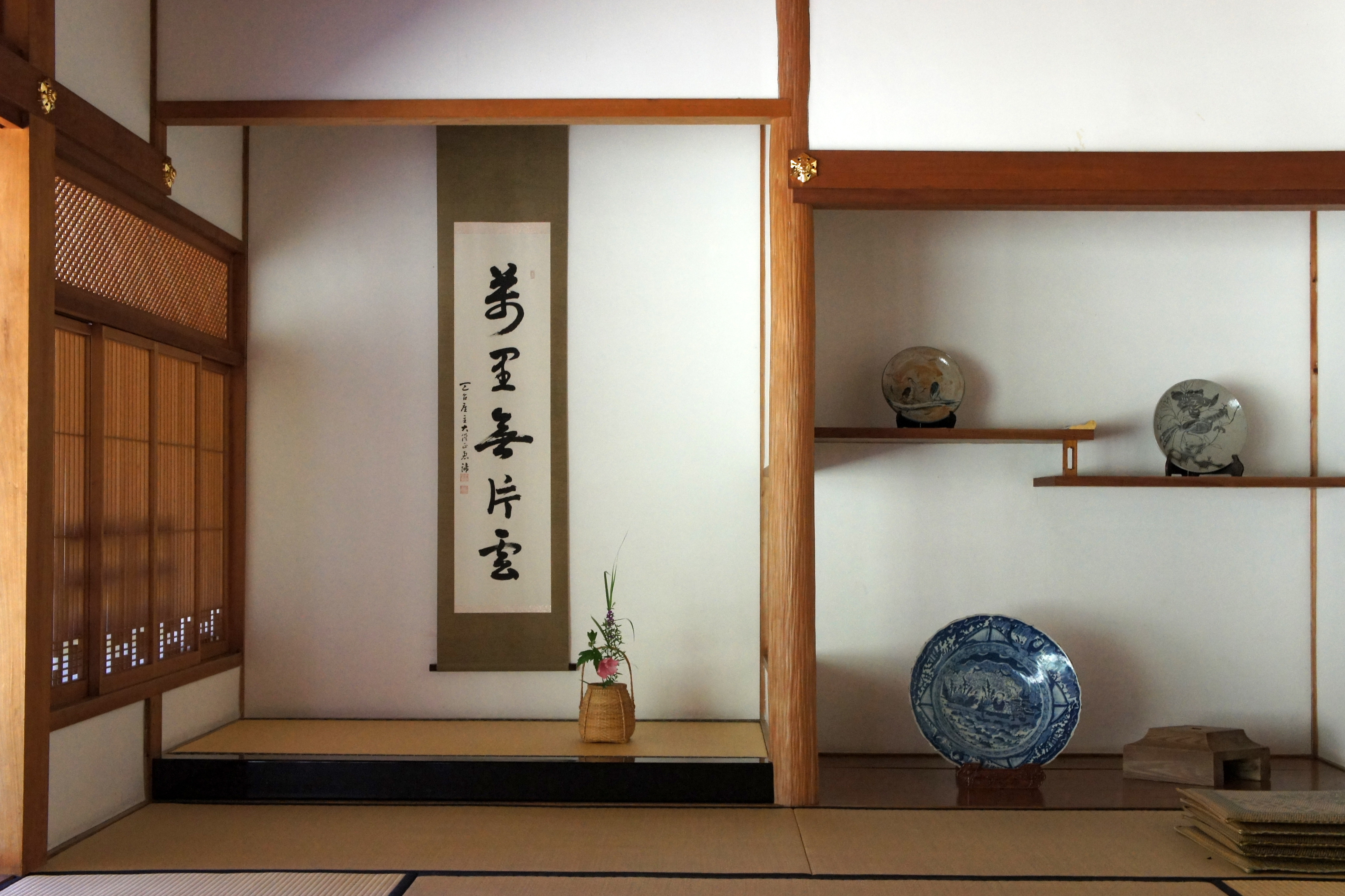
Reference picture:
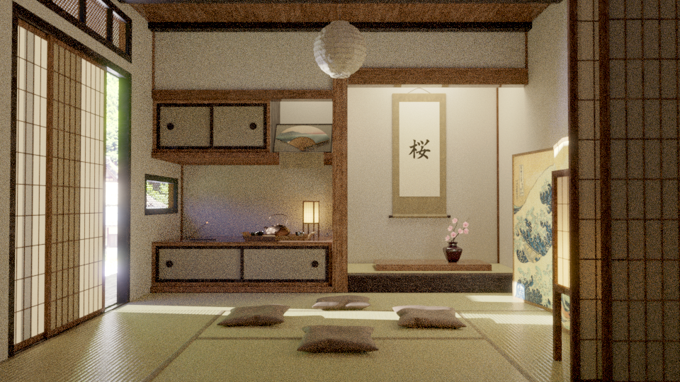
I’ve been following your suggestion, but adding volumetrics only makes the scene darker… I think it might be because there isn’t strong light sources so what I could do is to open a bit the door on the left side, but I have to think how that’s gonna affect composition. Nevertheless, your comment gave me an idea, I could use a particle sistme to add dust to the air, that could make the scene more interesing too.
Crank up the outside light. In your reference image there is more influence of it. There are more proeminent light/shadows play caused by the enviroment light.
Straighten the verticals of your image.
I would also try to move the camera up a bit. Might not work, but I would try anyway.
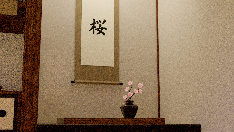
Yes that would be an option as well. Also try to work on your lightning to set the viewers focus on the interesting parts of the image like the vase and the tea pot, it works well for the banner. And I think it Filipe ist right your image is too dark overall
So following your suggestions I added volumetrics (and more windows), tried to make it lighter (I will have to add some light on the dark spot somehow), add a bit of blue on the light and added objects to make the scene fuller.
I like the render called Kannonin_Tottori. What I see there is a nice angle of incoming light that makes highlights and shadow. Whereas the latest render, I see bounced, diffuse light which makes seeing less detail. It’s like when I go somewhere in my house where there is no direct light. In such areas, if I make a picture, it looks quite dull. But when I go to a room with a windows and look for a nice angle, I start to see loads of details like bumps, structures, highlights and shadows. But actually I think it depends what the renders are for. The way it is now, it wouldn’t be bad for a (japanese) movie actually, I think…
I like also the thirds and golden triangles
I am not to sure if the fog as it is, is a good idea or not. It’s such a small, almost a bit annoying stripe.
Well, actually “Kannonin_Tottori” is not a render, is a real picture made by the artist “named” 663highland, I don’t want to steal any credits.
I use the picture to have some kind of reference (but actually I used a custom drawing by myself, so is only conceptual).
But apart from that, I get what you’re saying. I have to tweak the volumetrics, maybe crank down then a bit to soften the strip of light. But yeah, one thing I noticed was that the light was so soft that many objects didn’t have proper shadows, so what I’ll probably do is open the door, lighting the teapot spot and giving some light to the scene.
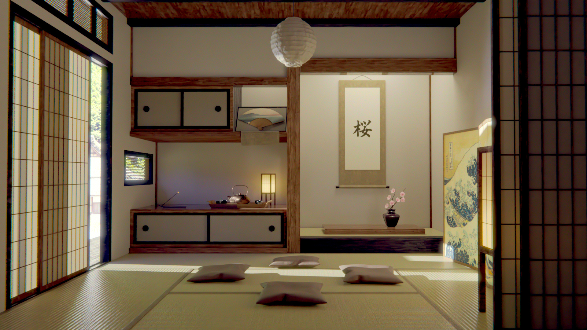
Decided to remove the volumetric ligthing, because it was very distracting. I light up a bit the scene and added a japanese fan on the empty shelve (and light it accordingly).
This will be the final setup (need to add some dust effects and render it at full size and sampling).
Thanks for all your critics, they helped me a lot.
Hello, I forgot to post my reply last week and now I see that you are done, I hope it’s OK if I post it anyway, even if my main point about moving the camera up has been mentioned.
Here we go
I can’t help with the technical part of your question, but I can give some input on composition. I would move the camera up, til the doorstep/slideline frames the bottom of the image and the upper left corner of the window meets the corner of your image. Then the things in your room will be framed by the room. I believe that makes the composition more together.
For realism, think about what holds the camera and how it is held. If the camera is hand-held put it at the right hight for it to be hold. In your reference picture the photographer is standing up. Observe the height of the one holding the camera.
If a photographer took your picture he or she would be crouching on the floor, pointing the camera slightly upwards. This technique makes the room tower over the viewer, so it feels more spacious. Do the opposite to make it feel less empty. But you might loose the epic look of the room if you move the camera up along the z axis pointing downwards too much. I think your feel of emptiness comes from the height of the camera not it’s angle. Make the door and window the frame of the picture and it will hopefully force the other elements together. If the roof gets in the way, change the angle of the camera so it points slightly downwards. I like the placement of the furniture but if you want to brainstorm a bit here are some pointers.
To quickly get a feel for different layouts of the room you can cut out all the silhouettes of your objects and experiment with their arrangement by moving them about. Just keep them at the same depth as in the model, or their scale will be off. Then you won’t have to change your model til you know what you are going for. To train your feel for composition rip out shapes and place them on a background. Pick an emotion too convey and arrange the shapes with the goal of expressing that feeling. Afterwards do the same but using composition guides printed on the background paper. Do this exercise with the cut out furniture in your room and it could help you get some ideas.
Remember to have areas of many details and areas of few details. This can be done by varying the size of the details, like how the window and doorway are big details, the cupboards, plant and painting medium details and the things on the cupboards are small details. To convey feelings by positioning shapes about, use differences like cramped vs airy or structural vs disorganized, dark vs light etc.
I just read it now (14 days later). So, for this project I don’t think I’ll change things but definetly gonna follow your tips for the future ones, I really really struggle with composition, so is nice to get those tips and critiques.
Hy I really like your project and in same time woke in me the appetite of this culture and it’s simplicity. (driven by history and natural causes)
You did some awesome job by yourself, but a bit of teaching (tutorials on youtube or books) don’t make a Samurai less of a Samurai
Since you said to Cinnober that is too late for this project, I will say my thoughts also, because in a few years maybe you re-visit. I will not repeat what said by others (some are not that dealbreakers) but here are a few:
If you use wood, make it look good. A craftmanship always gives it’s soul to wood because he cares about the tree, and in his work, he searches to give long life to the tree;
White and light brown. Paper and wood. Ceramics and stone. There is no need for a blue light on a table (or is it an artifact of Cycles?). There is no need to put a lamp in a corner in full daylight (why waste?). This collection of objects on the left side of the room looks like a Japanese room as shown to tourists in parks in Europe. Too much, too many. Simplify.
Make the mood less muddy and more white and pure. It is more pleasing to the eye the white in this context. At least when compared to your reference image.
(you can skip the following: the 3D artist is less of an artist than a painter, so he says, because we cheat, so he says. I say that when you touch a sensitive subject such as Japan, there is beauty and story in everything.
So in your reference render, wood is used, not too much but enough to enrich the story -> check the windows in his image and the details. Also the clarity of each ring (the age of wood).
So to better show Japan you need to show less and more at the same time)
Hope it helps and I hope you show us in some years your new take on the same subject!
No, it isn’t an artifact, is the light coming through the window, so is my mistake, not blender’s or cycle’s one.
That’s actually a really good critique now that I look back on it. While I created all the textures I have to admit that I didn’t have the enough patience with the wood texture (unlike the tatami one, that I spend a lot of time to make it like that). I definetly need to improve my substance texturing skills (I’m on it, by the way).
I’m reading “Japanese Architecture: An Exploration of Elements and Forms” by Mira Locher but, at least from now, I didn’t reado about those details about wood that you talk about in your comment, so thanks for that.
My main weakness in this kind of projects indeed, sort of fallin on the stereotype.
I think that you could call the original image “very nice.” I don’t happen to agree with the OP’s self-criticisms of it. If you want to convey "Japanese room tranquility," the smooth, even lighting “that seems to come from nowhere” definitely does this. Adding light beams, slightly opening the sliding door, and so forth, adds interest. (The “reference photos” in post #1, with their very odd and harsh off-screen lighting, did not look good to me.)
The open doorway in the last picture immediately draws my eye to “the brightest thing in the scene,” which is now outdoors. You’ve just pulled my eye out of the scene. The idea of adding a small window as an excuse for squirting more light into the area where the desk-lamp sits is probably a good one, but I’m not sure that the beam of light cast across the floor actually works so well.