I made an intro and outtro to use for myself with a design inspired by science fiction and film. Thanks to Gleb Alexandrov for the wormhole technique and freesound for the sound fx.
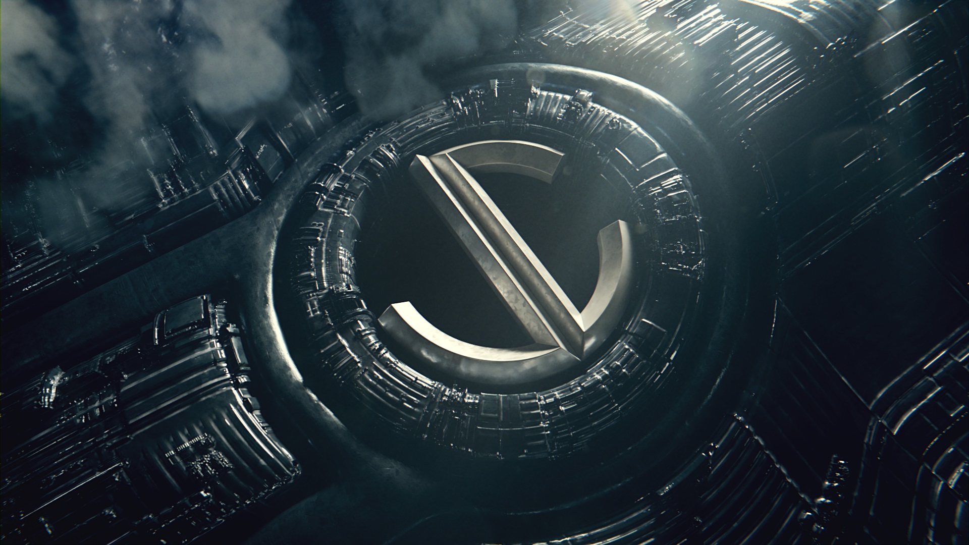

I made an intro and outtro to use for myself with a design inspired by science fiction and film. Thanks to Gleb Alexandrov for the wormhole technique and freesound for the sound fx.
Looks cool - the thing that I noticed though was the J looked bigger then the C. Specifically the curve part of the J (4 second mark). It’s not thicker - but it sorta looks like it. Maybe if the J only went up the same distance as the lower part of the C it would look more balanced.
Just my opinion of course.
oh yeah it’s kind of an illusion but theyre both correct and the same size
it appears bigger, that’s what matters (in design you should never disregard illusions, but use them to your advantage)
would help if you’d slanted/beveled the endings of letters so they conform to corners and appear uniform from different POVs