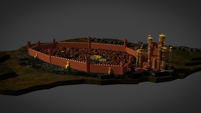
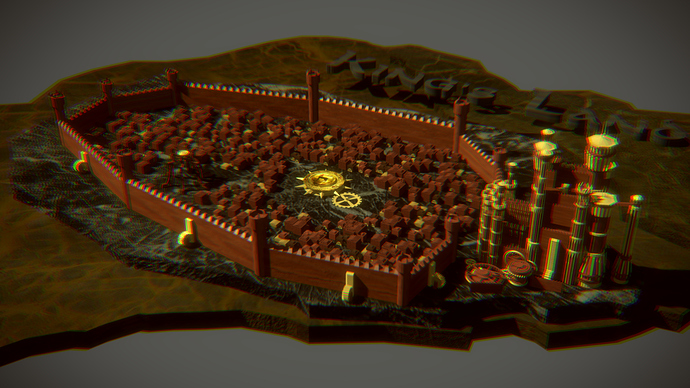
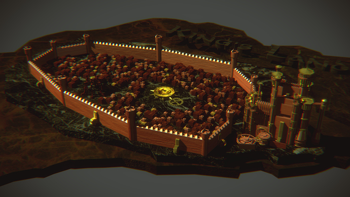
So, I had created a King’s Landing 3D Model some moths ago, but I wanted to animate it as well. So, I began working on it, making it more detailed, animated it(it was actually easier than I thought!) and finally texture it(I suck at texturing…) in Blender Internal, because, for my PC specs, it was the only viable option for an animation.
So, here’s the final result:
Yea, it doesn’t look like a video, does it XD? Well, the video will take some time, but I wanted some feedback about the look of it, suggestions for improving it and etc.
Well, I really hoped for some help… 
As far as I can tell the modelling looks fine, but the texturing is really throwing the whole image off. The textures don’t fit the models, and they are way too stretched.
perhaps u should add a few more pics showing different angles.
from this however,
the model looks nice. and u nailed the colors right.
and like Jonathan L pointed out, the textures are the problem.
and one last thing, i’m not sure if it’s water or snow, but the background needs a bit of work too
Well, the textures on the walls do seem streched, but for the plates Ihad no idea what to put, so I used some marble textures that I had somewhere on my hard disk. And the background it’s just a sky…
I’ll try to fix the textures…
BTW, oh shit, you can’t see it, but I wrote King’s Landing with a ‘t’ XD
Anyway thanks for your comments, keep it up, I want to make it better.
And I probably should tell you that I plan to sell it as well (you really don’t want to know my PC specs, I’m dying for a new one)…
Here’s an update, fixed some issues, but still, the only thing that I think destroys the image is the plates…
I don’t know if you’ve seen the original intro, but I find it damn difficult to recreate the original materials!
after watching the original again, i think i know what’s off about the textures. the contrast is way way too much. try to make the color variation a lot less. and pls change the sky  perhaps u should just model the rest of the land. at least enough to fill up the view
I think that you’re absolutely right: it’s the contrast! I must be stupid for not seeing it! I’ll try to even the colours…
On the other hand, the only thing I can do for the sky is to darken it, the whole Esos in a inverted globe will be too difficult for both me and my PC 
Trying to fix the colours, what about this:
Not perfect yet, but it seems better to me…
The walls and such is too bright, if you look closely on the intro, you clearly see that every color is pretty dark, that even includes the ice and snow at the wall, that can easily be fixed with compositing tho.
Looking pretty good so far!
Fixed colours a bit, a lot of compositing as well:
Growing stronger… (Game of Thrones joke)
Any compositing ideas?
Too much blur, it became kind of irritating to look at, also it seems it went brighter rather then darker.
Well, I actually find the intro quite bright, but in a different way, like if there’s a thin atmosphere…
The red of the tower is not red but more of an orange colour, a bit disaturrated.
There’s work to do!
Well, I really like this one.
It’s not exactly the same with the real thing, but I kind of like the look of it…
I think that I’ve done everything that I could. What do you think? Is there anything else to fix?
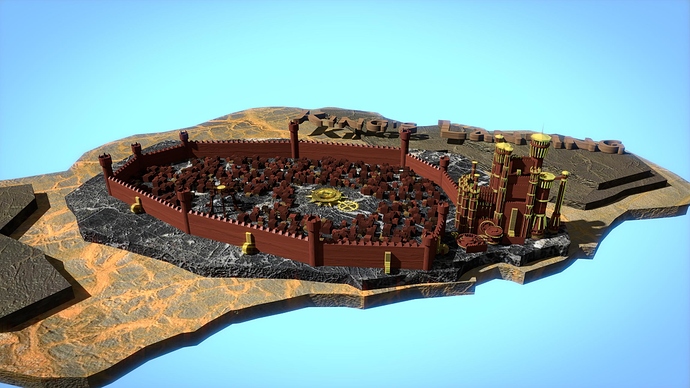

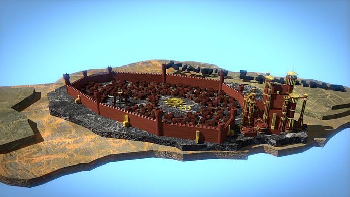
 perhaps u should just model the rest of the land. at least enough to fill up the view