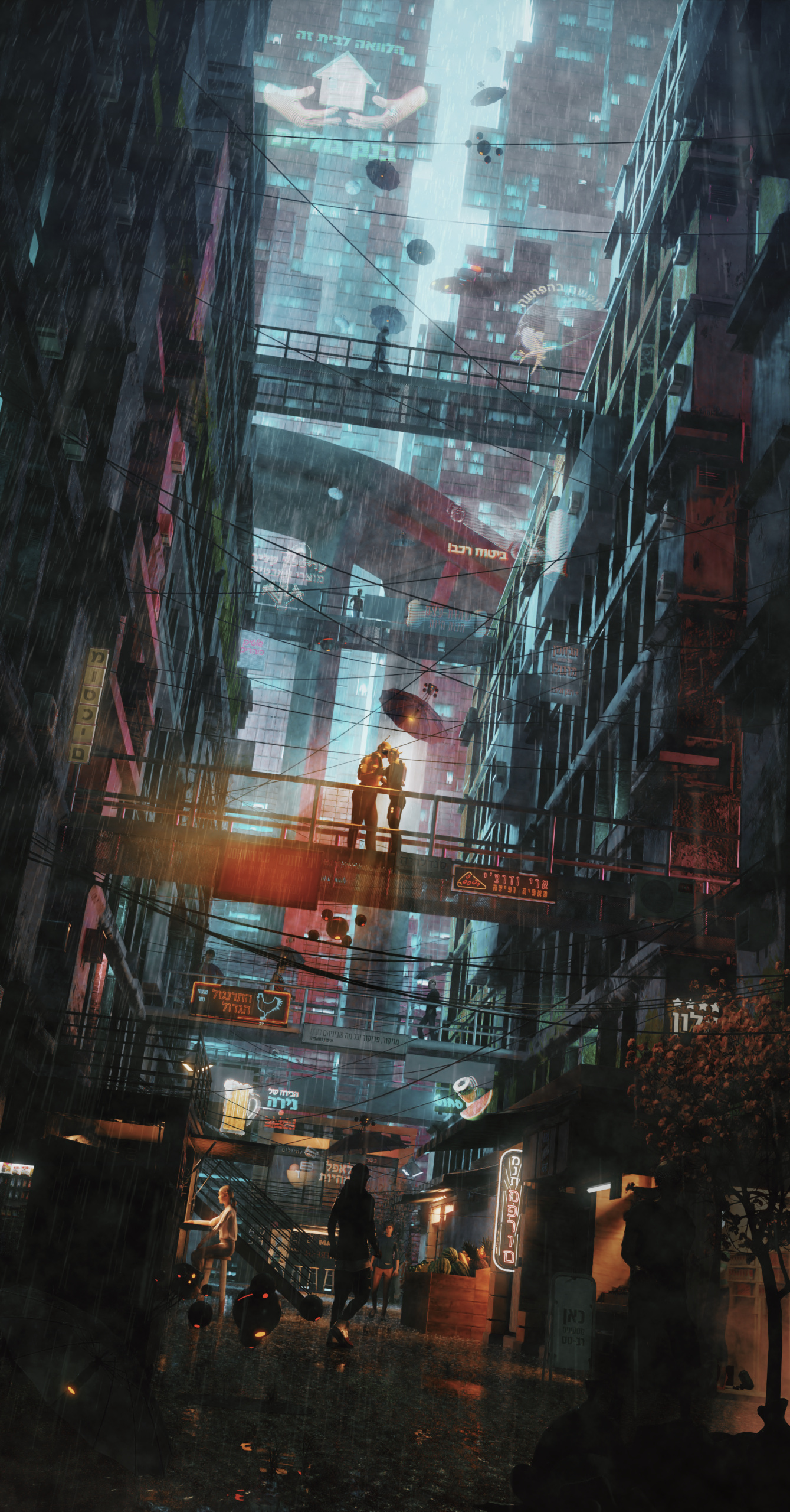
Hello guys! Been trying to create yet another frame with some Akira/Blade runner vibes, but with a different language from Asian languages. I’m a bit exhausted and thinking to conclude this.
So - please hit me with some constructive critics before that!
Overall, not bad in execution. Hebrew(?) writing for all signage was an interesting touch. One reason you haven’t had many responses may be the overall colours. It’s the same blue/purple shading into orange palette as all the other cyberpunk genre works out there. Also, there really aren’t any significant foreground / focus elements in the piece; everything seems to be off in the middle distance.
It’s generally a good ide to have a big, close in foreground element, which tells a story, or illustrate some kind of action in the piece, as a main focus, and then your mid and back grounds.
Colour palette being distictive is important too.
There is such a glut of art out there at the moment, especially in certain genre, that being visually distictive enough to get noticed becomes more important than ever. It can be frustratingly difficult at times. I hope the critique helps! =)
In addition to what Shinseiko said, you have to take a look at your values.
You must use the brightness to guide the eye better. Your focal point should be the brightest area on the image, as the eye is always drawn towards the brighter elements.
I see you did try to get some focus via the flying thingy with the light, but its a too small, not causing the visual impact you try to get.
I would suggest to add a more heavy volume into the scene and use it to weaken the contrast behind the bridge. With some scattering light through this volume towards the camera, you can try to isolate the bridge much better.
Try to get rid of the bright shop in the bottom right, high contrast more towards the center of attention, the further away, the less contrast should be used.
These are of course just my personal thoughts on the matter, and the guidelines i think might work well here.
I think you did very well with the basics of the scene. But now it’s about creating the best impact and mood with it.
I agree with the comments before this one.
But I think the most important would be a good depth of field. Now it looks like everything is in focus, which gives it an artificial, clinical feel. Depth of field, like lighting, helps a lot to guide the eye - and simply makes pictures look more real.
Additionally the picture looks too clean to me. (Eevee render?) Cyberpunk can and probably even should be a bit ‘gritty’, in my view. So if you would render this in cycles, I would not mind to see a bit of grain.
And my last comment is about the position of the kissing couple. For me their bodies are too far apart and especially her body feels too stiff. Yep, it could be a first, shy kiss. But even then she should ‘feel’ it more. As we are so far away from them, it’s their bodies, which have to express their feelings. And feeling some more love and passion here would definitely help the overall mood of the picture.
I don’t know anything about this genre, but the overall execution of it… i don’t see anything wrong with it. Environments are something I’ve never attempted and am envious of your skill level here.
This is true… unless you’re trying to draw attention to that particular shop, it is drawing too much attention with the different lighting from the rest of the scene.
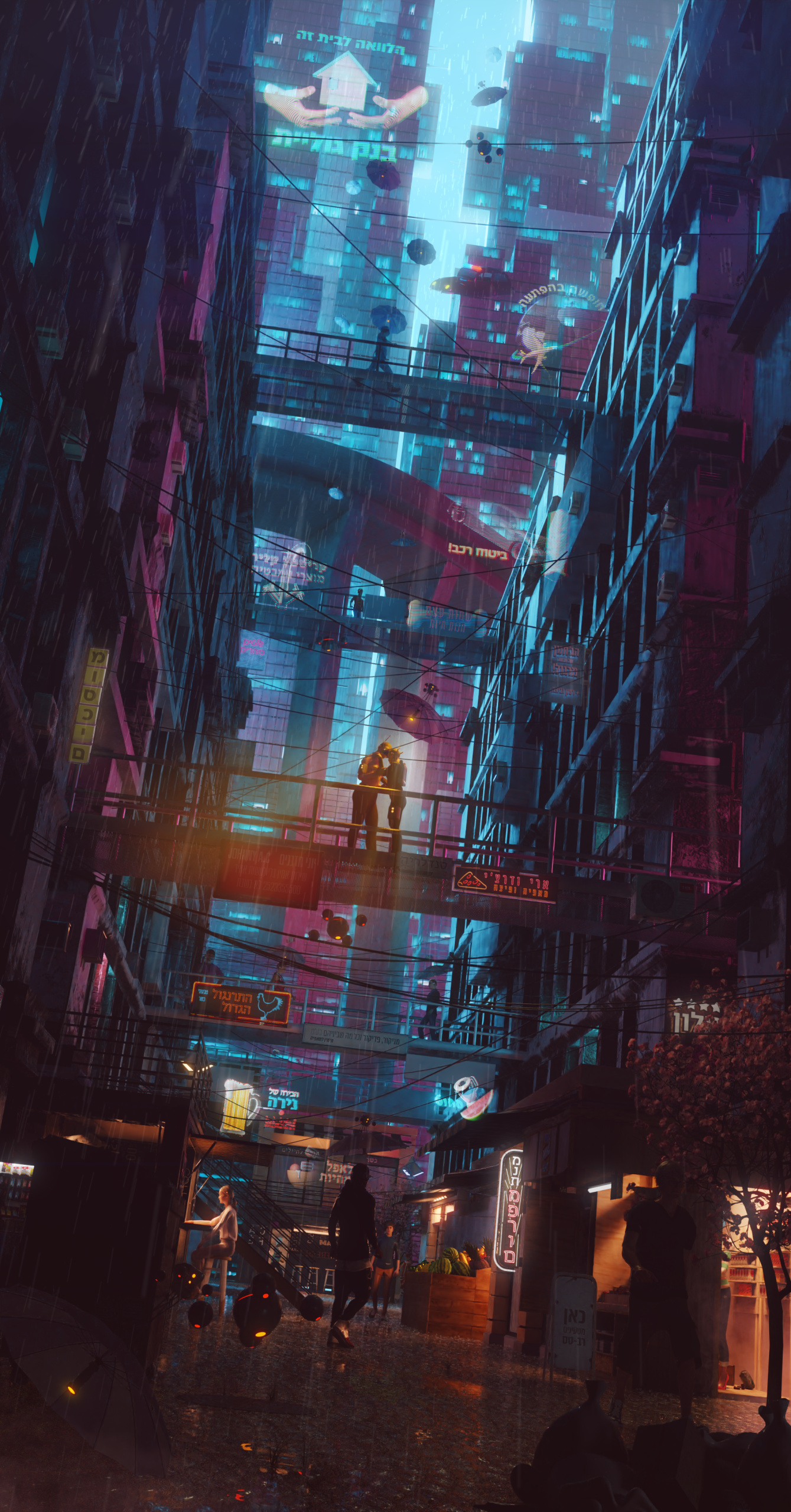
Update: More contrast to the center, a bit more dirt and different colors, dimmed the lights of the shop in the right.
Don’t know if I’m going to change the distance between the couple because I want to have a distinctive silhouette of two people… @JollyJumper@Linolafett@Shinseiko@bstaub
Certainly an improvement! I think the composition’s still a bit off, in that If you want the couple to be the focus of the piece, they need to occupy a larger chunk of the image. I echo the other poster’s comments about the posture and proximity of the couple to one another. THey will still be a distinct shape of two people, noi worries about that! At a glance, this looks less like a kiss, and more like some kind of illicit transaction. Drugs? Nanos? Simchips?
I would suggest zooming the camera in on the couple. General rule of thumb, foreground is for the primary focus of your piece. THe shadowy figure in the street below is actually larger in frame, thus making the couple more of a “whatever” background element.
Also, if you zoom in on the couple, move the camera so that the couple is somewhat off of the center of the image. THere are some awesome tutorials on composition out there, (as opposed to compositing, a wholly different beast) I would recommend looking them up and reading several of them. It’s better, in my opinion anyway, to get several takes on a subject like composition, compare ideas, and draw / generate your own conclusions.
Good improvement though, and the change in colour palette works well! Keep up the good work, and always seek to improve!