By “controls”, do you mean… "all the UI elements that your add-on uses in the KIT OPS tab, don’t you?
It’s true that sometimes, some add-ons contain so many options that their own tab (once the drop-down menu is expanded) takes a lot of vertical space.
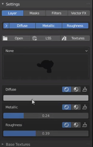
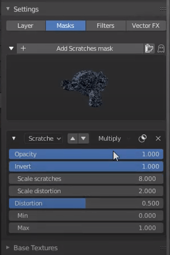
As a workaround, some addons split their options (buttons, sliders…) into “horizontal tabs”:
Example with Layer Painter 1.2:
IMO, it’s unlikely that a user will move all his/her activated addons into the same tab with all drop-down menus expanded at the same time…
And if the other drop-down menus (for the other addons) are collapsed, it is visually fine.
I also hope that Blender developers will allow more customizability for the N panel (letting user change the location of tabs, turn tabs labels into icons or displaying a second column of tabs), but I don’t see that coming anytime soon.
I agree that this option is not the ultimate solution to this N panel clutter issue but since there is atm no other workaround in Blender… it would still be (imo) a nice option to have in addons.

