First time I’ve posted to the finished thread, as this is the first image I am essentially happy with.
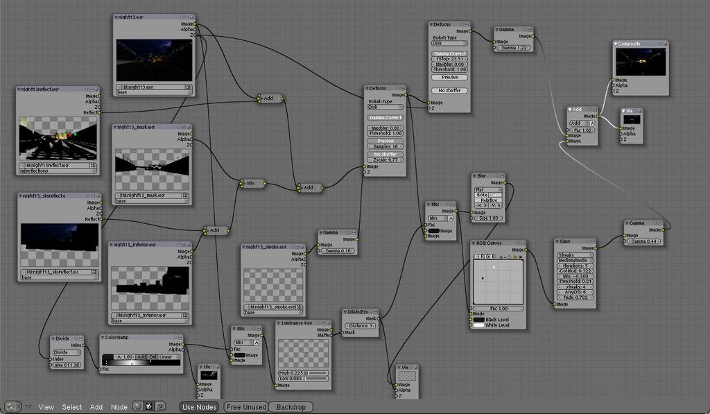
Result is from a blend file to produce the original exr’s, then a second blend file to composite the results. I found that having both in the same file kept crashing blender.
Opinions or questions?
Thanks to everyone who made suggestions and comments.
Let me be the first to say that, that looks brilliant!
Looks very realistic and love the way the light bounces off the tracks.
One thing though (probably just me) but that little spot where the blueish cloud is in the second image looks a little off-putting. The contrast between that blue cloud and the orange and yellow scene clashes a little too much. Maybe try changing the cloud colour to something more redish like on a sunny evening, I just think the clours would flow better. (Maybe remove it and replace it with a dim lighted sky instead of the jet black or perhaps replace it with stars, I dont know…)
WAAAAAAAAAAYYYY too dark… surly the moon lights things up every night? or ambient deflections of the surrounding city’s lights? i’d add a very feint hemi or some low AO
To the last couple pf posters who think the image is too dark, I’d like to suggest a monitor check. You should be able to see the rails, the sleepers, and the ballast as three separate things. If you can’t, check:
At the foot of the page is a monitor check pattern.
LCD monitors in particular do not handle high ambient light levels well. They have little contrast ratio and any background light makes dark images impossible to view.
you’re right about gamma problems, but i still kind of disagree.
i couldn’t see the details either on my macbook (1st gen). not with the default color profile (applied to the lcd) nor with the one i created with a colorimeter (x-rite eye one).
they became slightly visible after setting some strange profiles or assigning sRGB to the jpeg file in photoshop.
the thing is your darkest dark is 0/0/0 (R/G/B) and the details in the front (railtracks) have a maximum lightness of about 3/3/3. that is really not very much and it’s very likely that people won’t be able to see those details.
here’s what i would do:
assign color profiles to images to avoid wrong assumptions by viewers.
accept the fact that most people watch your stuff with uncalibrated, inferior LCDs and compromise your colorcorrection in a way it looks decent on most displays.
I have a calibrated 2.2 gamma monitor, but my image viewer is calibrated to 1.8, so I have corrected the image to look like a 1.8 on a 2.2 monitor. New versions uploaded to the top of the thread
LCD monitors in particular do not handle high ambient light levels well. They have little contrast ratio and any background light makes dark images impossible to view.
rubbish, that argument is.
I viewed the image from 2 different screens. The first, a 21 inch LCD monitor, properly calibrated (more or less) with lots of ambient light.
The image was reasonable, but only because the ambient light and poor black range of lcd’s made the blacks brighter.
The second screen, an AMOLED (on my phone) was way way way dark.
AMOLEDs have incredible contrast and blacks.
I couldn’t make out anything in the shadows.
It looked stunning, and certainly like something straight out of a camera, but I would definitely prefer to see some details in the shadows, like you would in person.
All that said, it’s good, although I would like to see a 1920x1080 version of the cropped one. That one has a more pleasing composition, IMHO.
LCDs do have a worse response to both high and low light levels, both ambient and within the image themselves. I work in CCTV and we still try to use CRT monitors, because at night, or in bad lighting conditions, images degrade far more rapidly on LCDs, making it hard to distinguish images for the operators. They cannot handle difficult images, not because the contrast ratio itself is poor, (they may be 3000:1 or more) but because they usually have a lmited number of grayscale steps. Correctly calibrated and operated in ideal conditions, they can be very good, but as soon as conditions are not perfect, or if the image itself has been processed digitally, the combination of conversions tends to mash several shades into a single one, making detail vanish unless it is high contrast.
Glad you liked it though. If it looked like out of a camera, I succeeded!
I know that Travellingmatt knows how I feel about this pic as I commented on it in the focused critique section. It is certainly not too dark if you want a realistic pic. As a train driver I can fully appreciate this piece compared to the limitations of my point and shoot camera. I can’t photograph scenes like this but see them every day when on late shifts. I far prefer the zoomed out wide view because we have a wide angle of view in real life. It just looks more “right” to me. Also, if you assume the pic to be a photo taken from in the can of a train going the other way, the flares are right too. God knows what they try to clean the windows with on our trains but this is what it really looks like from my experience.
As an art piece it may be considered a bit dark but on my desktop, laptop and netbook it is OK to me comparing it with reality.

