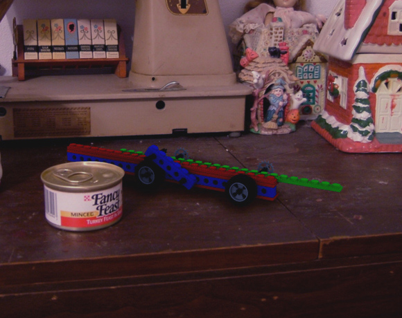
shrug my first attempt to combine a render with a photo. Thoughts?
Attachments
shrug my first attempt to combine a render with a photo. Thoughts?
Looks good, but i think the lego looks too bright for the scene. Creates a cartoonish sort of feel.
JCTiger
too bright? I’d say too dark. I dunno something with the lighting is not right.
But it’s still a good job. 
If it was the can that was rendered, i would say it was great 
But those lego could have better lighting. Than again for a first time trying a photocomposition its nice.
The color of the lego bricks is imho to strong.
Otherwise it looks good.
Nice
I think your AO samples are too low, put it up to 16.
The shadows in the photo and the shadows beneath the legos are not symetrical. The shadows should be going away at a angle, not from the top.
maybe if you put down the color saturation of the lego… it can be done whit out a change the blend file.
The colors of the Legos are too saturated, in comparison to the rest of the scene.
The shadow of the Legos seem like the light source is from the top, while the rest of the scene has a light source from the “front”, or high behind the camera from the left.
The shadow is too BLACK looking and too diffused. Try to match the photo. Use a surface that is close in color with the photo.
You need to use an area lamp with a smaller source. However, keep the samples the same (at least 4).
Lego is plast (is it called that in english) so you should stick with the default spec value.
It’s called plastic.
I edited the image just because I was bored:
So maybe in your render you can make it look kind of like this, except shinier.
Yes, the saturation level of the legos is too high compared to the scene.
Thanks for the comments everyone.
Played around with the settings a bit. Added lamps at the same positions as light sources in the room and some fake objects in the .blend to obscure ambient light. Changed surface color. Desaturated in photoshop due to overwhelming opinion. Might be a tad dark, but… 2nd try
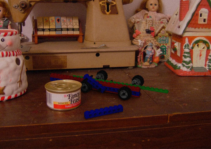
The first version was too bright and saturated, but now it’s too dark. I think it still looks pretty good, just needs a little more tweaking.
I agree, either render is very good, but what I think happened is that the saturation is still the same. The brightness of the first one is good, however just the color needs turned down.
AAAAK… listening to to many people can drive you mad!
… so listen to me 8)
First shorten you shadows in AO to get a better match with the scene.
Second you need to have a light source at about 7:00 from the camera postion (given that camera angle is facing 12:00). That light source should be tied in to AO using sub, and spectral should be drawn out to match. Materials, turn down hardness, but not all the way… just match it out to the lighting in the room. The can is producing the spec you want. Try to match it to that…
It’s work, but not impossible.