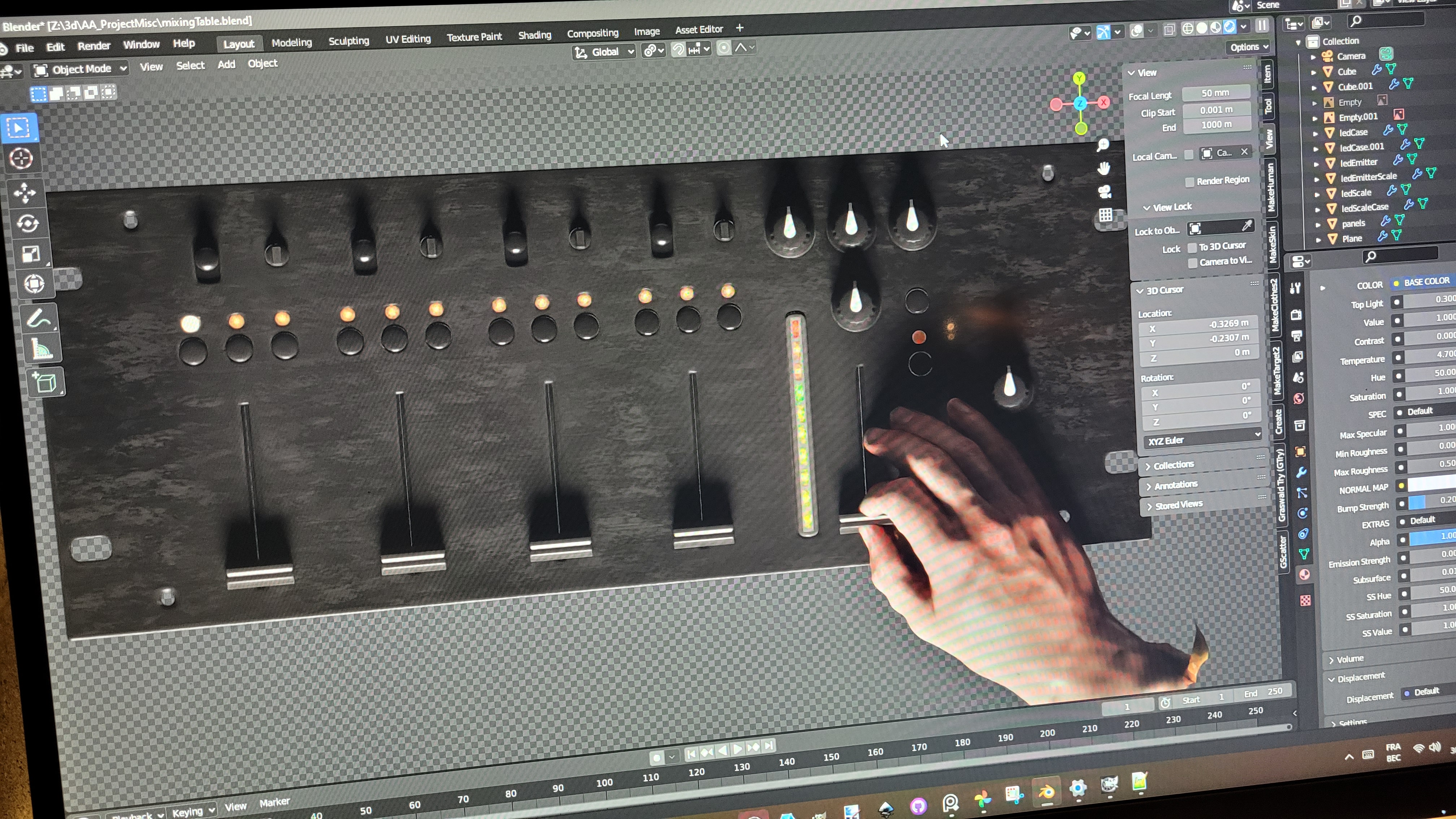
That’s a piece which spectularly failed as an art piece, but maybe you guys here will like the technical aspect of it. I think I did a clean job here, and I modeled everything for once.
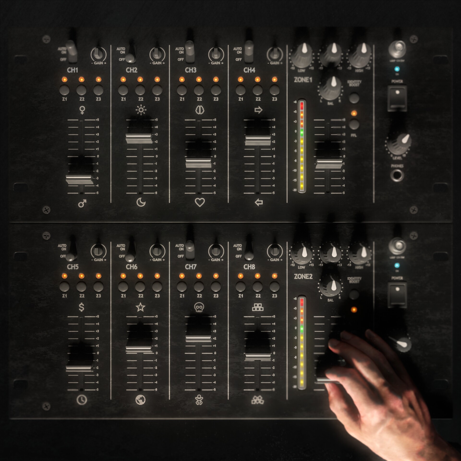
If you look closely at the symbols of the potentiometers, you may grasp the title and the meaning of the piece. Please do, that’d be great! It was also a hard-learnt lesson in focusing attention throughout composition.
Meaning as spoiler
The symbols at the end of every cursor’s course represents opposite personnality traits, choices, ways to see the world. The ones on the top left are the male and female genders, then you have night and day, brain and heart, etc.
It aims to convey my belief that life is very much not black and white, and everything is subtle, rather complicated and nuanced. Veyr much “in between”. And if one wants to be more that, one should accept to be less this.
That’s my very hand, photoscanned ![]()
And a little progress shot, before diving into inkscape.