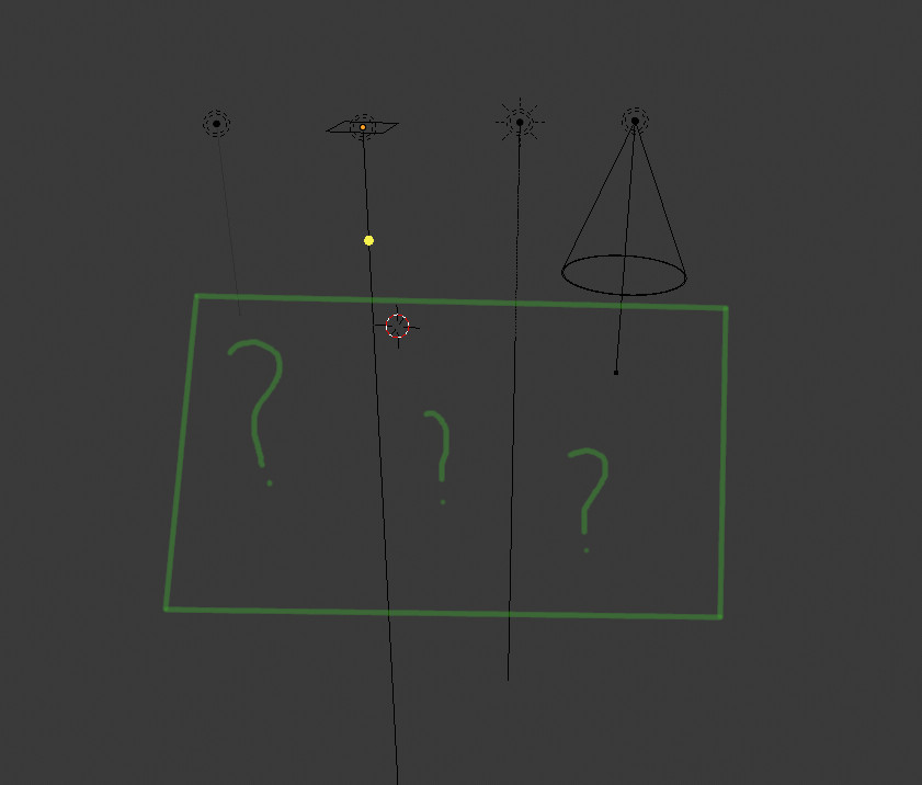
The very long line is probably useful for people doing landscape sized projects. So I just scale them down to about a tenth to better match my interior projects. Still, I think these kind of visual representations should follow a global scale set in the gizmo dropdown. Not to scale the lamps sizes - because size matters - only their direction indicator. Similarly, camera graphic could follow the same size, except here the size doesn’t matter.
Also, I’m not quite happy with how I have to deal with lights, but I’ve come up with a workaround that may seem obscure by some (most?). I tend to use a bunch of IES point lamps with mesh as well as material based geo emitters - and I have several in several rooms that I need to control with more ease than is currently allowed.
So I’ve made it so that all lights are driven using node groups, and all these node groups are present in the world shader. If I need to turn off a spotlight, I select the lamp shader group for that room and mute it, then select the spotlight mesh shader and mutes its emission shader (fixture/glass etc remains). I can also have sun settings in there, as well as obviously sky shader.
What I still have on object level is the displays and monitors we use. These are quite heavy materials and they’re not as many as the lighting fixtures for a project.
Of course you need to manage those groups properly, requiring some discipline. It really helps having things organised like this for complex interior projects.
Also, I’m curious, are IES lights correct wrt size? Or should they have a different parameter for shadow. To get the correct patters I have to use size 0, but that creates ultra sharp shadows. I’m no expert, but I feel this could be improved?
A proper light lister could be useful. But how lamps vs emission geo work together should be improved first.