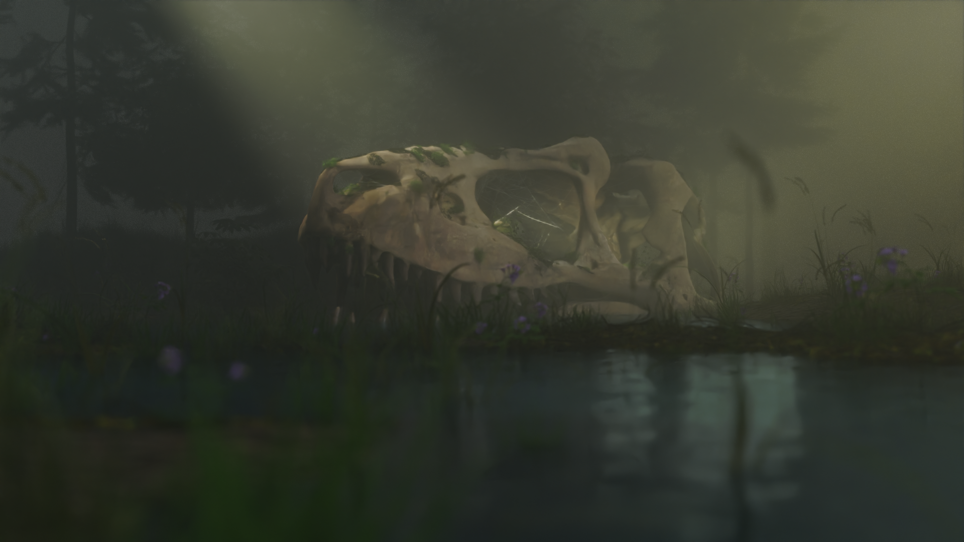
Hey there,
This is a project im working on
and I wanted to hear some opinions and tips about the lighting and compositing
with comp (in Blender)
(without comp)
Hey there,
This is a project im working on
and I wanted to hear some opinions and tips about the lighting and compositing
with comp (in Blender)
(without comp)
I recently found a nice tutorial about lighting and composition. Maybe you can take a look at it. https://youtu.be/jCLeuK0L-Tw
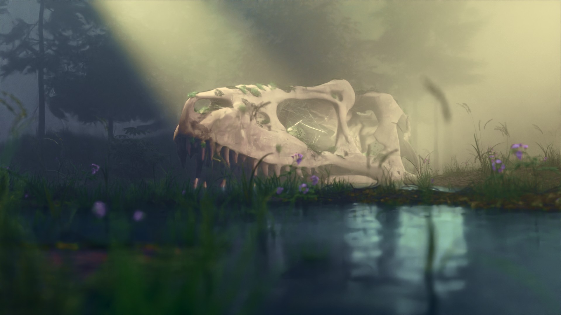
I overall like what you have done with your compositing. I would have used a little bit more contrast, but that might just be the difference between our monitors.
For the lighting, I would like to point out that the most vivid colors are all in the blurry foreground area, attracting lots of attention there. What if you tried putting that foreground area in shadow? The plants would turn into interesting silouhettes and the water would become dominated by reflection rather than that vivid color. I am not sure if it would work, but I would try it.
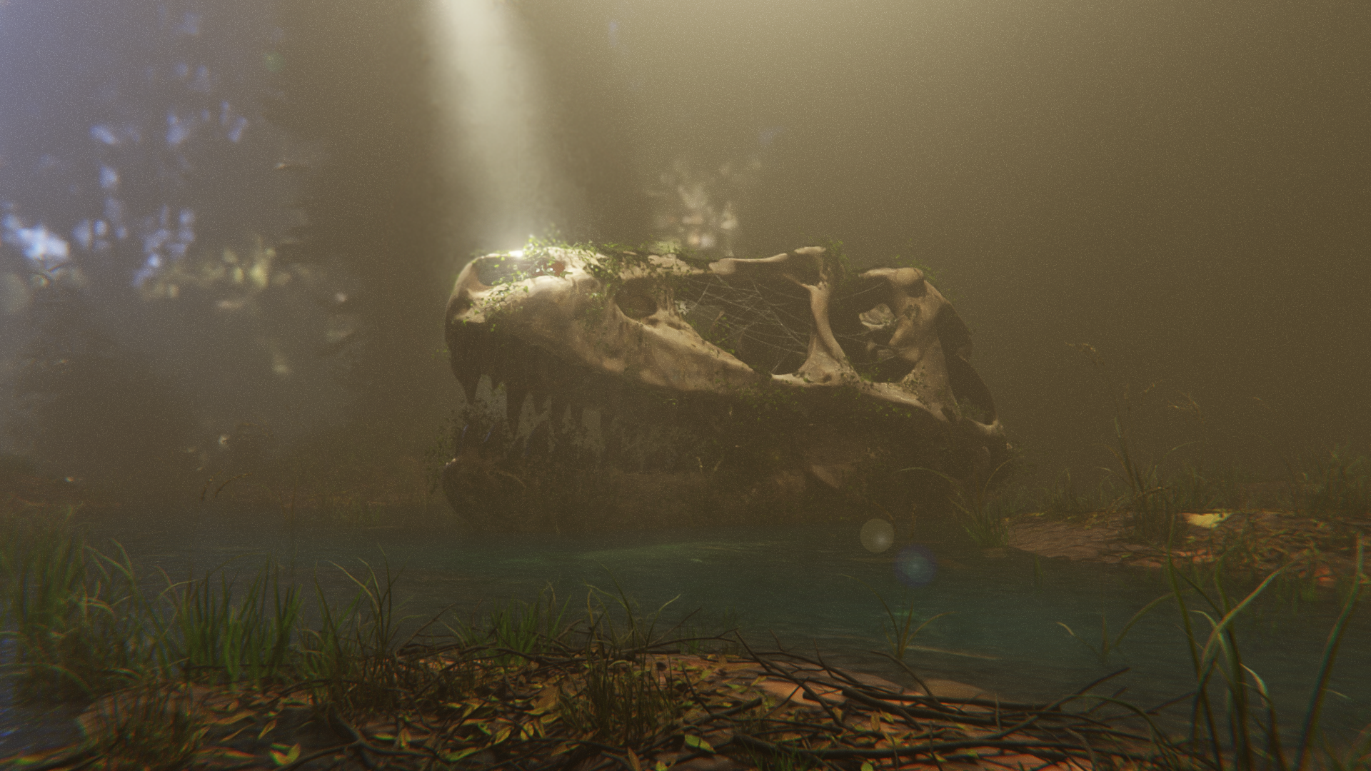
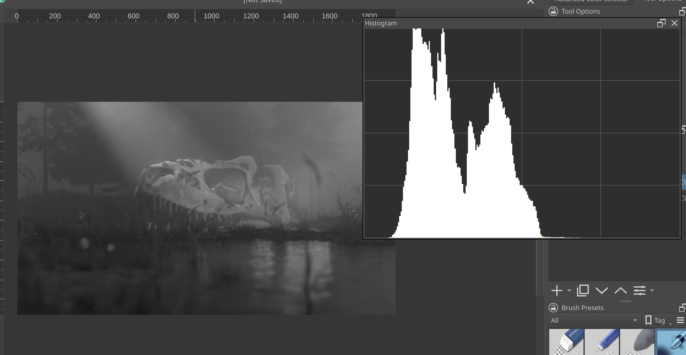
My advice for improving it is to work on the contrast of the image. Look at the desaturated image and the histogram here.
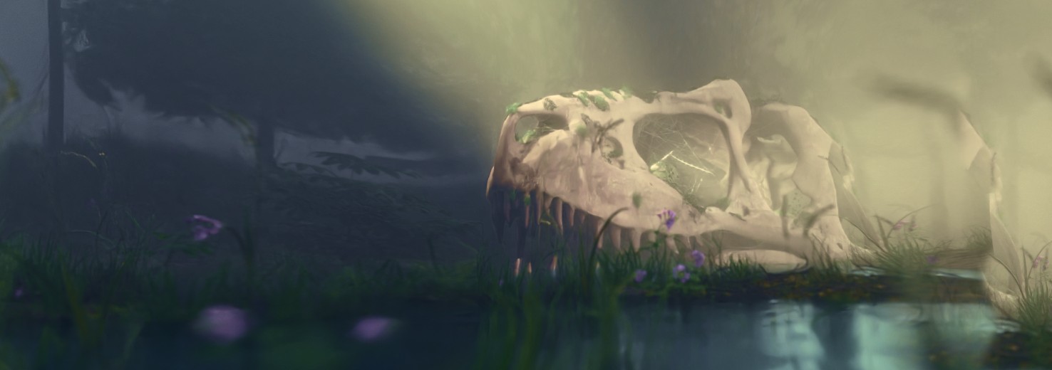
Same picture with a bit more contrast and saturation.
I think you could improve the composition of the image by changing the camera up a bit:
In particular, I don’t think you need such a wide area of water in the foreground. It takes up a third of the image but it doesn’t really do anything for the skull which is the focus.
You can also move the skull out of the center if you want. The “rule-of-thirds” is kinda basic but it’s also almost always a good idea and I think it helps you here. Specifically, when I have a composition with something that has eyes, I tend to place the bounds of the image so that there is more space in front of the character. If you crop a picture so that a character is looking out of the frame it can have a claustrophobic effect. So I put the skull on the right so that it’s facing into the picture-plane.
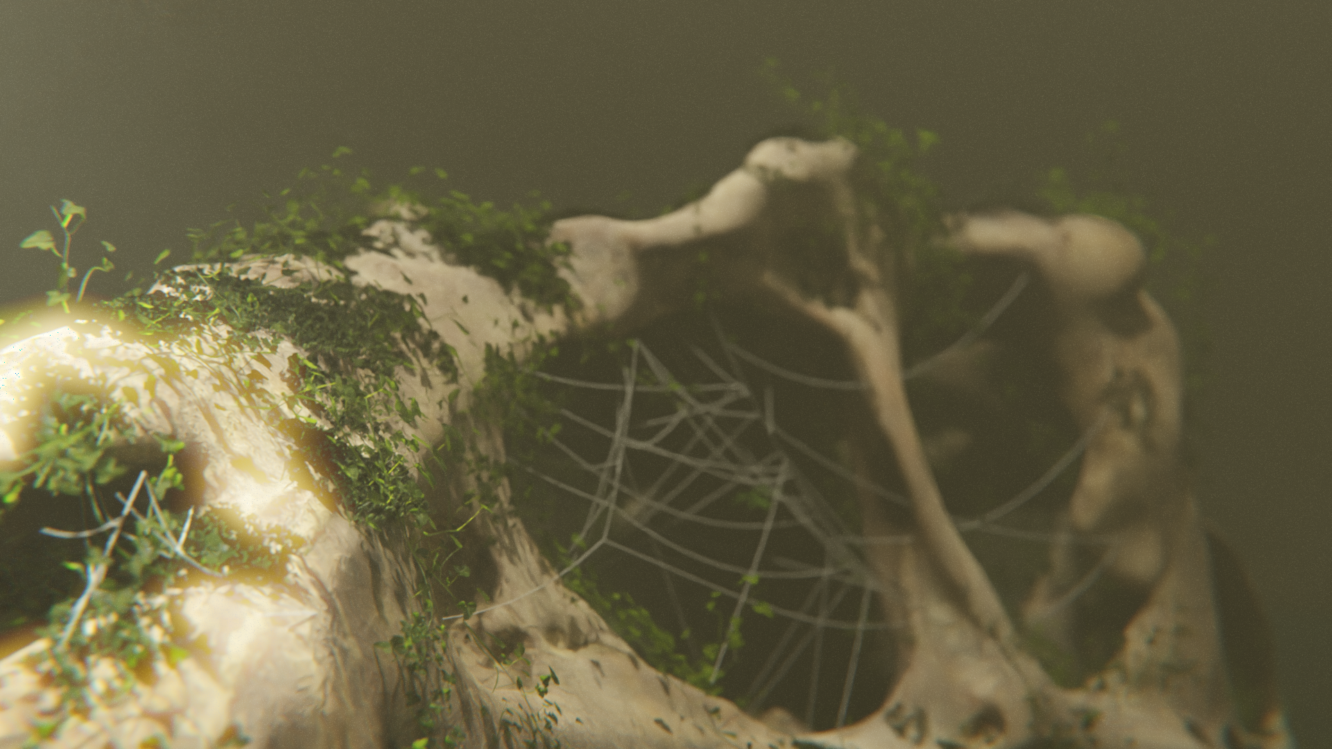
Basically, as far as camera and compositing are concerned, you can take this a lot a lot further by trying a bunch of different things. You can also try placing small lights to add highlights to things and overall improve the contrast of the image. Take the black-and-white image, paint some bright spots and see what looks good for highlights – that’s where you want to place the little lights. Shadow cards (“gobo”) may be a good idea, too.
All of that goes to show one very important thing - which is that the objects in the scene don’t need to be changed at all, The models and textures are alrady really good. The overall atmosphere works. The sunbeam is nice, the moody, dark swamp feel is nice, the depth of field is great. Even the overall “flat” feeeling caused by the fog is potentially very good if you put stuff in the right place and grade the colors well.
One final nit-pick. The image is just plain grey behind the trees in the background. That makes it much more flat than it should be. You should put an image in behind that (this is called a “matte painting” and it’s commonly used in film to make stages look a lot bigger than they are. The Wizard of Oz is a good example because they used them extensively on a really tiny stage, so they’re very prominent, though not hidden well.).
The only thing I would say after all that is that playing with the image in Krita or some other image editor is a good way to find things you can do. Add a little highlight on the grass here, draw a sillhouette of a character there, maybe a pool of light in shadow created by a lantern deep in the fog… who knows? Trying stuff out is how you find out if you’re leaving anything on the table.
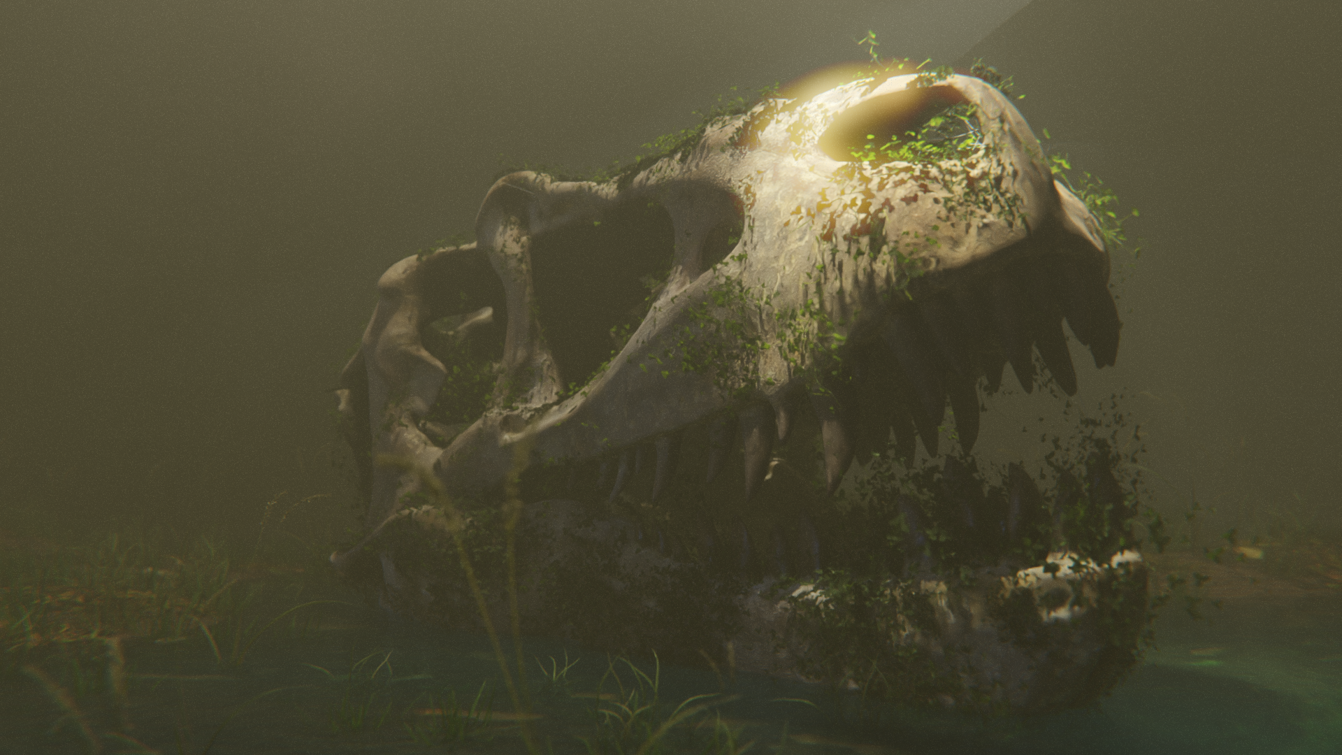
It looks like you’ve posted new stuff since I started writing this. Nice! The bright spot on the nose in the close up is just what I was describing above.
Good luck, nice work so far! ![]()
One thing that I would do is to “squirt a little light” into the mouth area. And maybe put some (colored) light to better define those trees. There is a lot of “mist” here, and my eye continues to wonder what’s to the right of the skull because I can’t clearly see it. The histogram display is tilted toward “darkness” when it should have more of a bell-shaped curve. Put a very subtle highlight exactly where you want my eye to go first, then “create a circular path” of other slightly-less-lit areas which takes my eye back to that original point.