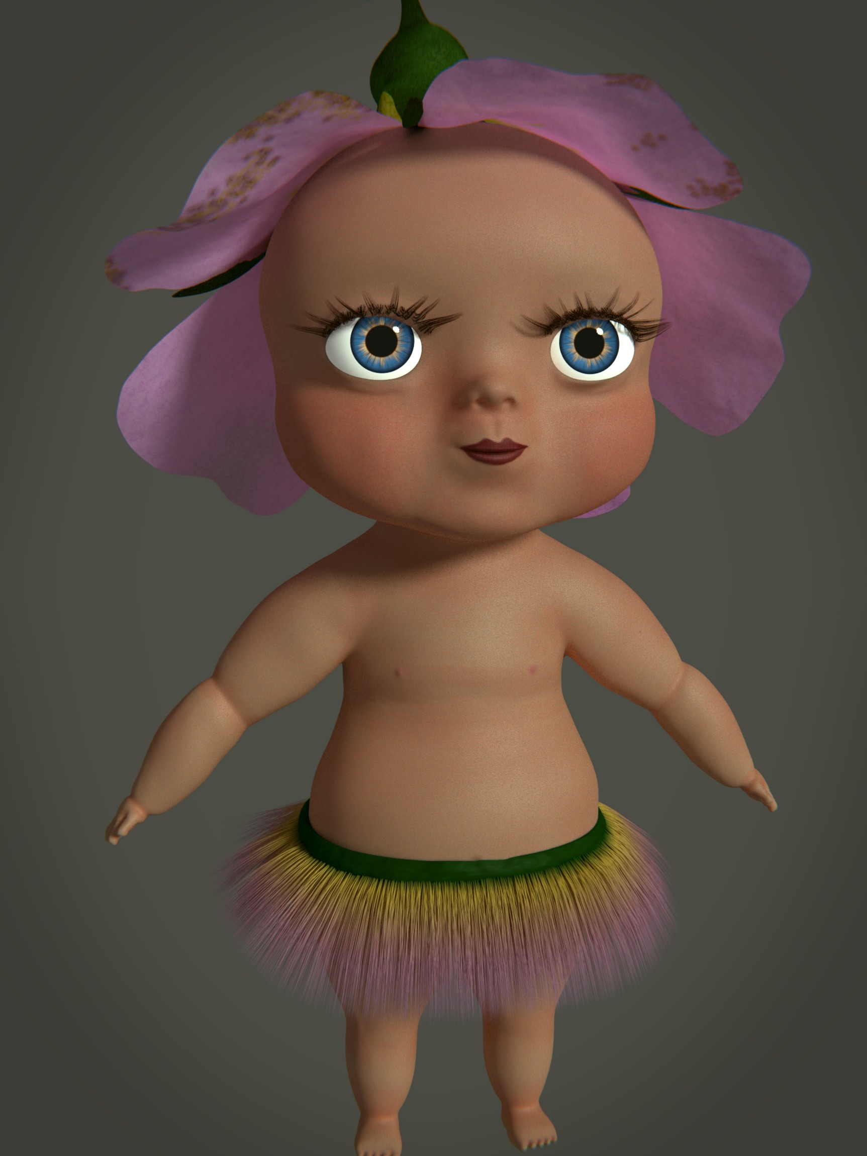
Something that immediately stood out to me regarding the first rendering was the difficulty in mentaly seperating the foreground from the background. I’m definately no lighting geek, but are you sure you did it right?
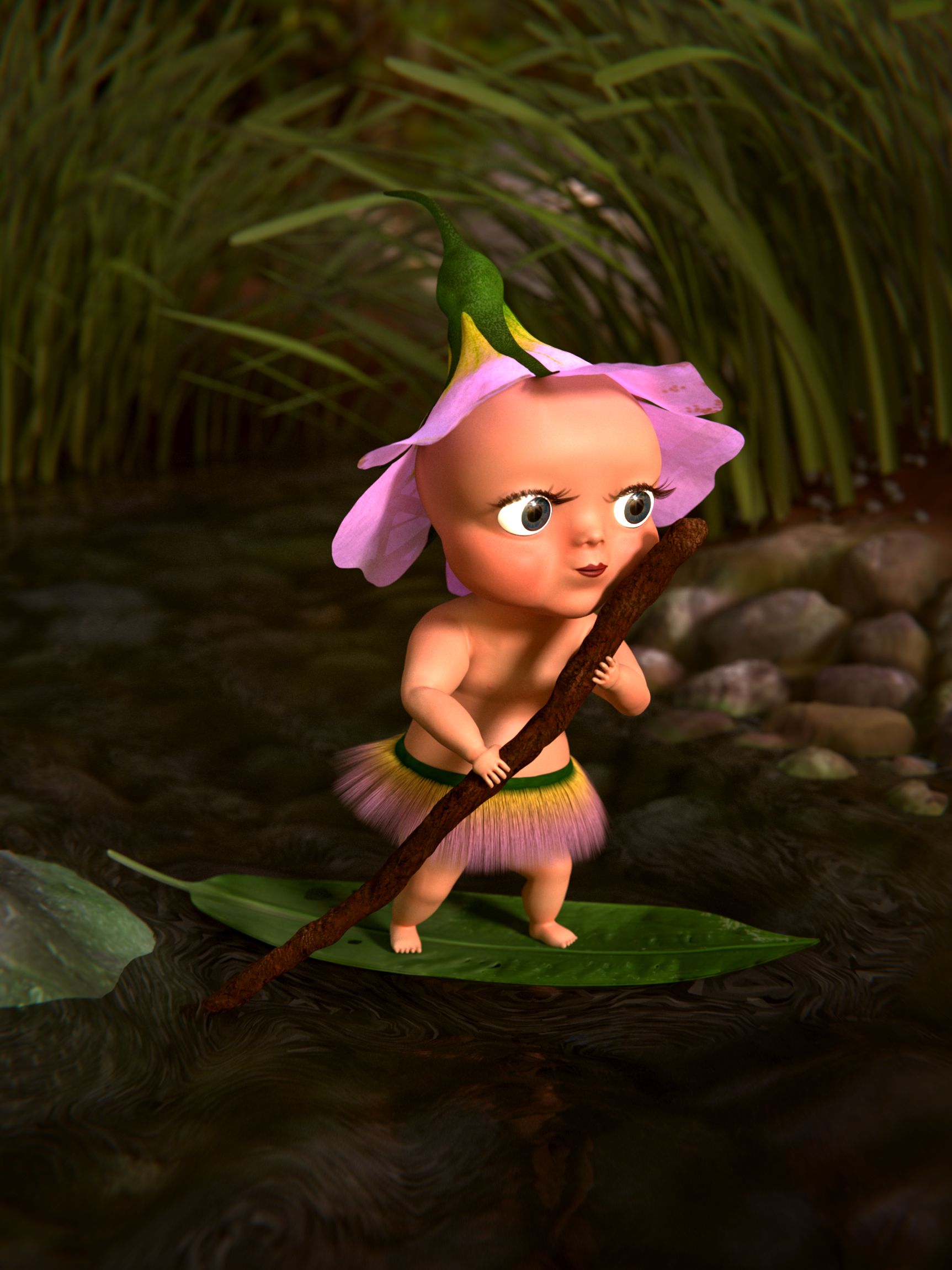
Among others, regarding the second rendering, the overall lighting appears excellent to my eyes, but the inconsistent shadow angle doesn’t appear to be justified, as there is no evidence of a second light source other than the sun. The stick shadow on her chest claims that it is either early morning or late evening, while the shadow on her brow claims noon. I rarely study lighting, so tell me to shut up if I’m wrong.
Next, her belly button appears to be incredibly low. Is this due to aesthetic politics? A pretty interesting question to talk about is, what is more important here? aesthetic “politics” or realism? Of course it’s up to you, but that just sounds like something cool to chat about.
Anyway, if you don’t mind a couple other critiques, shouldn’t the navels have a slightly different color than the surounding skin?
Also, the elbow joints look a little deformed. A little bit too jagged? Your thoughts?
Furthermore, have you considered changing her eye color to better match her environment? Maybe change them to green? Though this of course depends on her home, not necessarily just what I can see.
Finally, could you maybe do a little more to communicate the fact that she’s on a river? It’s a bit hard to distinguish on this end. Maybe turn up the blue value a tad bit?
Now for the good things:
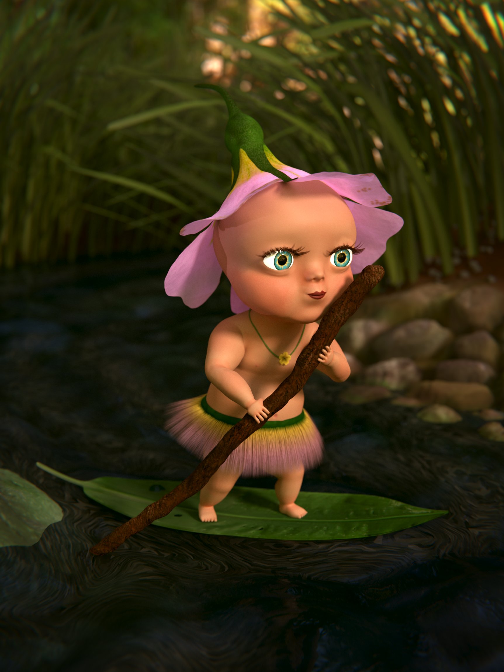
First of all, the eye design is GREAT! The size is so helpfull when connecting emotionally to characters.
Secondly, like I said before, the overall lighting and coloring of the second rendering is exceptional!
Thirdly, you (or whoever did the original pencil sketch) did an excellent job at making her match her surrounding environment.
The fairytale-like mood was very successfully achieved.
However, do you think there’s anything that can be done to push that even further? Is there anything you can put on her body or around her body to make her look even more a part of her environment?