So I,m a relatively newb to Blender 3d but i have been using CAD (everything from Sketch up to solidworks) on and off over many years I have been working my way though various tutorials and course over the last few months and after 4 months of using blender im finally confident enough to post one of the projects ive been working on.
All feedback welcome I really want to become good in the 3d Arch Visual area.
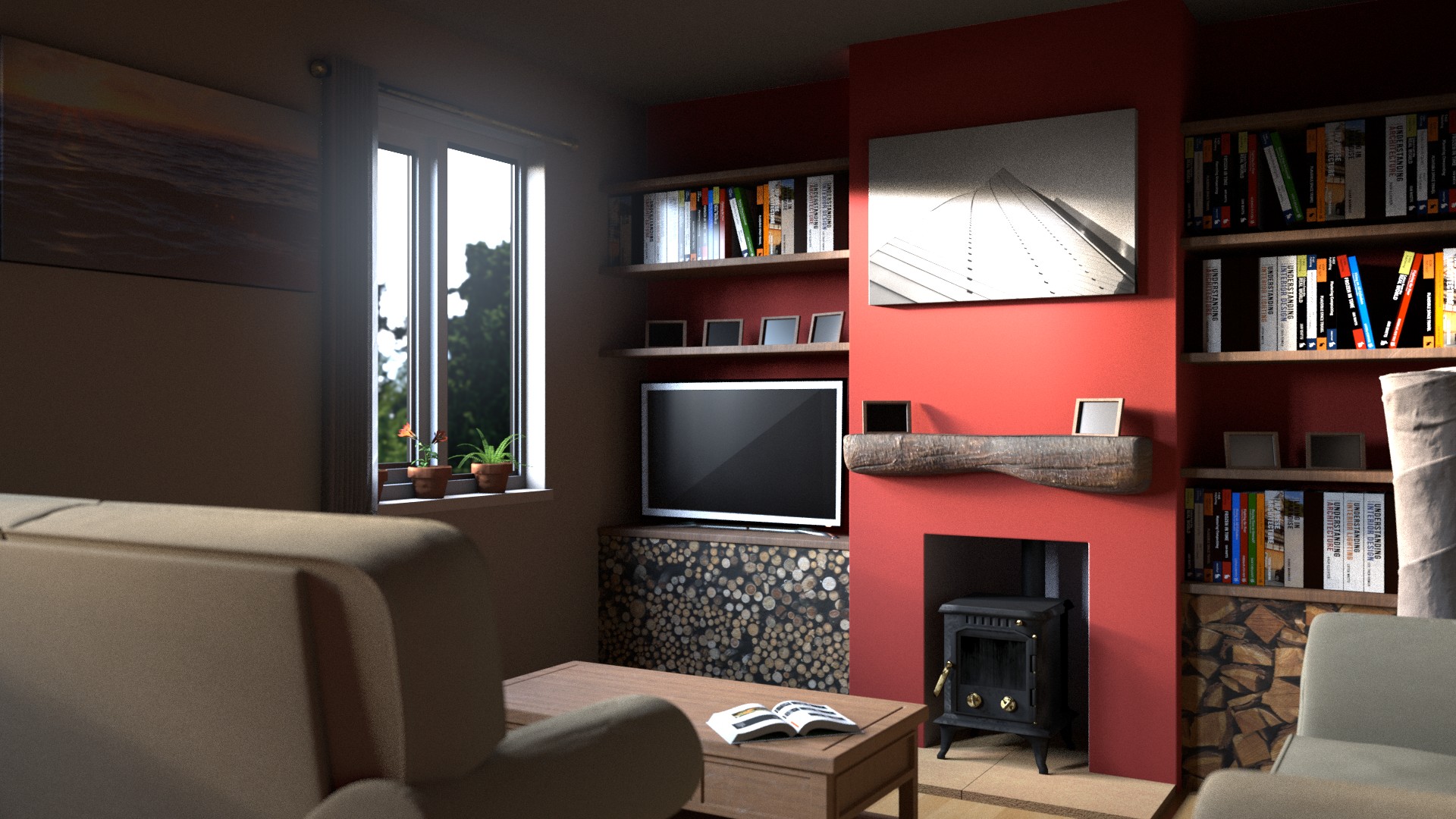
Nice job. And LOL. I have that exact picture (side of the window) hung over my bed. I literally had to go and check, though it’s mirrored in your render.
That’s what I was going to say.
I think it’s a very good render from a 3D CG standpoint, however from a photographic standpoint you shouldn’t use shallow DOF for shots like this. You use shallow DOF if you want the viewer to focus on something, like an object on the table. with wider shots like this everything should be in focus. Or at least make the background walls and the table in focus and have the armchair out of focus, not the other way around.
Cheers, I’ve taken what has bee given so far on board and I’ll make some changes and re-render. I’ve personally noticed that the plant pots on the window sill are floating as are some of the photo frames … I know there is no photos in the frames but that was intentional
Way much better! I like it a lot now! The only think that makes me want to see a “perfect” render now is the stacked wood under the TV set and the books. Both look like photo wallpaper glued on the wall… unless it IS actually a wallpaper of course…
Subdivide the screen on your T.V. and it should make that triangle go away…“should”.
Looks pretty good, just need those aforementioned finishing touches.