Hey again people.
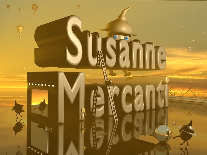
Here is an image i did simply for fun.
Learning Blender at a SLooow rate 
Thnx
Leon.
looks great better than what I can do.
It looks good
have you thought of animating this? I think there are some really cool parts. A couple suggestions I have are: 1) try some variation in color; it’s all so close to the same shade. 2) try viewing it from other angles, maybe you could find one that would give better perspective to the whole scene. 3) I would like to see a texture on the letters; they are the only “fake” looking thing in the whole composition.
In all it’s really a great piece with even greater potential. Love the “sunset” feel the light gives.
A small update.
Thnx for the advice Gobley and others for their comments. I had been thinking about animating the scene actually and will take that advice on colour variation and the texture of the words. Actually, the only texture in the scene thus far is the iris in the eyes. Ill work on your suggestions Bobley and post and update soon.
I did this image ago, so wasn’t expecting any more comments so thnx for posting.
Leon.
http://www.mediafire.com/imageview.php?quickkey=82ttojp4ryc&thumb=4
