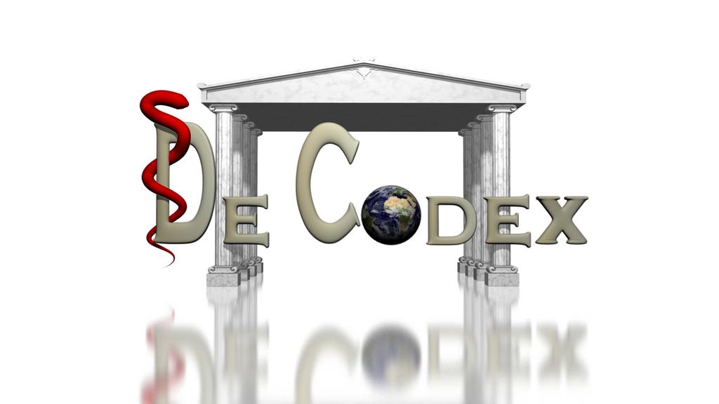
image is attached. It’s my first “official” project.
I think it is a bit more complicated than it needs to be, and the text could be a different colour to help it stand out more.
I like it. nice job
Nice work.
tell us more about the project, or i wont feel comfortable commenting 
It’s a logo for a program for a medical encyclopedia.
My father made the program and I renewed the logo :).
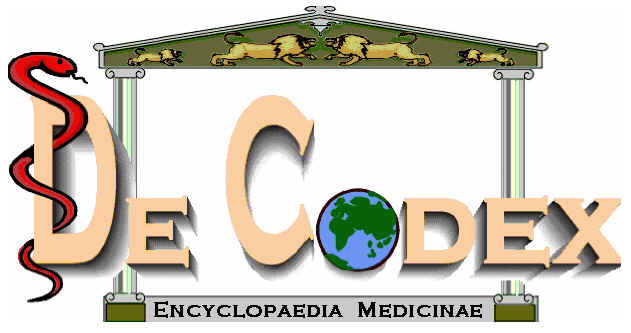
original logo attached
Attachments
The text doesnt flow with the background. Its too smooth and round, you need to keep the rectangular feel of the original logo (which i wont critique since its not relevant)
Make it look marble.
Your “C” is weird, its not completely round and has polygon “breaks”. I sense a subsurf usage to mask mesh-imperfections.
Always use bezier curves for creating text in a logo (except if you have the font).
Funny you should say that, I mesh model all my text. It helps immensely with animation and texturing. Oh well, to each his own.
I would remove the bottom reflection, makes it impossible to properly use the logo in anything other than a splashscreen it seems
Thats interesting, i never saw it necessary to mesh-model a logo. Hmm, maybe if you want to animate the mesh it could be easier that way?
For the last logo i used also curves to later let something track clamp to them (arrays running over its edges etc.)
I like the old logo better. 3D logos never gets good as the 2D versions. The 2D logo has way too much going on. A snake, earth, lions and so on. Just pick one.
As a designer I’ll say two things: the 2d logo is bad, the 3d logo is worse.
Such logos remind me of the 90s when computer graphics were still “teenage”.
First things first - NO font stretching! The capital letters are either stretched or squashed. That’s no. 1 rule my cousin is threatened with by her father (a graphic designer).
Secondly, everything in a logo is symbolic. The snake and the D is good. A snake symbolizes medicine. What are lions there for? Do you need that globe (emphasize world-wideness when talking about medicine in general)?
And thirdly, the Greek colons sorta act like a frame but your logo is bigger than it. It’s like framing a picture and framing it with a much smaller frame.
So my advice: *no 3d
*loose the shadows
*no font stretching
*loose the lions and put encyclopedia there
*leave Medicinae on the bottom (you might want to space out the letters a little with these two)
*frame the “De Codex” with the colons. Snake is ok, the world may be there too
Hope this hwlps improve
thanks for the helpfull reactions!
But I don’t really know what you mean with font stretching. I used the original logo as background image.
- encyclopedia medicinae should stand togheter.
seconded, i didnt want to be too harsh but i agree on everything you said.
Id actually say the logo (2D) needs to be redone from the ground up, it looks like word-art.
Font stretching is the second of the three examples:
http://www.flywebmaster.com/webdesign/tips/good_bad.php
Edit:
Ok, fine, i feel a rant coming up so i need to post it, just as a warning to everyone doing logos.
Logos are probably the hardest form imaginable for a graphics designer, they require thought, training and background knowledge.
Someone not trained in graphics design shouldn’t even think about “designing” a logo, it will end in a tragedy (like the one above).
Without sounding too much like a dick, people are just not trained to communicate with images, they will overcomplicate the design, push in too much symbolism in an attempt to make the logo a collection of their knowledge about the subject.
In fact, there are even graphics designers who hire someone to make a logo for them because they know they are not up to the task.
A logo is something you are stuck with, its your calling card, screw it up and you are going to regret it.
Logos are not cheap, and require a lot of work, be prepared to dish out around 3000$ (and more) for a good logo.
The designer needs to incorporate the “thought/soul” of the product/company into the logo using his knowledge and training. This incorporates a lot of research on the background of your company, the competition to your company/product and general “feel” of the brand.
Designing logos is an art in itself, your mom or cousin is not going to make a good logo, its just how it is.
Heck, I wont do a good logo and i have some experience.
Please, if you (generally speaking) get in a situation where your client/mom/dad/grandma wants a logo designed or wants to make her own, just say NO and tell them to find a graphics designer.
Or else you will be stuck with nuggets like this:

(i lold at the last one)
instead of:

 i think they have a great library logo
I think most of the feedback is valid here. How long can your dad wait for this logo? And what kind of typefaces
are going to be used in the program? (often the intricacy of typographic style is neglected in computer programs…)
and. behold : http://itunes.apple.com/nl/app/medical-encyclopedia/id313696784?mt=8
make sure he does one for Android Mobile OS, it’s gonna pwn iphone left, right and center
Finally, back on topic. http://webtypography.net/ translates well to program typography
My dad is going to put the 3d logo in the program but he is going to put the 2d logo on the cd package and on the website.
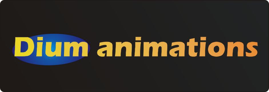
I also made a small logo for testin. I made it simple and in 2d. Should I make the letters completly orange and make the circle blue?
Attachments
Someone wasnt reading my rant.
Oh well. Critique:
blue + orange/yellow = bad readability (complimentary colors)
orange + black = good readability (orange contrasts well with black and appears stronger)
Start way simpler, loose the gradient(s) it doesnt serve any purpose.
Notice how the logo has a certain “anxiety” on the left, its because you clash together at least a dozen hues together with those gradients.
Use a different font and check your kerning, the letters are uneven.
what purpose does that circle serve?
I read you rant but I think It’s rediculus that only a small group of professionals can make a logo. Yes there are people who just can’t make logo’s. Besides, this was just for testing. Btw the original logo is 12 years old and that’s why it looks like word-art
Because the weight of the three stripes is uneven.
Im talking about optical uneven of course. If you would have followed any of the links people have presented you would know what im talking about:
Right now your logo reads optically:
D - i - um an - im - ati - ons
Here is a good 70s logo that ran for 20 years and is most successful:

Or a 80s logo:
![]()
or a logo from the late 60s that has been unchanged for roughly 40 years
90s:
Just because its from the 90s doesnt mean that it needs to look like word art.
Helpful links:
Edit:
Yes, right. how silly of me to suggest that qualified people make better things than unqualified laymen. 