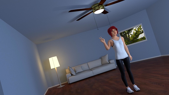
I created a still frame to test the character for a current project that is similar to a comic book. I’m looking to get an art style that is consistently close to reality, but i prioritize stylization and emotional impact over perfect photorealism. While I’m only breaching the surface of basic lighting and composition, I’m looking for critque on elements of design, materials, lighting, and composition. The scene is very basic with not much in it and I have a friend to help with interior design, but im looking for important fundamental changes that need to be made to make the character and scene more impactful.
Problems I feel need to be adressed: Not entirely sure how to make the leggings that soft material where the tangent faces fade to lighter tones, but the front facing materials become reflective. I dealt with layer weights and glossy diffuse mixes, but couldn’t get the desired effect.
When i did subsurface scattering on the lamp shade and put an emission shader beneath, it didn’t illuminate the room as well as i would have hoped and could only get the effect i wanted by putting the emission shader on the lamp shade which makes it look like an LED screen surface on all four sides and left the cieling above to have a patch of missing light where light should have been even more prominent.
aside from this, spacial design elements and posing of characters is not a current concern for this thread, as this scene was pieced together for demonstrative purposes to reference as the project moves along.
Skin textures and model made with MakeHuman.
Currently using blender 2.77
Rendered at 400 samples
I will accept any and all criticism.  Thanks!!!
