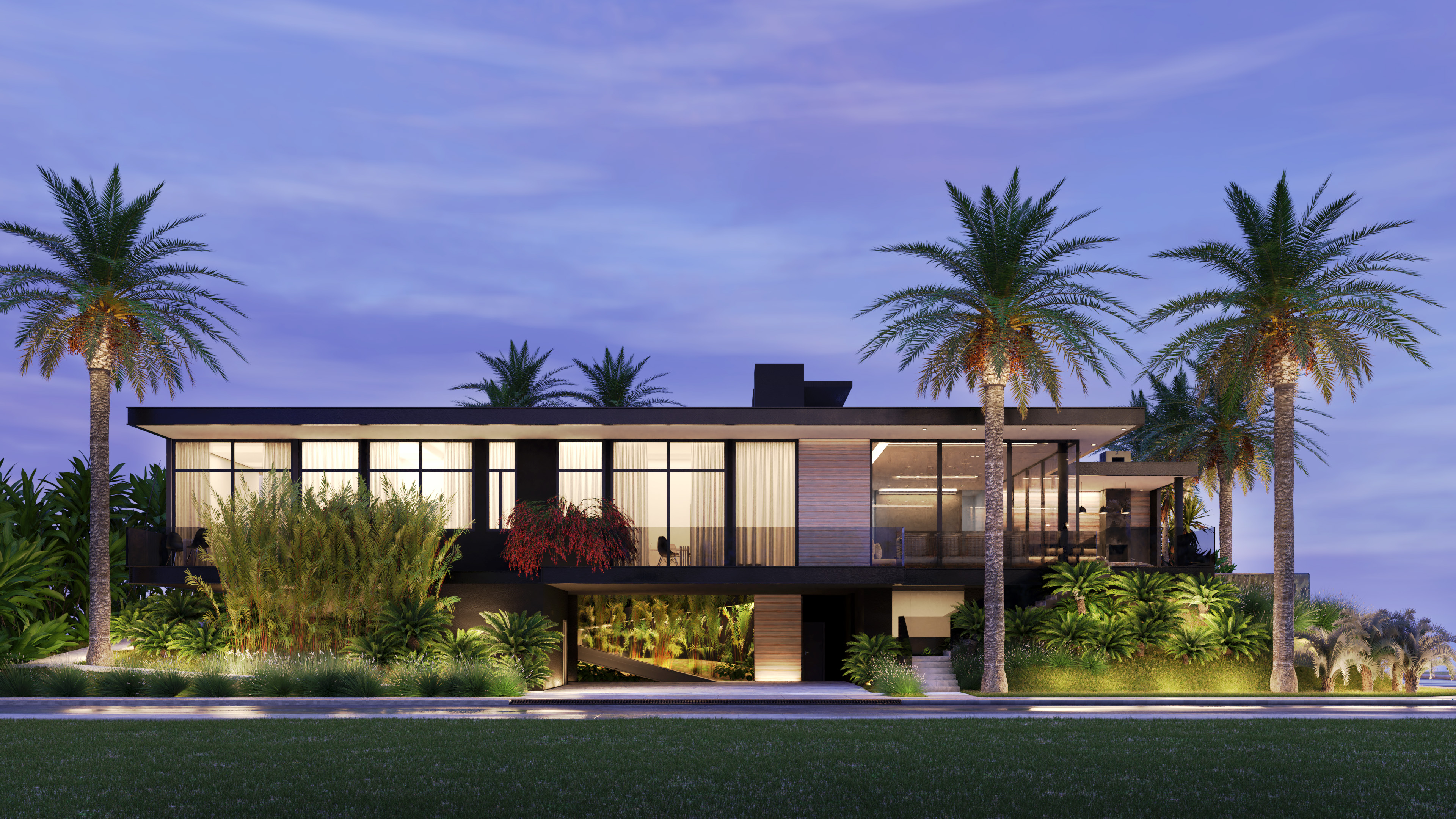
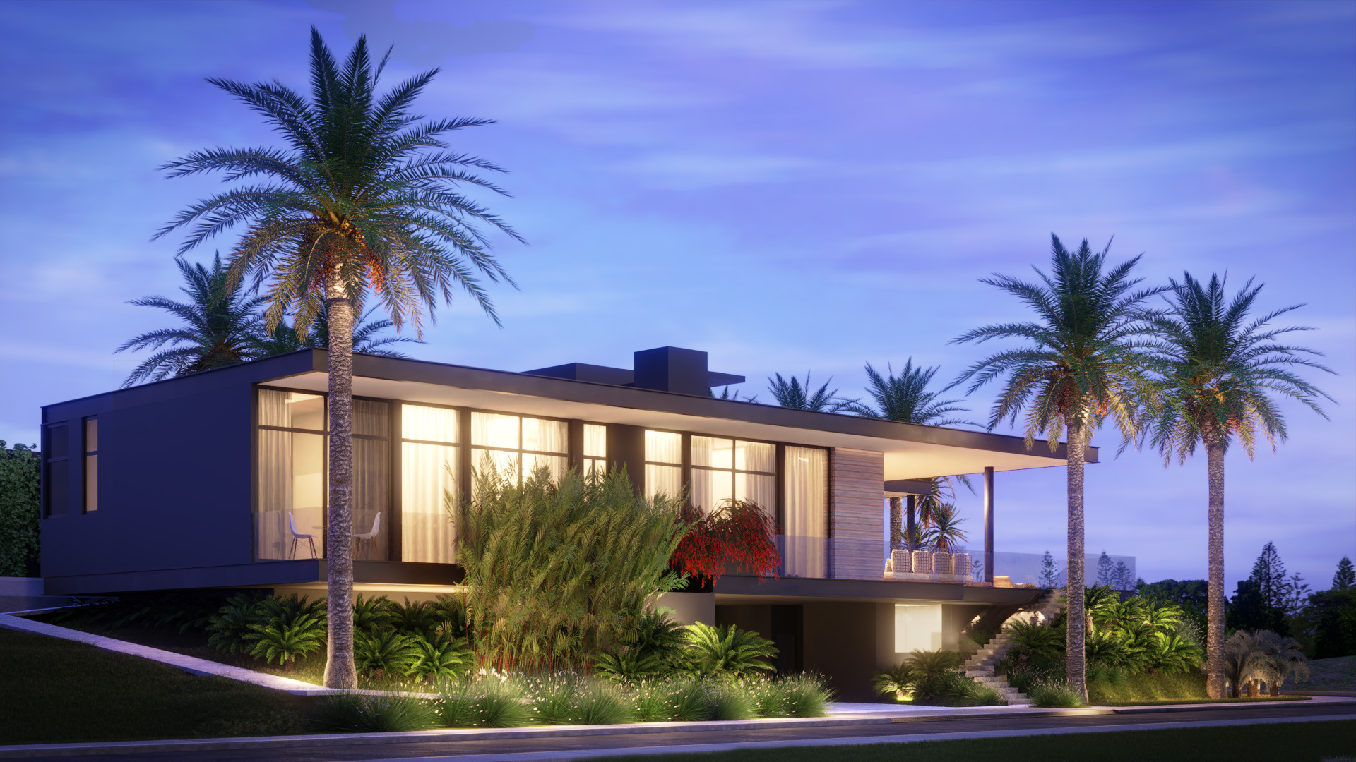
Hi guys, my name is Augusto and recently I worked in the folow project.
It is a archviz project, but the quality isn’t good enought… Any tips to improve that?
I would like to make it looks real, not so… washed out and artificial like it becomes.
Personally, I wouldn’t call these “bad renders.” Now, you are definitely doing long shots of the house in all of these frames. I think that you’ve got a future as a landscape low-voltage lighting contractor.
Thx man.
But this renderings wasn’t realistic enought. My goal is to make it photorealistic, and this renders aren’t looking really good. I just wanna to know how can I improve it. Maybe change the vegetation, redo the lighting from scratch as a did in the second on (the render with the car) or maybe redo the materials with more quality and details. Or maybe do everything I just said here… haha
It’s true, these render are decent, but they have many common cg issues and suffers pretty seriously from an uncanny look. I’ll try and sort these by the most important fixes first:
desaturate the sky background and the foliage/trees color maps. you use an HSV color node for that, lowering the s for saturation from 1 to ~.7
mess up the palm fronds, so they are no totally symmetrical. think about buying graswald add-on and replacing some of the low plants with that grass.
incrase filter width on camera to soften up the edges 1.5 -> ~2.0
separate the green parts of the trees and run some blur on them. also add slight transparency to the leaves.
add some grunge to the exterior texture, at least in the roughness, it’s too uniform, some slight bump too.
use filmic, and do some color corrections in compositor.
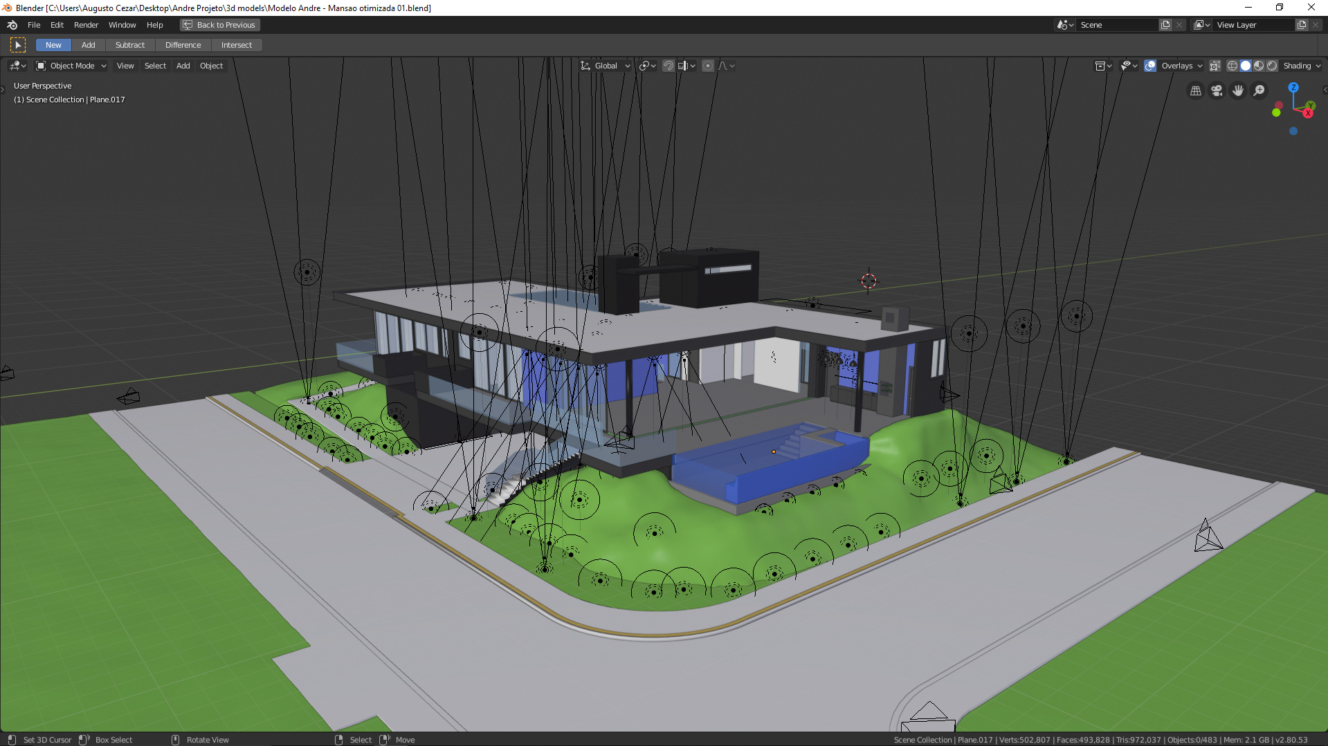
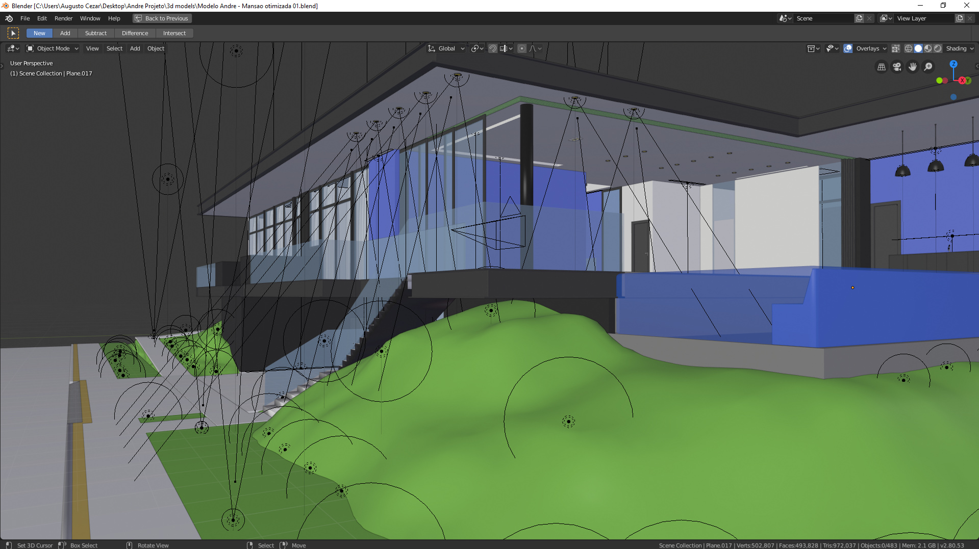
I think you’ve got too many lights, it’s as if it’s a night scene with a clear sky.
At first try to do one daylight scene, and after that night scene or sunset.
Maybe start by adding one environment light and one sun lamp and try to get the best of it.
After that you can add other light sources to compensate but they shouldn’t be as visible as in your scene.
That should give you a more convincing image, then you can work on materials and details.
While I don’t think I would do any better than you, I can give a few suggestions those could help perhaps.
Probably check out the saturation of the sky; to me it looks oversaturated (in fact all of the images look a bit too saturated to me), although my dispaly is anything but a professional-grade one.
Something isn’t right with plants. Too uniform (my wife says the same). A little bit of diversity added would help there, I think; the plants of same families seem to have too uniform size and very similar form (array modifier with rotation added?).
Sidewalk has visible faces on the first render.
Palm trunks’ sides are too smooth, although the bark in reality is very rough, and some added bump/displacement on the sides is expected, perhaps?
The last but not least: consider using Mist pass and postprocessing nodes such as Filter->Glare (Fog Glow mode) in order to simulate some atmospheric effects without plunging into the depths of angst and despair called ‘volumetrics’; there is also an immensely useful node Distort -> Lens Distortion which helps simulating real-world optic effects. A good setting is ‘Projector’ mode and Dispersion at 0.1-0.25.
Optionally(?) there is a handful of useful Camera Presets simulating real-world cameras settings. May come handy too sometimes.
P.s. My wife said these images have some deficiency in depth. Probably more pronounced defocus would help.
The Vegetation looks really weird and uniform.
Also the Lighting and colour grading could be improved. But the overall thing is really good, you should really spend that extra time and it will become awesome.
Ps: As a last touch i would add some Depht of Field.