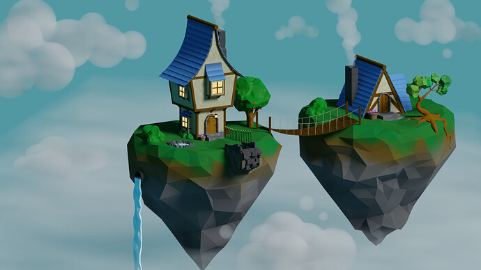
If anyone has any suggestions of anything I could change or add or wants to know how I did anything feel free to ask
The islands are drawing a lot of my attention because the tris per cubic meter is so low. I might subdivide 1 or 2 times and displace the new vertices.
No matter how much I look at the house on the right, it still looks like half of it has sunk into the ground. I’m not so familiar with A-frame houses but maybe add a little bit of vertical walls and work on the placement of the boards on the side.
I might actually add some windows or something towards the bottom of the right side to make it look like the whole island is being use and I will subdivide them and reply with updates as I add more.
Thanks for the feedback though, I appreciate it 
You could have an interisland pipe for the water to flow.
Maybe I just played too many video games in the 80’s – (koff, koff …) – but I’m still a sucker for this kind of artwork. I personally think that the “gigantic polys below the edge and even in the lawn itself” really make this image work. You’ve got high detail where high detail is most needed, with completely stylized lawn, trees, and rocks. All in an unabashedly-absurd, fantastic situation.
I think your colors are too light, Maybe I’m wrong but when I look at it, It’s not caught my eye. Anyway, try more, good luck
thankyou for your thoughts I really appreciate it 
Update on the islands, I’ve added a small pond and a pipe connecting the two islands for the water flow
I don’t think the pipe helps. I think it was a whole lot more fun when only the bridge connected them. You really don’t need to explain where the water comes from … any more than you have to explain how they’re floating in the sky!
LOL. I don’t know if the pipe is good or bad. I think it is ambiguous 
But cool update on the islands. I like them more.
For the A-Frame, I think you should go with strictly vertical and horizontal side boards. Like https://www.pufikhomes.com/wp-content/uploads/2020/02/uyutnyi-lesnoi-domik-v-forme-bukvy-a-pufikhomes-1.jpg or https://www.dhomeplan.com/wp-content/uploads/2019/08/A-Frame-House-Plan-1-01.jpg. I’m not an architecture expert but the diagonal boards remind me of like Tudor-style rooftops.
I have removed the pipe and added a different tree on the right island using vertices and the skin modifier.
I don’t know whether I should change the tree back to it’s original or change the other tree on the left to match its style
I’d change the tree on the left to more closely match the right. When it comes to low poly work, the more bits, bobs, and uneven edges you have, the better it looks.
Yeah I didn’t think it looked right, I’ll change it now thanks for the feedback 


