Low poly SR "Schools" Class V (game asset)

I’d like to say that I have been totally blown away by the quality of work that regularly appears here, even though I haven’t been gushing about it in every thread. I do not pretend that my contribution here is in any way “art”. I’m posting it to get ideas and to encourage other beginners.

I first picked up Blender about a week and a half ago because I wanted to model some stuff for my own amusement.This is something I’m working on as a game asset for the old Railroad Tycoon 3. Due to the requirements of the game I’ve set a total budget for locomotive body and tender body of vertices + tris < 4,000 on highest LOD (wheels and other moving parts can be extra). It’s on target but will need some revision as it evolves, since there’s quite a bit more detail to go and I have to decide how much can be done with textures/alpha and how much requires geometry. So far there are no textures being used. It’s just bog basic materials to get an overview of the thing.

The wheels shown won’t be used in-game since they are far too high-poly. I’m modelling those just as exercise to get more experience with different functionality and topology in Blender. The final wheel skins for game use will just be a texture on a basic square, using alpha to get the transparency where needed. If you think that’s primitive, the game in question also requires binary alpha. My aim is simply to make some game assets which, while necessarily being as rough as hessian underpants by modern graphics standards, will at least be a lot less rough than the originals and add to the fun.


[ATTACH=CONFIG]369254[/ATTACH]


So I’ve done some more on this beast. It’s had some more bits added but is still within budget for vertices and tris, and is now at the stage where it needs optimising. I can save a few dozen more without much trouble, which is handy since I have some more bits to add. The number of bits that still need to be added look like taking up the rest of the budget, but without running over the self-imposed 4,000 limit. :smiley:

Some of the model is now running basic textures, just to get a feel for the UV mapping and for what can be done with alpha instead of with geometry. The textures are far from finished and will get a lot more detailing before calling it quits. Naturally the first bash at UV mapping was the wrong scale and ran out of space, but at least I now know what scale to aim for.

With this game there’s no using large textures, or multiple textures. The maximum size the game engine will read is 1024 x 1024, and it will only recognise one skin per unit. Fortunately the locomotive and tender count as separate units so I can use two skins in total, but all the components for the locomotive still have to fit in less than 1024 x 1024. Since the tender is smaller and less complex, I’ll just UV map it to the same scale as the locomotive and use a smaller skin (768 x 768 is looking about right).

And I’m going to finish the high-poly driver wheel modelling just as an exercise (it still needs the crankpin boss and a few other minor things). Not only has that been educational in terms of learning Blender, but an orthographic shot of it can be mangled in Photoshop to produce a decent wheel skin. I found that making a 3D model with some basic lighting and materials and screenshotting it gave a better result with less drama than trying to build the effing image from scratch in PS, so I’ll use the same stunts for the front truck and tender bogies.

Speaking of PS, its handling of alpha transparency in PNG and TGA formats is bloody abysmal. I may have to do some of the work in GIMP or another app, because I’m totally over the artifacts PS throws into the mix.

Attachments


I’m making an effort to get this thing usable, now that CoDEmanX (great blessings be upon him) has written an export script that will enable RT3 diehards to actually get models out of Blender and into the game. Previously, all custom modelling had to be done by direct manual editing of the game’s hex files, which is no fun at all.

Anyway, this is basic WIP testing of skinning just so I can try the thing out live and see how it runs in the game. It’s far from finished. As mentioned before, the whole loco has to fit on one skin image of 1024 x1024. What can’t be done in that image just doesn’t get done, as there are no other in-game tweaks for extra materials or anything else.

How it looks in Blender is pretty much irrelevant since the game’s lighting is different (and not that great). I suppose it would be possible to get a Blender lighting setup to match the game’s look, which is probably worth doing at some stage since it would help with the skinning process.

Once I can see how it looks in the game I’ll be looking at giving the whole model a bit of a diet to get rid of some poly-saturated lard too.


Just noticed this in the WIP and I can’t wait to see this rigged!

Looking good @Gumboots - keep up the good work.

Cheers, Clock,

The game’s rigging is very basic and there are limits to what you can do with it. It was coded as an RTS rather than a full-on simulator, and coded back in the days when a 256 kb graphics card and a 1024 screen was hot stuff.

Usually the valve gear is just badly pixellated frozen stuff that is not rigged at all. The only bits that are rigged are wheels, connecting rods, coupling bars and pistons. However, I have had an idea about how to use this basic rigging to get a sort of fake valve gear action, which may be fun enough to be worth having on the highest LOD’s. I haven’t had a chance to test this idea it in the game yet, but it involves using extra connecting rods, etc to do things they weren’t meant to do. I want to try it just to see what’s possible, as a bit of a coding challenge.

Obviously the model itself could be kept and revamped to a higher poly and fully rigged Blender model for rendering, which is an idea that had occurred to me too. It’s all built to scale, as accurate as I can get it without the original blueprints.

Still working away on this. Hopefully I’ll have it satisfactory by the end of the month. I’ve been revamping the mesh to drop the verts/tris counts, which obviously means remapping UV’s again. :rolleyes: It’ll make for a better result though, so it’s worth it. Verts/tris have been dropped by a few hundred without making things look worse.

For anyone else new to this stuff I found that, providing diameter is not too large, a square pipe smooth shaded looks just as good as a more complex one, except when inspecting the ends at close range. Often this is not a problem for looks, so I’ve been using a lot of square pipes.

Also, I think I figured out why the game’s lighting is bollox. There’s no specular. None at all. No normal maps either. The old DirectX did have the capability to allow various extra shaders, but it appears that the game was coded to not use any of them. Since the source code is obfuscated I’m stuck with it.

If anyone knows good tricks for getting extra life into skins without relying on specular or normal maps, feel free to chip in with advice. I’m a graphics beginner so I need all the advice I can get. Among other things, any tips on good rivets via texture (no geometry) would be cool.

Originally I was going to only do this model in three Southern liveries: Eastleigh olive (a dark one), Ashford olive (lighter) and the Bulleid malachite that Cheltenham has been running around in. Anyway, for a bit of fun I decided to do an optional St. Trinian’s skin for this beast.

Since ACE Trains just made a wishy washy pink model because they thought a girls’ school should have a pink train, I figure I can do what I like. Nobody in their right mind is going to worry about historical accuracy for fictional schools. For those who haven’t read Searle’s books, the St Trinian’s students were sometimes literally murderous. A nice dark colour, with a sense of presence and a hint of blood, is more fitting than a sickly pink.

What I’ve done is taken one of the 19th century liveries from the London and South West Railway, which was one of the older companies that was amalgamated into Southern in 1923. This is a nice deep sort of crimson/maroon, which is usually listed in articles about LSWR livery as “purple/brown”. It totally looks the part.


I’ll also be adding another skin which I’ve already roughed out. This one will be for that fine old school St. Custard’s, and will be suitably coloured by taking minor liberties with another old LSWR livery. This covers both of Searle’s schools, and should also assuage any BR fans who may be missing their blood and custard, thereby covering Southern history at both ends of the time scale. :smiley:

Attached is a shot of the St. Trin’s skin at its current stage of progress. Needs more detailing to sort out some rough edges, but the same sorting out needs to be done for all skins anyway.

(BTW, the skull and crossbones is the St. Trin’s coat of arms in the original books, and this version was taken straight from Black Sam Bellamy’s original flag, with a bit of suitable Photoshopping)

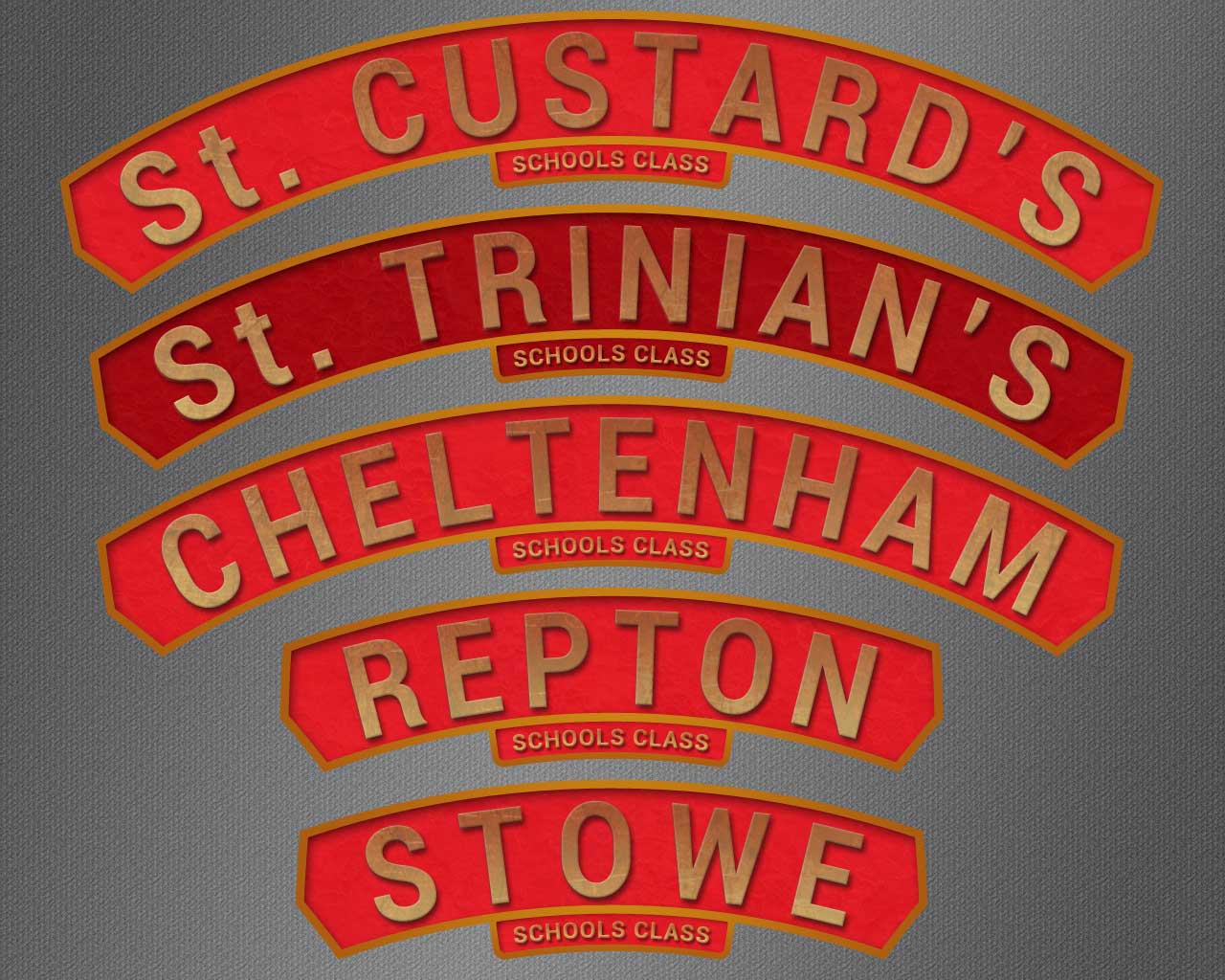
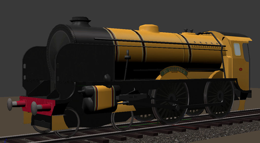
Got sidetracked into some detailing. Obviously the nameplate in the previous screenshot is as rough as guts, so a system for making better ones was needed for doing all the skins to a decent finished standard.

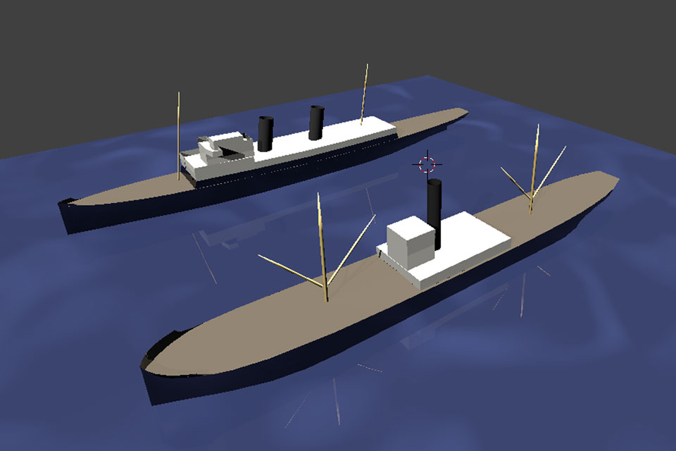
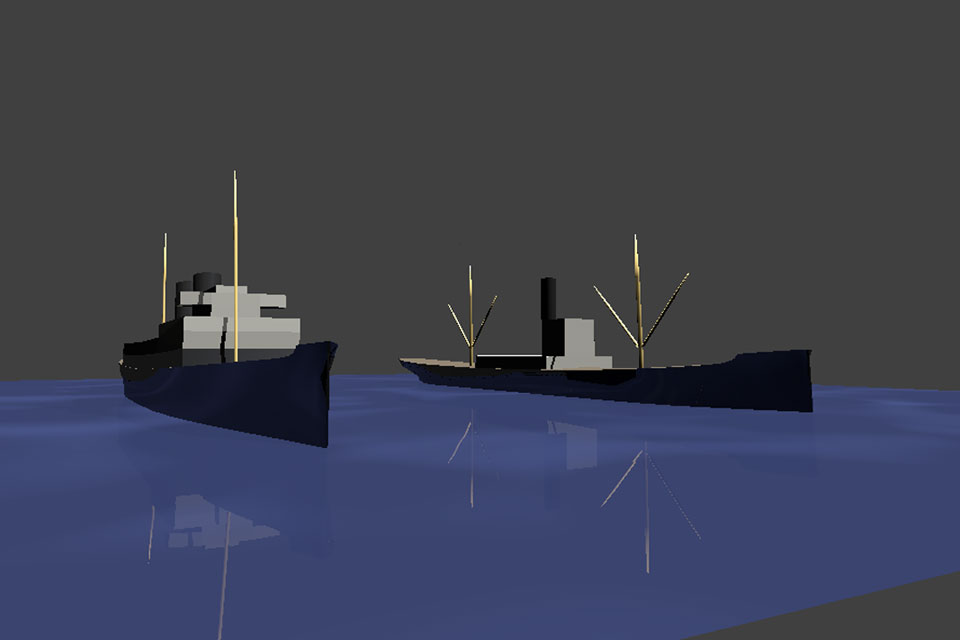
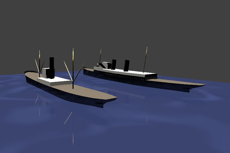
I could have modelled these directly in Blender, but at this stage I’m kinda wanting to learn just enough Blender to do the bits I need Blender to do, while still dealing with all the image work in Photoshop. I’m used to messing around with PS and right now I just want a finished game asset to play with. If I decide to re-do this loco as an unlimited poly Blender showpiece later, I can learn more Blender then.

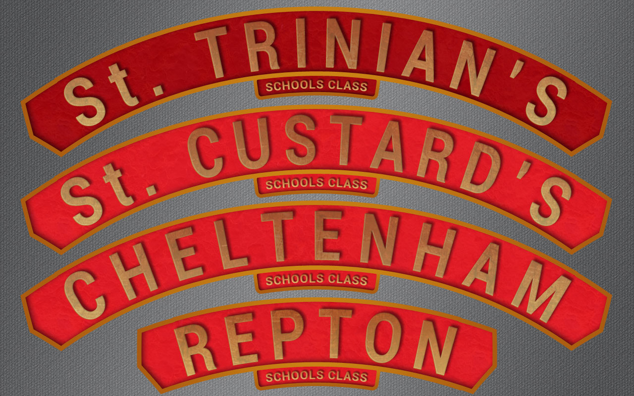
So I just had to upgrade my Photoshop skillz. The nameplates for these little choofers are a bit tricky to make. They have pointed ends, but not at a standard 45/45 degree point. Then they are curved too, just to make it even more fun.

So I did some searching for PS tutorials and found a good trick. It turns out you can draw the usual vector (non-pixellated) shapes in PS and then join shapes together to make your new vector shape.

This works really well. What I did was grab a basic arrow shape that had a 45/45 (90 internal) point on the end, then scale it vertically to widen the internal angle to match the Schools class nameplates. I then drew a basic rectangle to a suitable length of a bit over half the nameplate length, then merged this onto the basic arrow. Took the merged shape, copied it, and flipped the copy horizontally. The flipped copy was then merged onto the first half. All I had to do now was transform>warp it to the right arc percentage (easy) and add a bit of styling (brass coloured stroke, etc). Result: one perfect nameplate blank.

Ok, so now the text. I went through the 200 or so fonts on my box looking for the closest match to the original cast nameplates. Out of what I already had available the best match turned out to be Roboto. This is the default Android mobile font, but funnily enough it just happens to be a pretty close match to the original 1930’s Southern Railways nameplate font. It’s not an exact match to the original, but you’d have to be really fussy to worry about the difference. This is handy if anyone ever wants to model something from Southern, since Roboto is a legit free font and readily available.

It does need some tweaking though. The font has to be used in its bold variant, the height has to be set to 120%, the width to 85%, and the tracking (ie: spacing between letters) has to be set to 300. The size in the example is 46 pt. This is for the main name of the loco.

The smaller text underneath, that just says “Schools class”, is still Roboto but has width set to 120% and tracking set to 50 (so the letters are wider and much closer together). The size of the small text in the example is 8 pt. This smaller text will be too small to be legible in the finished skin, but I figured I might as well have an accurate starting point to scale down from since it’s not much more work. The frame for the small text was just done with a basic rounded rectangle, which was then warped in an arc and had stroke etc added.

Attached is a screenshot comparing the new made-in-PS test case with the original nameplate from No. 928 “Stowe”. I’ll have to do another one to tweak the nameplate length slightly, and it needs minor details for the screw heads and bosses, but generally it’s pretty good. I don’t mind making another one since all the skins will have different names, which means they all need different lengths for their nameplates anyway. Not a big deal, since I have all the basic settings sorted now and will be able to churn them out pretty fast.


Edit: Got the others done too. I ended up cheating a bit. Since I was too lazy to make different length nameplates for every skin, I adjusted the tracking on the three long names to make them fit the one backing plate. I figure nobody is going to mind. If anyone does mind, they can make their own.

“Repton” got its own backing plate though, which is the trial one I made for “Stowe” but was a bit long for that name. So I just cheated the tracking on Repton a bit too, and it fit nicely. Now I can get back to all the other stuff that needs doing.


Still looking good sir!

Cheers, Clock.

PS. I am not going to mention the cricket…

:smiley: Meh. You win some, you lose some. Actually I always think it’s a bit odd when you have a game which has two teams, and people act surprised when one team doesn’t win. They’d be even more surprised if both teams won, but they always make a fuss about one team losing.

Your pitches seem to suit your bowlers better, and our pitches seem to suit our bowlers better. We’ll clobber you next time you’re over here. Remember that The Ashes originally symbolised “the death of English cricket”. :wink:

I may re-do the name boards slightly. It’s not a big deal, but really they would look better at this scale with the text along a path, instead of just warped. OTOH it probably won’t be noticeable at finished skin size, particularly if the train is moving.

Yes the “death of English cricket” indeed - you certainly clobbered us last time we were there! I was there to witness it sadly, but I still enjoyed the visit to your wonderful country, particularly down around the Margaret River area and the Southern Alps (near Mansfield in Victoria).

I think the name plates look really good - and as you say once they are running in a game, who will notice the tiny detail you are talking about. Carry on the good work.

Cheers, Clock.

PS. Was there ever a St Trinian’s Loco, other than in my dreams?

I revamped them anyway, just for the practice. Learning new skillz is always handy. They do look better with the text along a path. Doing it that way doesn’t widen the upper parts of the letter (which warping text does) and allows using tighter tracking and wider letters for the same overall length.

Speaking of the tracking, after checking out pix of several of the surviving nameplates it turns out that “Stowe” has the tracking set much higher than most of the others. I think this is because it’s such a short name that the bloke in the foundry thought the nameplate was getting to be too short, so he spaced the letters out some more to give it a bit more visual weight. “Stowe” is set to 200, and the others are now back to 125. Letter width is up to 105%, but even all the way up now.

I also noticed that the ends of the backing plates had been borked by the warping too, and weren’t sitting radially but were sort of falling over, so I hauled them back a bit. Only took a 2 degree skew on the base stock before warping to the curve, but it’s a definite improvement.

PS: Well yes and no. There was never a real Southern Railways choofer named after St. Trin’s, but there was an infamous ACE Trains model of the Schools class back in the 70’s or whenever. It looked pretty horrible, in a shade of pink that was sort of Barbara Cartland meets old Band Aids. I liked the idea, but thought the colour scheme should be better.


Made some more progress.

This one is mostly skinned, in the sense of using actual gfx. Most of the stuff in the previous shot was still Blender materials. The only things still relying on Blender materials now are the pipes, and the connecting rods/coupling bars/pistons, which are all easy to sort. They’re simple components, and there is still space for them on the 1024 skin.

Obviously this is not “skinned” in the sense of totally finished, as it still needs more detailing to help bring it to life, but the mapping has been tested live (found some interesting bugs in that) and it has reasonably good placeholder skinbitz in place.

Next job is the tender, which will be a lot easier. It’s already mostly modelled, and has been partially UV mapped. Will get into that this week. :slight_smile:

PS: I’m liking this skin. The main colour is called “Stroudley’s Improved Engine Green”. Srsly. That’s what it’s called. :smiley:

The livery is the old London, Brighton & South Coast Railway express livery from the 1880’s, slightly adapted to suit the newer locomotive (LB&SCR was one of the main companies that went into the formation of Southern Railways).


Looking good - in it’s new “Custard” livery…

Cheers, Clock.

It’s a rather chirpy sort of livery. Didn’t appeal to me initially, but it’s grown on me.

I think I’m going to have to go with TGA images for the A and B skins (first two LOD’s). Game default is DDS, but the indexed palette is giving me too much banding and blobbing with this colour range. TGA isn’t as good for performance, but will allow smooth gradients at close range.

I’m currently thinking go with TGA for the first two, then drop back to DDS for the C skin onwards. At that range the lower quality won’t be an issue, and most locos will be running at the level during gameplay anyway.

So I have to revamp the skin for this thing again, due to repacking bits to make them all fit better. I understand the process well enough. The delays and revisions are just down to this being the first time I’ve had to do it, and having to fit everything within one 1024x1024. Will get back onto that since I do want to see the thing finished and usable.

However, I got sidetracked when I realised I could introduce a new aspect to the game which had never been done before, namely ships. This will involve reskinning some existing default assets, as well as creating new ones, and doing a bit of cunning coding here and there.

These ships will be an interesting skinning exercise since they are far larger than the locomotives, but have to use the same size limit on the skin image. They have to be that large to swallow an entire consist of railway cars, and I’m determined to have them, so they’ll just have to be skinned one way or another. :eyebrowlift2:

I’ve roughed out the first two ships and will keep the poly count pretty low (currently only a few hundred each). First ship is a small Danish freighter, Aslaug, which is typical of small freighters from any country in this period. The second is Biarritz, a fast cross-Channel ferry which was operated by Southern Railways. Pix attached.


And yes, I know Biarritz’s masts are off centre by 8 units. Already fixed that. :wink:

I am going to watch this even closer now - someone has asked me to make a game asset set from my Toy Steam Engine project - I have a lot of learning to do…

Cheers, Clock.

PS. Speaking as a true Dane, I will not be so unkind as to mention events at Trent Bridge yesterday…

ROFL. That was a truly woeful performance. I had to laugh. I was saying last night that now we have the records at both ends. We have Bradman, and we have this. Now they ought to really go for it and see if they can get all out by morning tea. :smiley:

What game do they want you to do the asset for? AFAICT from the reading and looking around that I’ve done, doing game assets aint that big a deal as long as you’re sensible about the overall vert/poly budget, and as long as you can fit everything on the limited skin sizes. It’s amazing how crude models can be and still look quite decent while running.

This particularly applies to the lower LOD’s, which can dump mesh at a prodigious rate without the player being able to tell. I’ve just been sorting out a different model (quick and easy kitbash of one of the defaults, just for practice) and found doing the LOD’s was easy enough.

I wouldn’t recommend using Decimate for locomotives though. You can get a much cleaner mesh manually, just by dissolving faces and verts and dropping stuff. It’s still a quick job, and quite good fun throwing stuff out.

I’ll get back to the Schools class soon. I’ve just been madly trying out a pile of ideas that I’d had, but had never been able to implement until getting that export script recently. I’ll give Schools a final check over for dimensions, since I managed to get my hands on some genuine works drawings. After that it’ll just need a bit more rationalising of various greebles (love that word) and then it’ll be ready for final skinning.

Thanks @Gumboots - I will get onto this next week.

One of my English friends sent me this text, but with me being Danish now I did not understand it. :smiley:

“Rolf Harris - the only Australian not out by lunch time…”

Cheers, Clock.

They should be locked up with Rolf, after a performance like that.

Hey you might be interested in something I found yesterday. It’s Anglet, one of the original Mallets, built in 1876. As soon as I saw it I was wondering if the bloke who created your characters had seen it too. It may be coincidence, but the resemblance is rather strong. In this case it seems the excessively tall chimney was required because of the double-decked carriages.


Sorry - I have only just seen this, Looks good - perhaps a future project for you or I?

Cheers, Clock.