Hi,
I’m a new member to blender artists and this is my first uploaded artwork. I purposely gave it a cartoony style as I’m not that good at making my models look real  . (I made all the models and textures myself except from the sky in this one).
Please give honest feedback on what you think about it.

It looks good, but it would stand out a little if you added Sidewalks. Also shrink the yellow lines to indicate the 2 way, 2 card wide street.
looks pretty good for purposely cartoony. I would add a bit more detail to the mountains though, make them slightly more round (like 8 lines instead of what looks like 4).
Just to verify, by “sidewalks” do you mean raising the pavement above the level of the road?
I’ll post a new render including this when I’ve got a few more suggestions to incorporate into it.
Thanks for the feedback
Yeah, raise the pavement. The streets look too flattened with the current look. That’s the only input on my end.
looking good so far.
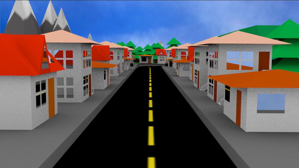
Looks fantastic. the only thing that i can see it that the Ambient Occlusion is very noisy. It takes away from the image.
Is the ambient occlusion the thing causing the dark areas on the picture? I wondered what those were…
What is ambient occlusion?  Does it add shadows or something?
Yes. ambient occlusion the the thing causing the dark edges in the picture. Basically, it darkens areas that are close vicinity to each other. It’s under the world tab (2.5) named “ambient occlusion”.
Usually, it adds depth and realism to a render, but because you’re going for a cartoony style, it doesn’t add to it as much.
I’ve checked and ambient occlusion is already disabled and since I’m using environmental lighting there shouldn’t be any shadows…
So what are those dark patches?
Can you think of anything else they might be?
environment lighting is causing the dark areas.
quicky solution: turn approximate gather on (in the world settings). then play with the sampling passes (something like 6 worked for me)
Here’s the image with approximate gather:

Hmm…
To be honest, despite the fact I was aiming for a cartoony finish, I prefered it before as it looked like a model rather than a drawing…
Still, both are here for you to decide which looks nicer.
Sorry Richter09, just found a better solution. Turn Gather back onto raytrace. Then increase it’s samples. It will increase rendertimes, but still give the look of a model.
Here it is:

I tried to upload the .blend file but it said it was too big. It’s 3.13 MB and I think I heard somewhere you could upload up to 10MB?

Maybe it’s because I’m still a “new user” as I haven’t posted 10 posts yet…
Thanks to all who gave feedback:):D:cool:
yeah… that looks better. are you putting any cars/people in the street?
Yeah, I’m working on people at the moment. My avatar is one of the ones I’ve nearly completed:eyebrowlift:. Again, I’m aiming for a low-poly, cartoony style to this model.

This actually looks like paper cut, fold and glue models and it hides that it’s lowpoly - it looks like the models just are that simple. Then there’s some extra added cgi features like mirroring that improves things in a subtle way.
It’s looking good. Would go well with animated characters in the same style or a doll style. Just a camera fly through animation with the camera getting lower as we go closer would look great!
:)That’s the effect I was hoping for:)
I’ll work on it
Here’s the blend file: http://www.mediafire.com/?cq1ew2m6w4pdvdc
I have a look at the .blend tomorrow. See if there’s anything that could be further improved.
keep up the good work!