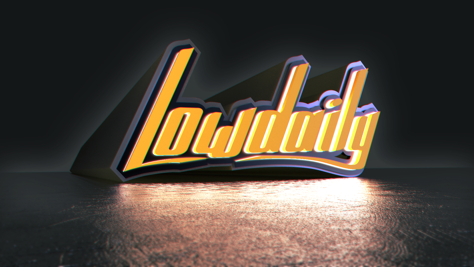
I’m making visual identification for Lowdaily pl (car rally) and I tried using Blender to make it more dynamic etc. It gave really interesting effect and it’s first time I use 3d ,beside archviz and surely not the last.
Hi, I like it a lot, but I have a few remarks.
The first is, the text is not easily readable especially to the right, where the letters are orange/yellow without the dark gap between them.
The second one would be that to me, the reflect on the ground (mainly the right part) is too bright and distracts the eye from the logo itself.
I’m not a logo specialist at all but I hope my feeling can be somewhat helpful.
thanks, you’ve got a point, right side is overall too bright, I’ll look into lightning. Second layer of logo is emission material so it’ll look a bit better in motion, as the dark layer of logo will uncover itself. Logo itself is flat vector this is just 3d variation that I want to animate somewhere in distant future and make kind of short advertisement.