this was done on blender ( I know you know that :eyebrowlift:) and with luxrender, I know its looks pretty noisy(I’am talking about the picture) its due to the time of rendring , (believe me guys I need a super computer to make it clear ) any way , the idea of doing that scene was from me:confused:, its not a tutorial application, I’ll post the real image reference which I start from next time , soo guys :spin: I WANNA HEAR YOUR CRIRICS !!
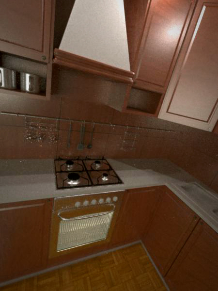
I think that the model performed well. Material tree is probably too bright. Move the camera, and of the floor does not look too good. I think that after these amendments will look pretty good.
the modelling is great but the two flaws i see are this: first is the camera position, i have to tilt my head when i look at it and it still doesnt look right when i do. second is the lighting, that light in the top right is too bright, for me i love the luxrender sun so i would recommend having a window with some sunlight pouring through.
for the floor I don’t think it looks good , and for the camera , my goal was to creat a cool perspective , but I think I did that the wrong way, you can see that the camera lens destortion is pretty exagirated to give that cool view , and the most imprtant thing is the lighting , I think that when i was plying in the luxRender light groups , I liked the shadows which you can see , it was the only the only way to achive that but i didn’t notice that the right top was to bright , any way guys thanks a lot , I’ll try to rerender it and I’ll make it better. 
First finish texturing. Then judge your lighting. You are waisting your time when you render this whole thing in Luxrender just to see your wood texture.
Make the stove door black or something…brown-orange looks awful.
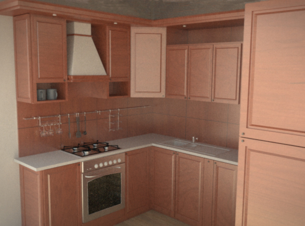
after some tweeking of the lighting and changing the camera view I came with a better result , and here is the referance picture also 
Attachments
Maybe a slight bit more yellow in the wood?
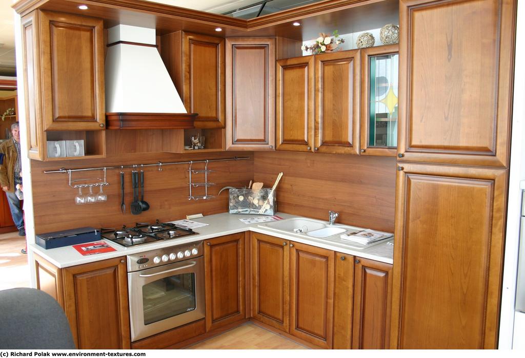
Depends on how much you are trying to duplicate the image, or how much you are adding in creative freedom
I think the wood needs to be slightly shinier if you’re replicating the photo.
look into film response to try and avoid that raytraced look.
What environment is your kitchen reflecting?
actually I liked this soft lighting cuz it give a softer mood like in the morning, for the lighting I didnt use an environment lighting its just the sun light, rendered in luxrender,
I’ll try to post another version with another lighting setup, you’ll that its completly deffirent
here is the other version with a different lighting setup
Attachments
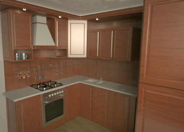
The new image is much better. However, the wood still looks slightly plastic. Maybe try adding some bump?
Jokayo, what happened? Great work … and I was enjoying watching the progression as I read the thread. Seemed to stop all of a sudden. Nice work
Just one word: specular maps… the reflection of the wood is too perfect, and this is one of the main reasons of the plastic look of your wood. If you pay attention to the reference photo, you’ll see there’s a little bump too. But overall is a nice work.
I quick note about the “cool perspectives”. It’s ok look for a distinctive composition, but in architectural rendering is always better try to get this with a human point of view, because the public tends to identify himself with the objective of the camera. Knowing this, if you don’t have a really exceptional control of the composition is better think in this first, and later look for the innovation. Many guys fail in this topic. You finally choose a more conventional point of view, and as you can see, your image is working better.
Notice how in the reference pic, the colors practically jump at you. In yours they are very dull and blend with each other. Try messing with that.