
Nst
Too many filters that reduce the quality.

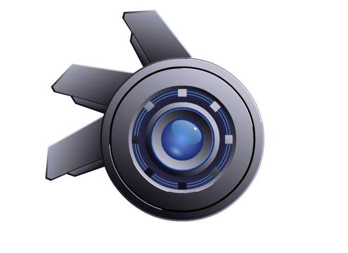
MZ’s right, you know. Less is more, and you sometimes don’t need to slap on filters and other random bits like a blue glowing aura. Original looks a lot better.
the aura, is a result of neural style transfer, which is what did all the other coloring as well.
there was 1 step from the first image to the second.
The issue is some of the filtered effects look more like crappy .jpg compression artifacts than anything eye-popping (which doesn’t stand up to the metallic center).
I know that neural-style transfer is the buzzword you are chasing right now, but you do risk falling into the trap of believing such technology is a magic “make this image great” button that you then rely on without question as to the actual result.
^^Didn’t really ask how it was made, doesn’t really matter how it was made. What matters is if the end result looks good or not. Let me try to explain it with a metaphor.
-If you build a high quality sturdy table with a hammer, screws, and wood, I’d be impressed with your skill at building tables.
-If you build a table of the exact same quality and durability out of entirely toothpicks, I’d be even more impressed with your skills.
-If you build a low quality table that breaks apart easily out of toothpicks, I’m not going to be impressed and wonder why you didn’t
make a table the normal way.
Just because you use a certain technique to make something doesn’t make something inherently better. In this case, the blurriness and all the other bits added to it hinders the overall design.
^Gotta agree with Ace here. Almost thought they actually were compression artifacts at a first glance.
yeah I can touch it up by hand 
It took like 300+ images to find the right one to pop this out
so their is no ‘make nice image button’
it’s still a ton of trial and error.
post #3 looks the best
the background in 1 is icky
something like the first might be the gimp gmic plugin " render / shock wave"

3 was the original before NST and looks flat out cartoony or like a vector graphic
the neuralstyle transfer target made some artifacts you are obsessing over,
where as I was intrigued by the realism the logo center took on.

the style image was my own photographic tampering
this is why it is what it is
I love the originally posted artwork
I really like the vector graphic by alf0
and I like the style transfer image itself.

But most filters like this only work best when you apply it to specific areas rather than treating it as a magic button.
The issue is that you are treating this as a magic button (as if it will suddenly turn you into a professional artist).
I feel like we’re starting to go into “back and forth territory”, which is starting to get redundant. First, somebody offers criticism of the OP, then BluePrintRandom attempts to justify it with an explanation of his neural style transfer technique, followed by criticisms of Blue’s NST technique, followed by more explaining and justifications from Blue, and so on.
To an extent, I was the same way for a little while when I discovered Paint Shop Pro’s “brush strokes” filter.
For simple images that filter worked well, but for complex and realistic images, I discovered it would not actually make things better. In this case, the filter actually worked well for the center of the image, but after that it breaks down (showcasing a weakness that is still prevalent in synthesis algorithms, though I think part of it is due to the radically different perspectives between the reference and the original piece).
:rolleyes:Its nice to have such dedicated fans ace
Post in Finished Projects and you get critique.
You also have to handle it in a cordial and professional manner, don’t complain if people point out a potential flaw (and you can trust me on this because I got banned multiple times for failing to do so many years back).
If you want to have a space where you are free to play around, I suggest starting a thread in the Sketchbooks forum for all of your work (that’s where the majority of Blender work is posted these days).
Actually this is not focused critiques that is a different subthread*
I like it the way it is*
I Have few dedicated “fans” that I do so enjoy like ace :3
^^@Ace: The majority of works are posted in the Sketchbooks section? Sounds off, because to me it seems like it’s probably one of the least active of the Artworks forum. WIP is like three times more active than that (though that might be from other general comments). I also agree with you on the handling criticism part. If I’m being honest, I’m actually pretty bad at taking criticism myself and trying to work on it.
^@Blue: To be fair, Focused Critiques was made specifically for people who wanted actual detailed advice instead of basic comments like, “looks good, man.” However, criticism is allowed in any forum, not just FC. It seems silly to create an entire forum where you can be immune to criticism.
Not immune.
Ace usually gets around to all my threads eventually to the point where I understand will always show up and talk shift eventually. About how I want a "make art button’.
I think he needs to press the “eat a stale dogs shit” button
It is a finished project but I personally don’t like it. I could go and say that I don’t like it but without saying why I don’t like it wouldn’t be nice to you. An artist should listen to the minds of of other and compare it to your own thoughts. Did your artwork do the things you expected?
If you wanted it look good and most say it doesn’t look good then somewhere you missed something.
If you wanted it to have deep meaning of depression and all say it looks comically and shallow.
Some do art for the reality skill as archwiz. There you have to take constructive criticism.