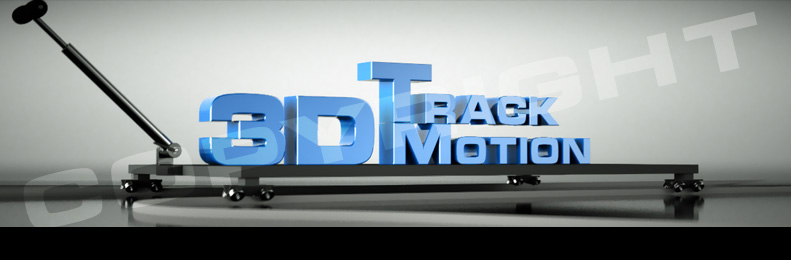
Ok, here is an email banner graphic I made. (took more time than I care to admit to model the dolly and the tracks, but I did detail that ended up being needless in the final image).
Modeled in Blender.
Rendered in Octane - (just direct lighting mode)
Anyone have any issues with it?
Would appreciate input - but would like it if you were constructive rather than just rip me apart :).
I’m by no means great at 3D, but I think it did the trick.
The other one is a banner for an upcoming sale ( just the text, but I’m just patching it on here for constructive crits ) - This one also used octane, but since octane doesn’t provide options a way to remove the BG yet, or generate an alpha matte. I had to create the alpha matte in PS via a little work around, and that may have introduced some jaggies on the edge of the exclamation point.
Anyway - lemme know what you think.
All of these are copyrighted, and not permitted to be copied or used w/o permission from myself. (they’re for clients, but thought I’d show em here).
not much to say here, stuff looks pretty reasonable, lighting might be a little too flat, but otherwise the text is legible and looks fairly attractive.
However, your clients might not like you showing this stuff around on forums, my advice is to stop
Showing it around on forums is no problem. It getting ripped off would be less than cool though. (hence the copyright blended with the images) at least until they’re done using them.
These aren’t big things, and in a few days they’ll be old news to them w/o a care in the world.
In the first one, you should change the text to white and blue, because orange doesnt have anything to do with america haha, but the second one is very nice.