Hello, Community! ![]()
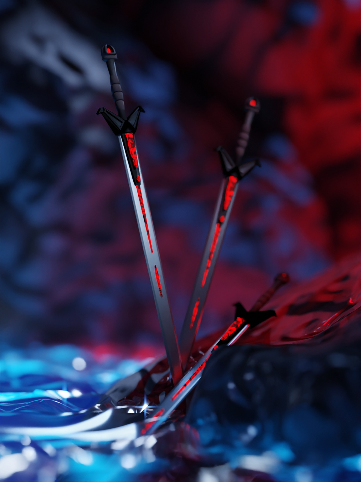
I went dramatic this time. But no worries, she is a strong one ^.^
I’m really open to criticism. It’s really helpful to get feedback, so, please, tell me that you think.


Thanks for watching!
Hello, Community! ![]()
I went dramatic this time. But no worries, she is a strong one ^.^
I’m really open to criticism. It’s really helpful to get feedback, so, please, tell me that you think.
Thanks for watching!
lighting is really good.
Thank you!
Love your style!
The lighting IS really good! The contrast in light and dark is easier to see than in your second to last work- and the colors are beautiful. The form is also beautiful. And the idea behind it- is beautiful  Lovely work!
It looks great, but it is disturbing to see the blood going upward
Looooooooove it 
Thank you! =)
It supposed to go down, where do you see it went wrong?
Joseph \(^▽^)/ Thank you!
But you know that I want  give me critique!
The green arrow could be explained by saying she moved, but the yellow ones i don’t know. It doesn’t seem to be following a natural path on the rock surface
Blood is rather viscous, and doesn’t really flow like water. Also, blood this dark would be coagulated and thick. It wouldn’t spurt or gush, but rather ooze- giving precedence to contour rather than gravity. Personally, I think if you reversed those yellow arrows, it would make perfect sense, but that is just me
Why must you make me do that  Ok, if I must, the only thing that stands out to me is the rock texture (and also the background rock texture.) It’s definitely stylized, but it seems too plastic- too smooth, perhaps, and also too specular. The water also seems to be solid rather than liquid, like clear acrylic. You can see it in the way the light travels through it: even being translucent, that material has a lot of depth and thickness that is not often seen in water. That may be intentional, though, as it seems to fit the mood of the scene?
You are saying exactly the same as me. The yellow arrows represent what the blood needs to do to go from the beeding point to the trajectory it took. Which is not really intuitive, especially for viscous fluid that have inertial momentum dominated by viscous effects.
Anyway, the whole picture looks really good, i was just saying that the two yellow arrowed blood path are kind of weird and in my opinion shouldnt be.
Oh I see what you meant. I misunderstood you
I totally missed that! >.< Thank you for visualization! It does looks weird and it bothers me now quite a lot 
Tip for myself: don’t forget to check the basic logic ^▽^)
Thank you for help! 
Cause it an important part of being an artist! Looking for things that can be improved 
I see about stones, I’ll try next time add more textures. I feel like if I did that, the water wouldn’t disturbed you that much.
I didn’t say it disturbed me you forced me to critique. but, good idea with the stones 
Oh oh :>
Thanks for help! 
awesome work.
