Dont know if i should put this here … modelled everything in blender but put it over in maya for the texture and light tweaking using ipr and ended up rendering the final version there too.
I think you could kinda the same effect in blender though and if i get some time over i would like to convert the shaders from maya to blender (gonna wait till 2.42 when the new material nodes come though).
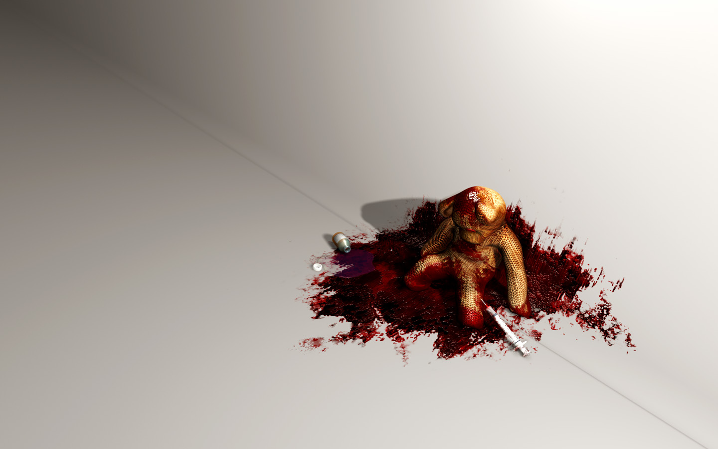
Anyway im kinda sick of this right now… the original idea was to point out the differencies between the harsh world of drugs and the voulnerable world of childhood, but i dont know if it shows in the final image
it is quite a stirring image, to say the least … i can definately agree it hits the vulnerable image of childhood safehouses.
continuing on to critique … if this were to be a photograph of a mixed-media project instead of a computer render, the blood splat looks to be made by a wad of cheesecloth dunked into oil- or synthetic paint, then struck onto the set. in other words, the end texture doesn’t appear as real blood would under the same circumstances. real blood isn’t that thick. i don’t know if “blood is thicker than water,” but i’m sure a balloon full of blood will make the same splattery mess as a balloon full of water would. i can’t show any specific images to illustrate my point, but i think browsing the “Macabre and Horror” photograph category of DeviantART.com would help a bit.
hehe thanks for all the nice comments (“disturbing” and “sick” is good right :P)
sariel: thanks for the tip, i have other projects in the same theme and i was looking for good input as how to get the blood good
the thickness in this picture was to get a kind a coagulated look… as if the bear had been laying there for a while but im not totally pleased with it, will definitely look up deviant art.
It does look exceptionally good, though it looks like he’s trying to get up and is using the wall for support while his legs push him up. That may be why he doesn’t look perfectly aligned with the floor and wall. This is still a very good peice though. I laughed for a good while.
Yeah, it seems like the gore is almost merged with the burlap texture of the bear.
Maybe one thing to consider is how you might simplify the picture for maximum effect. Start by cropping it in more closely, then make sure that it presents an instantly-recognizable story. I want to know, at a glance, exactly what happened here. I want to know, at a glance, what the syringe is supposed to mean. I want to have some clear emotion to be evoked, again “at a glance,” and I don’t want that emotion to be “huh?” Decide exactly which heart-string you are going for, grab it clearly, and yank.
Lighting, maybe a shadow gobo on the light, lighting color, will also help to make this picture snap. Point of view and the choice of camera lens is also going to give punch.
I wonder if it would be better to have a subtle texture on the wall and floor to help show their orientation. At least in the foreground, things are washed out. There’s a gray line that sort of looks like the boudary between wall and floor, but shading in the background, and positioning of the body and left arm suggest that the wall/floor boundary is actually farther to the right. Texture would help the eye pick out the surface orientations and the transition between them. Something like I used on the background surface of this:
(though I’m sure you can do much better). Not that it is really that important for this image I suppose, it is just that if I look at the image for more than a few seconds I naturally start trying to figure out what the geometry is. On the other hand, a not-so-subtle, bleak, institutional, cinder block (cement block) wall might contribute to the image’s message.