This is my first post here, although I have been reading in the forum for some months. This board has helped me a lot so far, answering hundreds of questions (thanks!), but now I am in need of some last hints and focused critique.
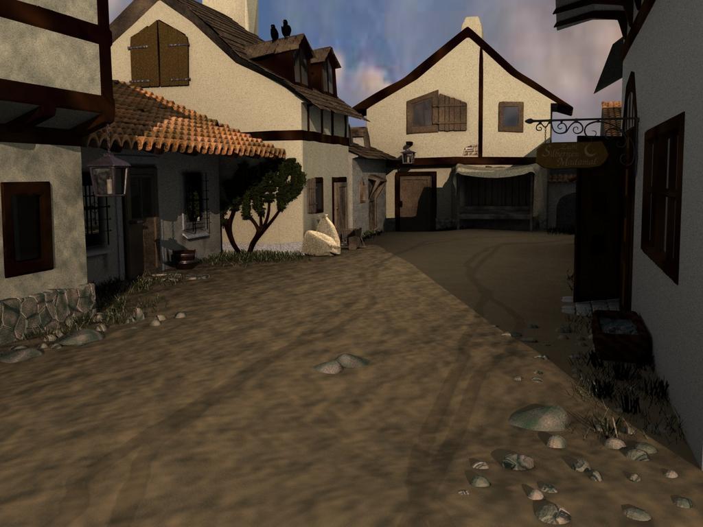
In context of a bigger project, I need the following scene as a background for some characters I would like to put in there.
It is supposed to be a medieval/fantasy village, but it lacks some “reality”. Too clean, too modern, I suppose. I think there are a lot of details that could be improved, but i am running out of ideas. So, I would be very happy if you could give me some hints on how to make the scene more realistic. I’m looking especially for things that do not involve redoing major parts of the scene.
So, here you go.
I think you should adjust the lighting a bit (unless it’s intended), and the ground needs a bit more work; it looks good, but it looks flat at the same time.
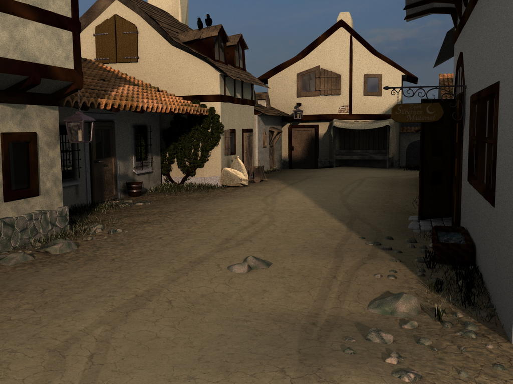
I tried to improve the ground, and adjusted the light. AO works beautifully, I did not even know something like that exists
I have not done much with the rocks, however. I might address the issue later. @hessiess: You are right. I am working on my laptop, which means I can’t calibrate my monitor, but I will try to use a calibrated one as soon as I can. I hope the image is brighter now.
Still, I am not entirely happy with the light. I want it to be an evening scene, let’s say half an hour before sunset. It doesn’t feel right as it is, but I can’t tell why.
I have a sun lamp at the moment, which also casts the shadows. One often reads about using a sun lamp for the light, and an additional spot lamp for the shadows. What’s the advantage? I find it hard to adjust the spot in a way that the angel of the shadows fits the light angle…
Still, all kinds of comments and hints welcome. And thanks again for your help
Looking good! Big improvement from the first image (which wasn’t bad in the first place).
I would agree on the issue of the rocks, you should model them in instead of just using a texture.
The ground texture would look good if you had a much much higher reseloution verison of it. If you can make a higher res version of the ground texture, make a bump, spec and displacement map from it. It’s too flat right now.
You need a higher res cloud image in the background. It;s too pixelated as it is and that draws from the realism of the whole scene.
The ivy growing on the building in the center of the frame looks odd. In the first image I thought it was a small tree, but it looks really flat in the updated version. The mossy green part looks fine, it’s just the brown section that catches my eye.
Definitely needs soft shadows for an evening shot.
Change the color of the light to add a little bit of pink/red to make it look more like sunset.
Add a bump map to the textures on the building (if they have one, maybe increase the norm a bit?)
Bevel every sharp corner, even if it’s just slightly. It will make everything look more real. If you don’t want to go in and bevel all of the corners, then pick out the main ones and just do them.
ok, here’s my take on the image.
first of all, use PNG, because it will have less artifacts.
i circled the areas that i think need improvement.
the rocks look like you just stuck 'em in the ground.
really, the ground should be interacting with the rocks
the section of stone wall, i think is a voronoi crackle texture.
take 5 min, go to cgtextures and find images.
as a note, for stone walls, you can use a distorted noise texture.
1st tex, blender original, 2nd tex, voronoi crackle.
distortion amount, somewhere around .3
the windows look dull, maybe because they don’t have enough to reflect.
the tree looks like it is part of the wall texture, maybe it is.
the sacks, at least give them a displacement modifier with a suitable texture.
Ok, so I am done for today, but I have not had time to do all the things you proposed. I will continue tomorrow
Still, here is an image on how far I got.
I did:
improve the ground
change the sky
tried to improve the ivy-thing, although I am not entirely happy with it
started something on the rocks, but they are not finished, so just ignore them for now
changed the light a bit
added soft shadows (soft enough? too soft? hard to tell)
bevelled some of the corners (are there some left that you think are too sharp?)
Still to be done:
improve house walls (texture, dirt etc)
the rocks…
want to change the wheel tracks, they do not fit in
do something about the dull windows
So, comments welcome and thanks again for the valuable tips
PS: it’s again jpg, since png was too big. I will upload it somewhere else, next time.
the tire tracks are very unrealistic now, isnt dark enough, needs more effect on the texture, also theres something wrong with the wooden shutter texture in the top right, just doesnt look like wood to me, i would also suggest adding some slight colors in your lights. lastly the glass in the building in front of the scene doesnt look right, something about it doesnt feel right. good luck!
that’s looking better
there’s something weird going on the sack things
30 min. before sunset, the light is fairly pink
so in general, what i would suggest would be a sun lamp, pinkish to taste, a hemi lamp, slightly purple maybe? and AO on sub to darken corners
i’ve heard about some sort of ivy generator that works with blender, haven’t used it though
the rocks are looking good
now that i think about it, the grass needs work
you may have to do it by hand
It’s improving every time and that’s great. I agree with the stuff people have said so far. However, I think the largest thing that is keeping this image from realism is just the lack of detail in everything. There is just not enough stuff going on. It’s lacking bevels, lacking props, lacking beams and wood support. But most of all it’s lacking detail in the textures. When doing a still like this you need to tell a story with the textures. Put some dirt down near the floor, put grime dripping from seams, show some weathering. Get all your wood grain going in the right direction! Your walls appear to be a solid color with some noise map on it or something. The one on left appears to have some uniform turbulent darkening applied over the whole thing. There’s nothing that screams “i am computer generated” more than some procedural algorithm attempting to break up the monogamy of things. If you want it to look realistic there are no shortcuts. Everything must be unwrapped and every square foot of every texture must be carefully crafted. CGtextures.com has excellent photos to composite in your textures, but you still need to composite and blend them onto your carefully-thought-out uv templates.
I would think your scene would look ten times more interesting if it weren’t just a summer afternoon. What if it was stormy and raining. Maybe if there were a subject other than the buildings like a wet cat/dog trying to find shelter from the rain. That would look really cool with some DOF and some color accents. It would be totally amazing if you made the road look something like this: http://www.endless-highway.info/tokyolondon/Img0057.jpg
I corrected the color scheme in Photoshop so it is far from perfect but this should give you the general lighting idea. Sunset lighting is much more deddish than you would think so use a frankly redish sun along with a blue-slightly purple AO. Lower the sun nearer to the horizon too. Right now, the sun is too high for a sunset effect. A lower sun would project much longer shadows on the ground. Adopting the “linear workflow” texturing and lighting method would simplify the whole “get the right effect” work too (the first thing I did is gamma correct your render).
Apart from that, I agree with the other texturing and beveling comments.


