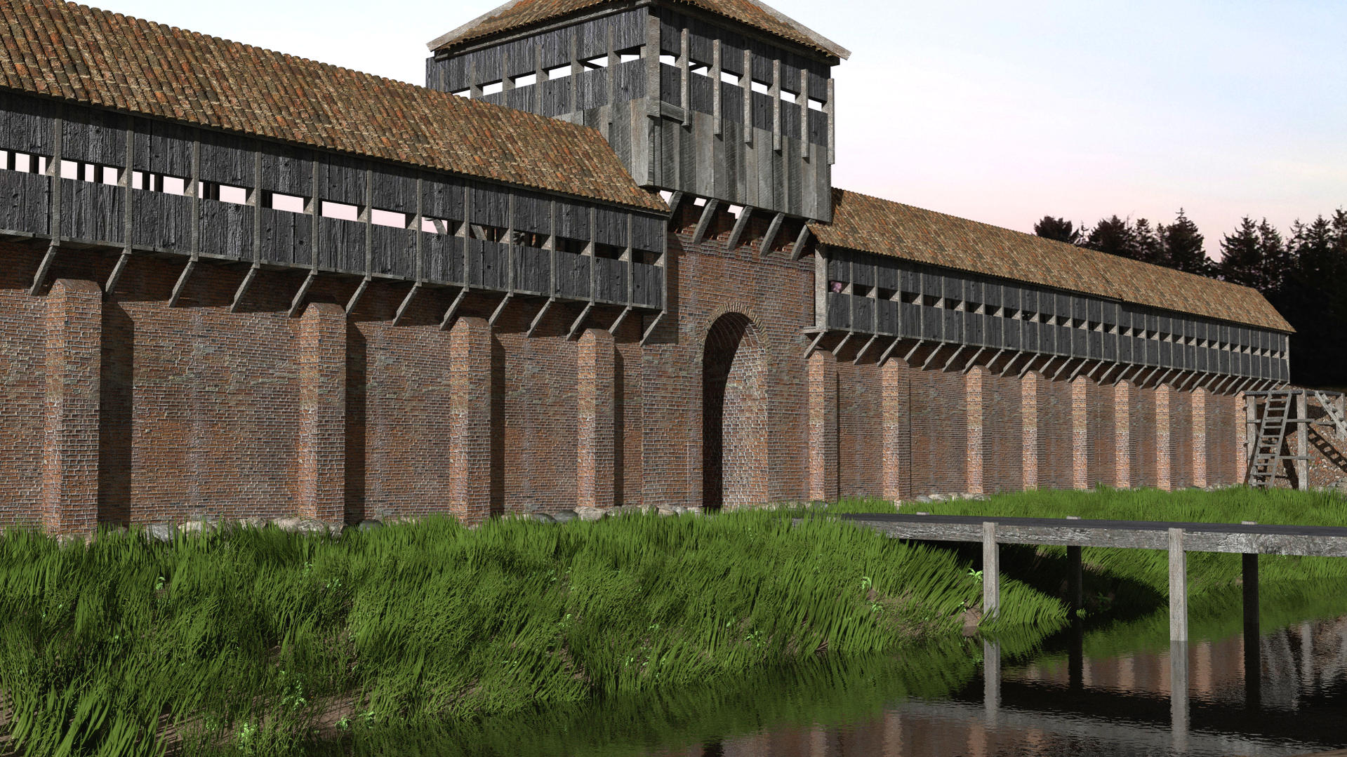
I made this wall, a re-construction of Danevirke (a Danish medieval fortification in Southern Schleswig).
It is meant to represent the Valdemar The Great’s extension of the older Danevirke.
For some reason I can’t get the grass to look right.
And the bricks in the wall seems to go inwards, instead of out, using the bump map. I don’t know how to solve it.
Hey philosopher,
This scene looks great, I really like the modelling and the materials look nice also, and especially the water looks nice, is it with a bump map?
For the grass, there lots of things you could do about it, search for some tutorials. Even if it doesn’t look bad, there is space for improvement. I would suggest these things:
Add some tranclucency if you havent already.
add a texture if you haven’t already.
make multiple particle systems, controlled by weight vertex groups, and assign different materials to each, so that you have variation in the length of the partcile and the darkness of the texture.
For the bricks seeming to go inwards, if you are using cycles, here is what you should do: go to the node editor, and in the add node menu select colot>invert. Then connect the output of you texture to the image input of that invert node, and the output of the invert node to the displacement. If you’re using Blender Internal, just make the normal influence value negative.
By the way, are you using cycles or Bi?
Anyway, the overall image looks good, continue!
-Jonathan
I already added both texture and translucency on the grass, already controlled by weight painting.
I use up to 4 different types of grass blades and as you may eventually already see, I’ve added other plants as well.
looks good but apart from the grass there is seams in wall tex ! spoils it a bit
there is also seams in roof but not so bad and every “wood panel” is exactly the same
will say you can do better then me and I sorta feel bad saying that your work aint great
but you have the change to be great NOT average
I always like your work, well done. I also like the roof tiles texture. What I’d do is work in PS or Gimp the main brick texture and add dirt and leaks, especially where the timber beams meet the brickwork. Moreover, I think timber tends to blacken after a while, but that depends on whether this wall would be newly built or already existent for a couple of centuries. When was this wall built up?
Also, I do not know in this case, but almost every medieval public building such as walls and gates had additional holes for beams. So I would add some holes beneath the ones which should host the timber supporting beams, and some on the gatehouse as well. Also, a couple of slit windows in the gate (for bows or crossbows, or, if your render is set in Early Modern times, even loopholes for artillery) would make no harm, and make it all look more realistic.
Looking awesome. I can see, that you have invested quit a bit of time in this. I agree with Manorial on the wall issue, to me it looks like it was recently renovated.
I aggree good modeling, but texturing could be better, also i would add some DoF. Maybe use the Doorhouse as Focus. Add some dirt on your textures, and in the end i would add some things that make the scene more alive (people, animals, flags, banners, just to get some movement) cause right now it feels more like a 3d animation for a info - movie.