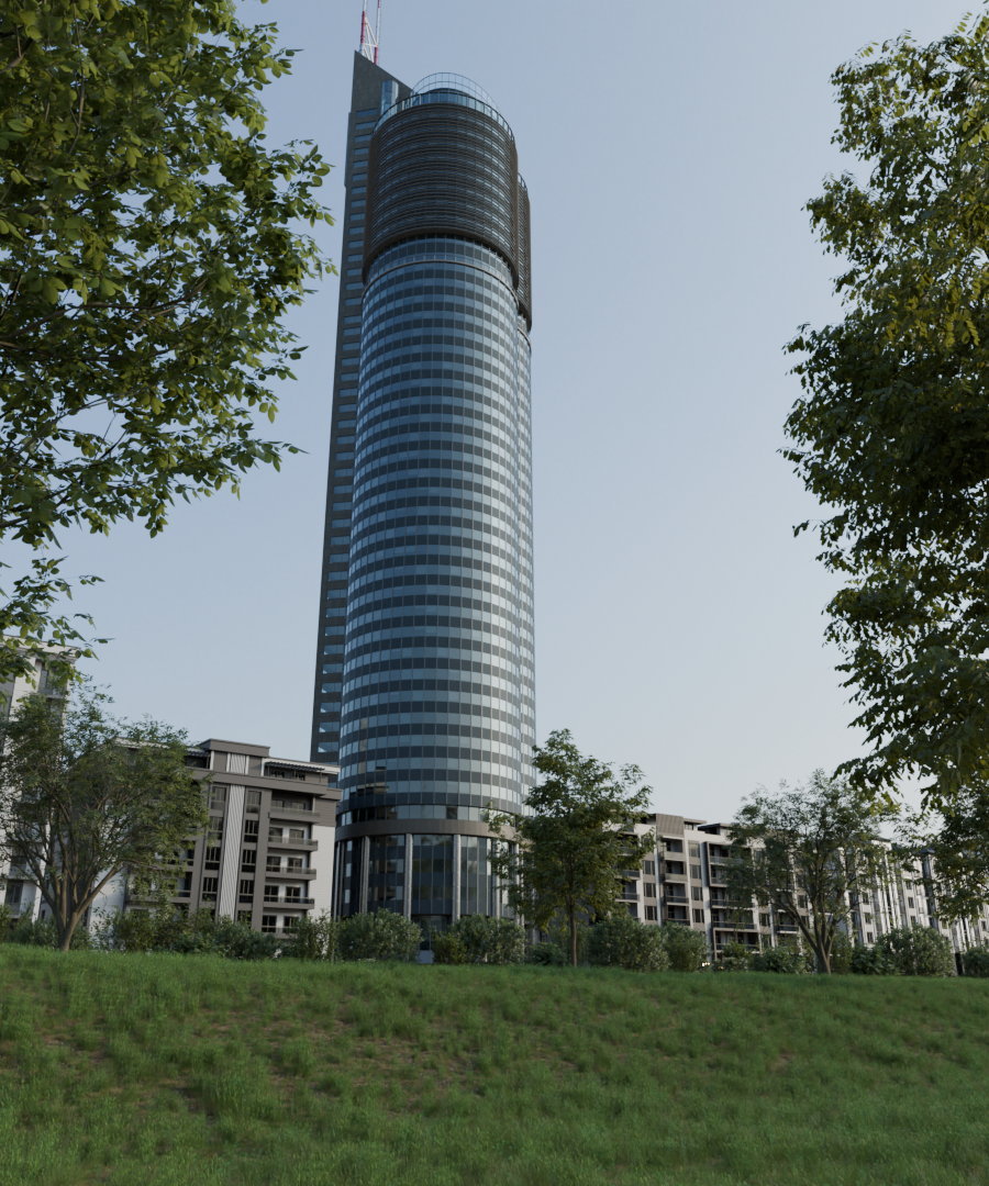
I made the Millennium tower in Vienna as my third archviz project. The sorrounding buildings are downloaded assets and I used Botaniq for the vegetation. I would like to see some advice how to make it look more professional and generally what to improve
4 Likes
It looks very much like a photograph of the real Millennium tower in Vienna.
I suspect you could convince many people that it is a real photograph.
So you have achieved much of the goal of a 3d artist in recreating something from the real world, and that it a notable achievement!
Now ask what might impress someone?
-A topological display of your 3d model would be a good start. That would communicate some level of craft.
-Something compelling in story telling or narrative would mean a lot. How about adding something unusual or interesting?
Sadly I must say currently this is not compelling. It looks like a generic photo taken by a walk-by tourist. You must think about how to make it communicate your craftsmanship…or make it more interesting as a visual.
Try to think like a photographer at what makes a break-through photo. Try to think like a story teller.
2 Likes
Thank you for your advice, I have always focused mostly on the realism and never really thought about anything else that could be imporant. I can feel the difference between this and some artworks of real archviz aritists, but I have no idea what it is. Could you please tell me what I could have made differently to make it look better? I have heard many times that my renders should tell some story and these things, but I just dont understand what it means
I’m near bed-time and have had a few cocktails…my mind is fuzzy.
But I’ll try to a few suggestions.
-
Google (or an alternative search engine) must be your friend. Search for whatever (Millennium Tower, for instance) and then switch to images mode so you can view as many visual references as possible.
-
Pick your favorites then start to ask as many questions as you can. What are the camera angles? What is pictured beside the hero object? What is the foreground, what in the background? What is the likely focal range of the camera (wide, 50mm, 200 mm etc). What are the loveliest color combinations? Try to force yourself to ask 20 questions at least about the images.
-
Then ask yourself… if this subject is my chocolate…how can I complement it? What is my peanut butter or caramel, banana or raspberry? Maybe it’s an odd looking old man in the foreground or a lovely couple. Maybe it’s an aerial shot and there is a parade taking place. Try thinking of natural…and crazy combinations.
-
Try to push for some extreme: Grandeur! Humor. Contradiction. Spiritual. Earthy. Polished. Gritty.
2 Likes
Okay, thanks, I wont bother you anymore, I will think about your advice.
You certainly aren’t bothering me! You are helping me to be more human, which is a prod I welcome.
Ask again anytime. I look forward to your progress.
2 Likes
That’s good then lol. I thought about your words for a while and I don’t know if I understood it well. I know I should make the picture more alive and interesting, so maybe I could add people in the foreground and a sidewalk with some benches, but I don’t think that would be enough. Is the problem only in the absence of some unique things, or could also the lightning or postproduction be done better? (I’ve done no postproduction actually, zero knowledge of pohotoshop or blender compositing). I found out most archviz projects about skyscrapers use the nightime to make the scene interesting. Also most of these artworks don’t focus on strong realism, but rather use some extreme lights and colors everywhere, is that what’s also missing here?
I don’t know if that helps, but you could try watching some street photography videos like this about compositing:

you can learn techniques like using the rule of thirds: place the tower one third from the left or right edge of the photo and maybe the street in front one third from the bottom (if there is some street or pathway). you could also make several differnt compositions (since you already have the complete scene ready), like zooming in and only showing a detail of the tower (cropping), a close up where only the first floor(s) are visible and maybe tell a story, but you’d probably have to add detail if you textured and modeled it with the idea to only show it from far away.
1 Like
Thanks, I checked out the video and I have some ideas what to change, but I also think I’ve done some things right. I have the 2 trees in the foreground, the sky is bordering the sorrounding buildings in the first third from the bottom and there is a clear sky as the negative space. Maybe I should move the tower more to the left so it’s more in the first third and add more things in the foreground, but idk what else. The cropping and zooming wouldn’t be a really good idea here, the scene is built just for this view and I want to show also the vegetation and stuff, so even if it looked nice, I’m not looking for this type of image.
1 Like
Just to add something different to what others already rightly said, I think the surrounding buildings needs more work. They are too clean and seems really empty. If you need this scene lighting then you can turn on some room lights here and there and also some in the tower hall.
Furthermore, sky seems really empty. Some birds, one soft cloud, etc could add atmosphere.
There are many talented artist about exterior archiviz on BA, search their works using ‘exterior architecture’ tag.
2 Likes
Thanks for your advice, the sorrouding buildings are downloaded and they’re the best looking free ones that I found on Blenderkit, so I guess I’ll make my own next time. I plan to add a night scene with room lights, but I’m not a really big fan of room lights in daytime, because that’s not what you see irl. For the sky, I though about making some more renders with different hdris, but I’ve also seen some professional renders where a clear sky covered half of the picture, so I don’t actually see a problem there.
I think you already did quite well in terms of compositing. I just noticed that you forgot about the most important rule in architecture photography. Vertical lines should always be perfectly vertical. This can easily be fixed.

The cropping was just an idea if you wanted to do more with the building.
2 Likes
Typically with architectural 3d you are looking to really put the shine on your subject. You want to make the environment seem like a real destination, or a place you’d want to spend time in/near.
Currently your grass is a bit spotty…not fully grown in. How about a lawn fit for a queen? How about some terracing? Maybe a winding path or walkway. Change that hard incline and put a pond in place with some golden carp. Or a brightly colored gazebo. Just throwing out some ideas here.
From a color standpoint the scene could absolutely use some bright complementary colors like gold or orange.
2 Likes
One additional tip: Consider three levels to any composition:
Foreground, Middleground and Background.
Here is a video that gives examples and concepts from the photography world:

2 Likes
That’s definitely what I need to fix, never realised it’s a problem and always thought it’s natural for a building to look like this, thanks for the tip
1 Like
I understand. I think I’ll just edit the foreground and change the lightning to make it more magical. I also thought about making one more render with like a mysterious atmosphere, where the scene will be covered in fog and the buildings will have lights on, idk if that’s a good idea.
Me like! Have fun pushing your creative juices.
1 Like