Hi all, I wanted to start a feedback thread for my Minimal Dark theme. It’s included in Blender and I actively maintain it, so you just need to head to your Preferences to find it!
The overall idea is to keep it as simple as practical - nothing should be unnecessarily shouting for attention but everything should be easily legible. It’s intended for folks who are already familiar with Blender and don’t need as many visual cues to find things.
If you find any areas in Blender where the theme makes something not legible or not as clear as it should be, please let me know here! I am open to also considering changes that are more personal preference type things but they have to stick to the overall design philosophy.
The most recent version with a few tweaks for 3.0 Alpha can be found here: minimal_dark.xml (46.0 KB)
I use Minimal Dark sometimes. The only complaint I’ve ever had about it is that the different colors for edge marks, like UV seams, creases, bevel weights, sharps, etc. can throw me for a loop when I open up an old file. Sometimes, I wish they were the default colors, so I’d know what’s what.
It’s a small bugbear, but a bugbear nonetheless. Admittedly, this wouldn’t even be an issue if I didn’t switch back and forth between minimal dark and the default theme so often.
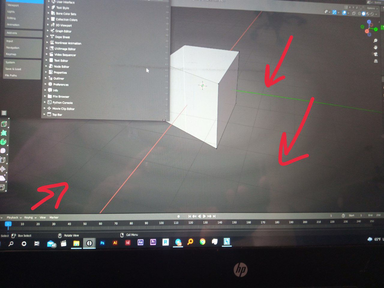
I’m really In love with the theme, but there is just one issue for me. How can i get rid of the circle things that appears in the viewport, looks like some sort of banding issue.
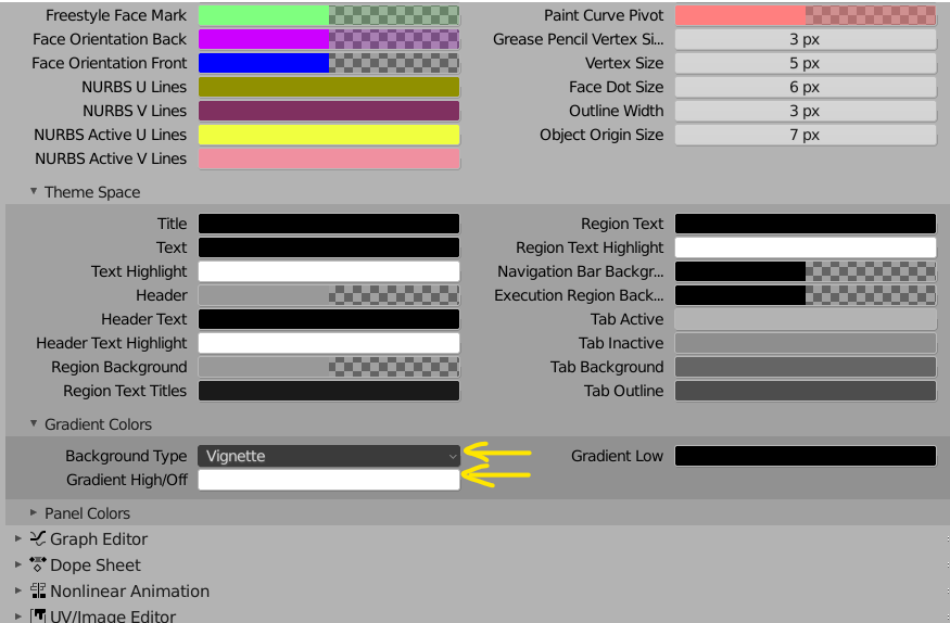
Themes → 3D Viewport → Theme Space → Gradient Colors and change Background type from Vignette to Linear Gradient or Single Color. You can also tweak default background color here (Gradient High/Off input):
I’ve seen a few other people have this issue as well but I’ve never seen it, so it must be a monitor-specific thing. I could probably leave the gradient off by default if it turns out to be a common issue.
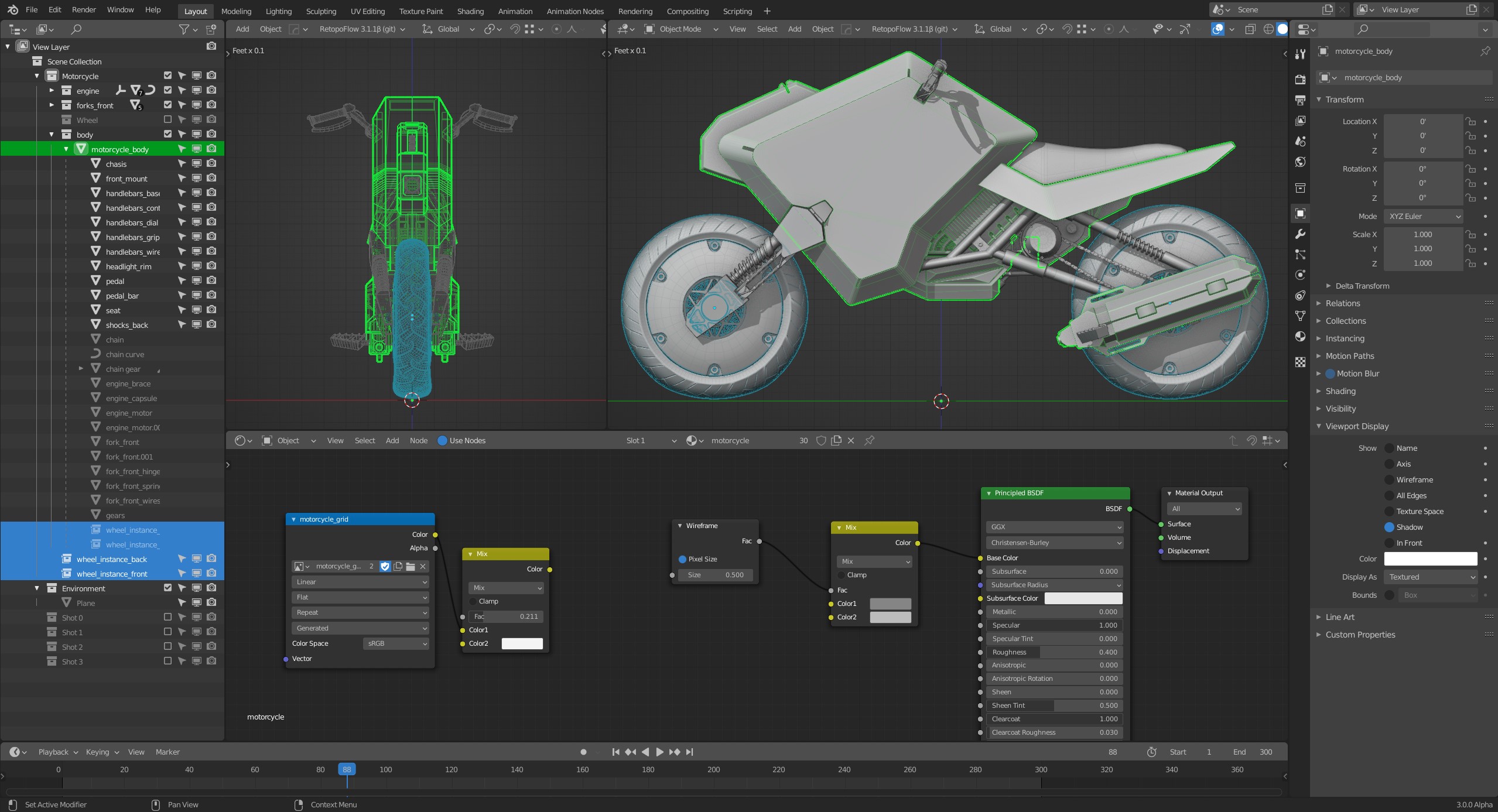
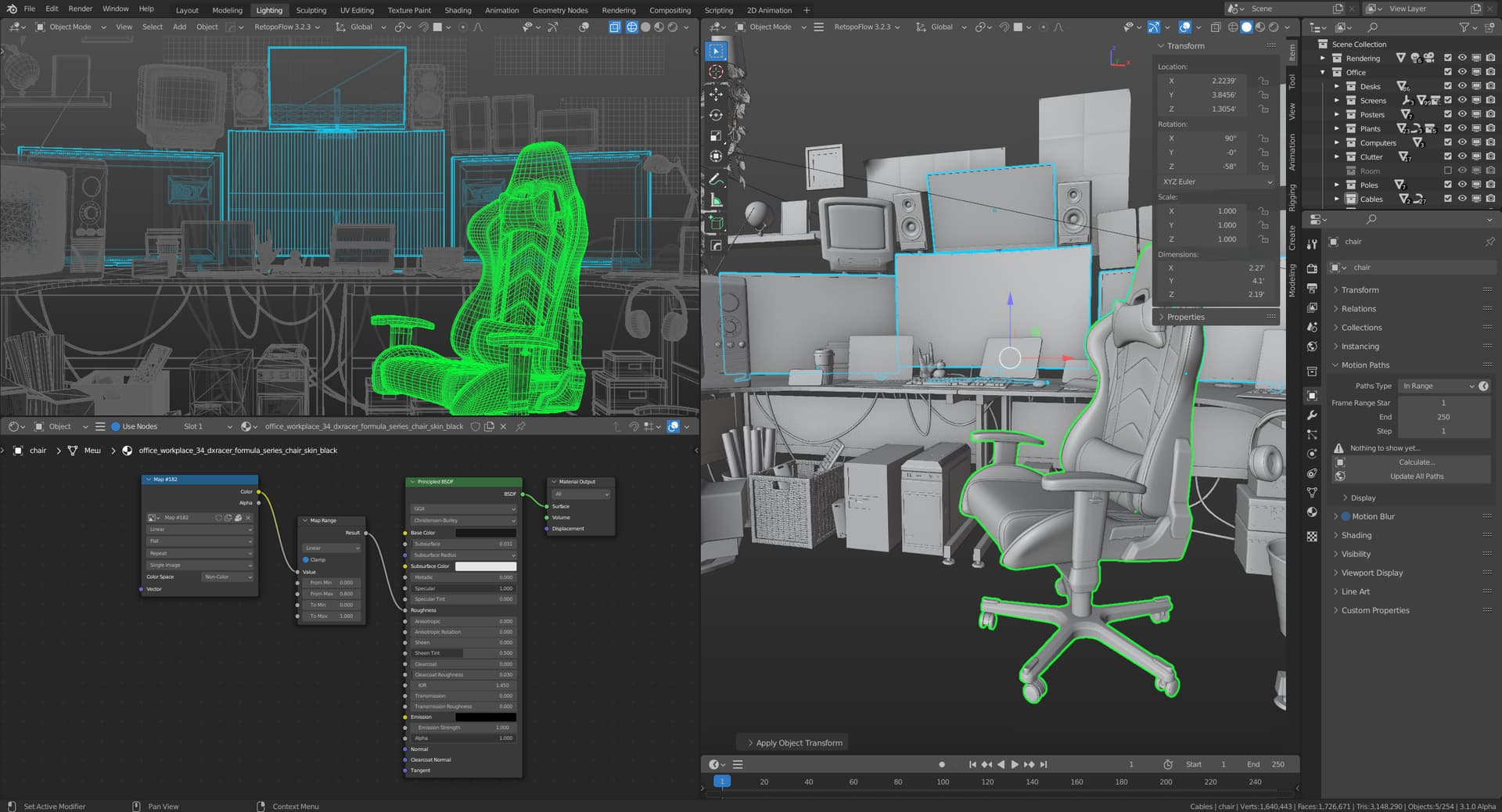
This has been updated for Blender 3.0 and the changes have been committed, so just click on the preset again to update. The changes are relatively minor but will slightly improve the look of the new panel styles, new node editor dots, headers, and edge marks. I’ve also switched the gradient to be a linear gradient so that it melts into the 3d view header and sidebar tabs. It should also create less banding since it has a little more contrast than before.