Hi guys,
I’m looking for some critiques for a project I’ve been working some time on.
Feels like something is missing but can’t seem to put a finger on what.
Any critique to make this better would be awesome!
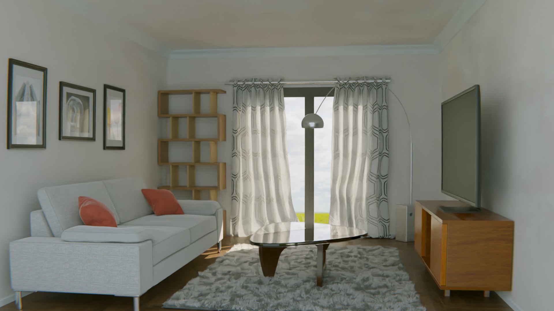

I think you need to increase the amount of light. It feels a little dark. The second image looks better I also think the second image’s scenery is better.
The drapes look a little weird because they looks like they were moving and then frozen in time. Try making them more straight. Also I think the light is really blowing out the fabric pattern
Put some accessories on the bookshelves
And put some surface imperfections on all the glossy surfaces (coffee table top, tv cabinet, tv, pictures, etc.)