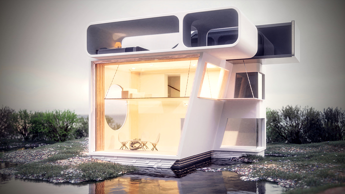
I designed and rendered this house for a school project and I was hoping for some critiques. Anything you think about it just tell me, I am grateful for any suggestions!
4 Likes
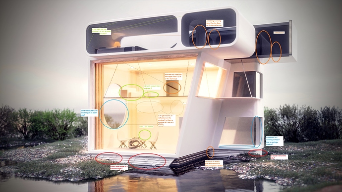
- no windows?
- is that top side (blueish window) reflecting the front side of the building? if so in mid section the pillar is incorrect and it has double reflections?
- from this side i wonder how do i get into the bedroom?
- lighting, bit to bright on the right side
- furniture the same color as the walls/lighting? the middle chair is barely noticeable
- the kit or wires at the bottom (above the water) are to long i would cut it where the grey ends to give it the fake look of hitting the other side instead of giving the feel that it is floating away from the wall.
How i think about it ![]()
Other then that great work.
I would tone down the lighting inside the main room, also the top part of that space looks a bit empty with only one couch. Other than that, it looks pretty sweet!
Thanks! @Cotaks you are right about the interior, I needed to spend more time and thought about that. I do think doors and things like that would add more realism, also make it more accessible and human. I’m not really sure what you meant about the front window, there is a hole that makes sort of two columns inside that little room and they are being reflected in the window behind it

