Hey guys, super simple scene for my sister as she has started going monopoly crazy, plus it’ll be a little fun project for my self
the end result is planned on being a little quirky, like maybe designing some of my own player pieces or something?
not quite sure yet, but photo realism is first and foremost
Very nice I like the glossy plastic of the houses. But I have a few remarks :
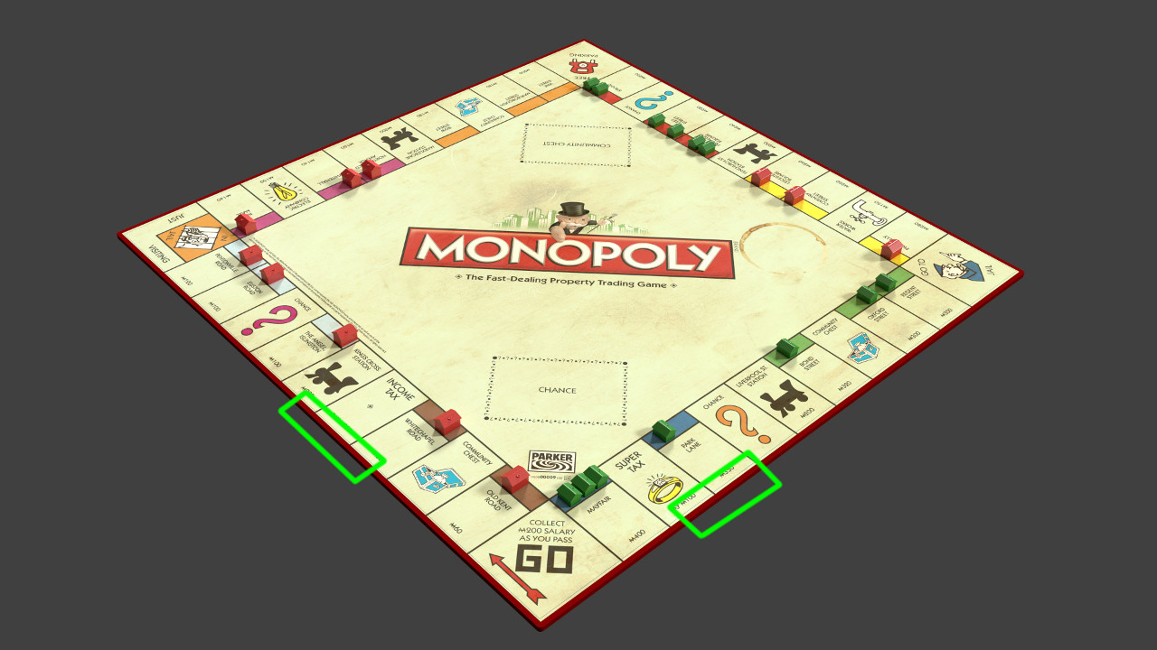
I think you should make the borders of the board more round, it looks very sharp. And if you want to make it realistic, you should add some ‘damage’ to it, a little dirt etc, it looks too clean.
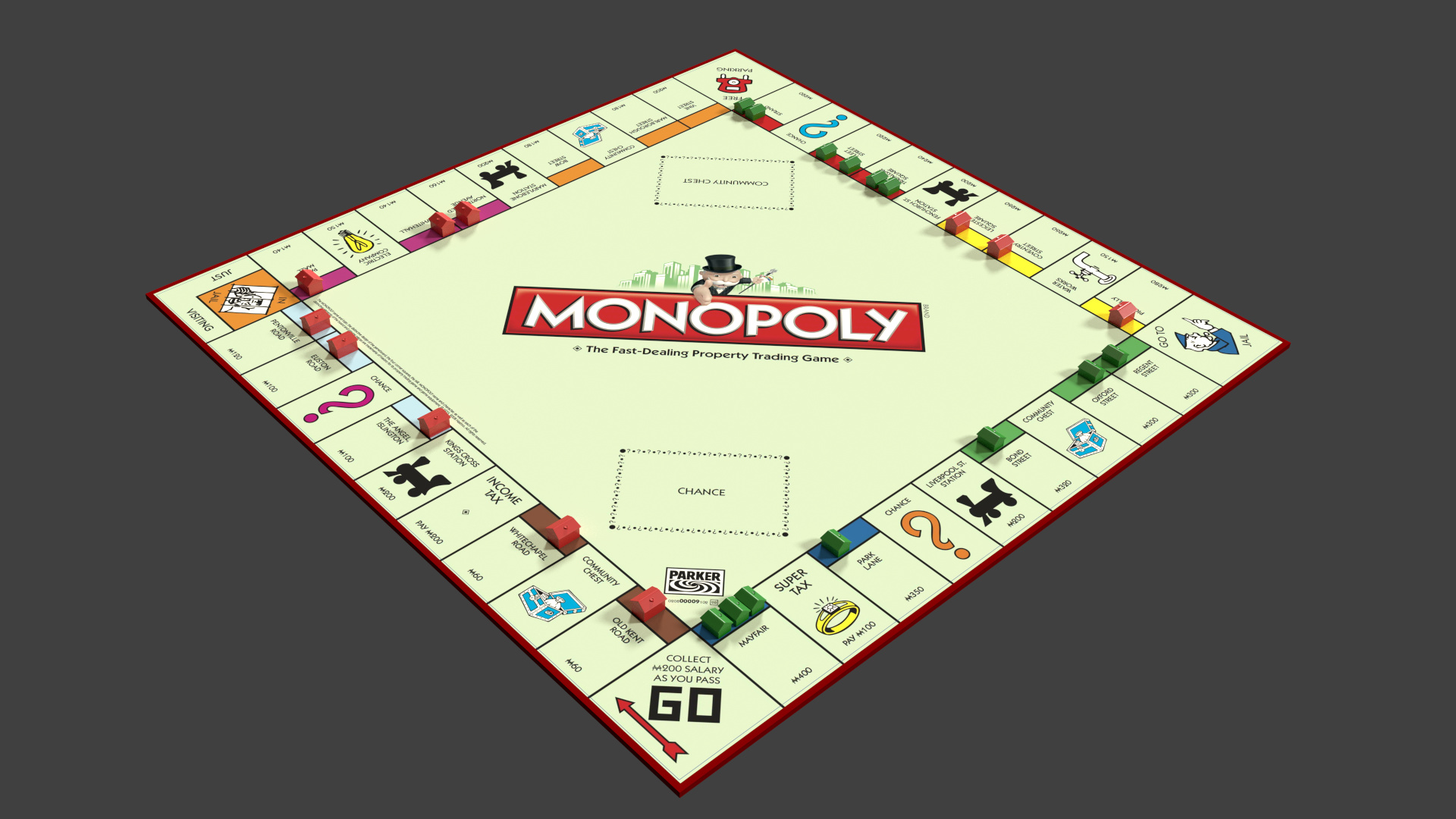
It’s a nice start. Maybe add a little more variation between having all hotels on the left and all the houses on the right. I know it’s cheaper to build hotels on the first half but yeah.
Also the fold marks in the board would be really nice to see too.
This is actually a replica of a game that i whooped my families bums at
Dark blues and greens were owned by my last opponent!
but i agree with the board creases + i will be touching up the house positions as we rarely ever have them that neat!
(upside down houses in a group are common in our games lol)
Haha, cool to replicate an actual game
I forgot to mention (I’m a fan of this game too :D), you can’t have 1 house on a street, and 3 for the other of the same group (the dark blues). You can only have 1 more house than the other street. But if it’s an actual game, then somebody cheated (although it didn’t prove to be efficient ^^)
For the rounded corners, that’s not exactly what I meant. Look at the green marks : those borders
It seems you changed the board texture, but now there is a little shift between its lines and those underneath, as if you had 2 textures (it’s visible between the green streets and the red border)
Last little thing : The new texture changes the way the coffee stain appears, now you have a light part of it that looks strange. I think the coffee would only make darker stains.
You’re almost done (And the chance and community chest cards are missing ^^)
This is coming along nicely. Now the board is amazing and pretty realistic, but the cards are too saturated and should be a bit worn as well.
The table is too distracting imho, try to turn down the bump a bit or try a different texture with less detail.
But yeah, Great stuff!

 I like the glossy plastic of the houses. But I have a few remarks :

 (although it didn’t prove to be efficient ^^)