My latest image, been working off and on on it for the last 2 months. Post processing done in paintshop, C&C greatly appreciated, thanks!

My latest image, been working off and on on it for the last 2 months. Post processing done in paintshop, C&C greatly appreciated, thanks!
I love the lighting and the sky. but some of the texturing… I dunno. Parts of this scene make me think it’s a high-quality cut-scene from a video game, rendered with the game engine. This probably comes from the textures on the ground and that hole with very polygonal edges…
very nice, otherwise.
I thought that same thing about the video games when seeing this. I think the tiled texture would benefit from less specularity. With everything else like a ruined city the polished tile look just doesn’t fit in.
-Anthony
I think, instead, that is a very good work. I think that in some cases the exasperated reality of the scene is worse than a more artistic approach. I think that your work is artistic. Very appreciated.
Bye
Ivan
nice atmosphere- and beautifull colours
was the smoke postpro or blender?
The sky, lighting and colours give a great sense of what the scene means and tells.
The textures, as mentioned before, are very lacking on the ground and all around. To a degree, some of it even looks a little plastic instead of stone.
BgDM
I really like the mood and colors of the piece.
I agree with the posts about the ground texture. It looks a little too reflective. There’s also a little minor nit with the statue, the neck and wrist look too thin to support the weight of the head and hands.
I also think it could be stronger with a little cropping. You’ve got some nice work in the statue and the surrounding area. It gets a little lost in the ‘big’ picture. Assuming the statue is the focus, I would also move it from dead center, it’s a little static there.
Cropping it also removes some of the problematic ground area. Which is a ‘pro’ in that you don’t need to fix that area, but is a ‘con’ in that you spent time working on that area and likely want it to be seen as well as the fact that it is the place that shows the ‘war damage’ - so without the blast areas, would someone understand the piece? Maybe there’s a way you can carry that to the parts of the model that would be visible still. Not sure.
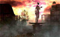
Cropping improves the scene, because the pool in the lower foreground, being lighter than the rest of the scene, draws the eye. The bright sunset behind the statue also draws the eye – away from the statue.
This is certainly a nice environment, but my eyes find themselves searching for “what is the intended subject?” Of the statue I can see almost no detail, and the structure itself seems oddly thin in many places – I’d like to get a closer look. Or, I’d like for there to be something in the foreground, something that I can see clearly, which tells me something about the statue. And, I’d like to see converging-lines in the composition that lead me to the subject. (The diagonals that are in the scene now lead me beyond the subject, right out into the sunset. The use of light and shadow is very nice.)
Be careful about the scale of things. Every now and then I get the uncomfortable impression that those stones are highly-magnified coffee-beans. And sometimes I have the fearful impression that this pool in the foreground (right at my feet as a viewer) might be molten! In any case, the Public Works department needs to do a number on cleaning this street. I wonder how many of these details could be removed without harming the picture.
Thanks for all the replies, I can see there’s alot of things that need to be fixed with this picture, but considering the render time(a couple hours) and the post pro time(another hour or so) I think I’m going to chalk this up as a learning experience and move on to something else. A couple replies to some of the comments:
About the blast holes having too polygonal edges : the ground is made of tiles, so the edges of the holes are littered with these tiles that have been torn loose, hence why everything is square and tile-shaped.
About the statue’s preportions: that was on purpose. The monument is meant to represent someone damaged/desssicated not only by the violence, but also other repercussions of war(starvation ect, hence the thinness), and not in the sence that the statue itself was damaged in this way, but that it was built to commemorate this sort of thing. Dunno if i explained that well, but I hope so. I know that a real statue of these proportions probably wouldn’t stay upright, but that’s the beauty of art.
a question about the smoke - the smoke itself is blender, but the colour was altered slightly post-pro.
I am taking your criticism/suggestions in mind, so don’t think I’m just ignoring what you’re suggesting, I’m simply not up to going (again) through the render and post-process times in order to make the changes suggested. As I said, it’s a learning experience I guess, and if i come back to it later on sometime I’ll definitly consider what you all said. 2 months of work though, I think it’s time for something new 
**edit
something i did in paintshop just for interest’s sake.
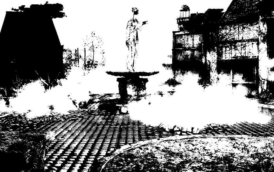
WHOA!
This new image is much more powerful than the colour version!
:o
Amazing what a little photoshop work can do…
The effect is much better in the new one. ITs very nice.
But I am saddened to see all the well done material work and colors being butchered in the black and white image. It was a lot of work so be sure to keep the two images together, as a pair.