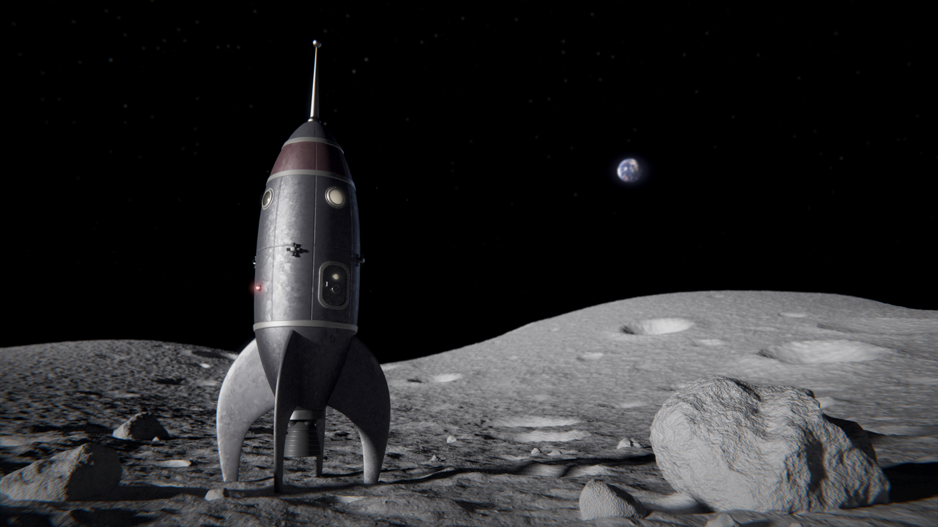
Inspired by a documentation about the moon landing, I have created this image.
I have used Blender 2.72 and have rendered it with Cycles.
I hope you like it!
Inspired by a documentation about the moon landing, I have created this image.
I have used Blender 2.72 and have rendered it with Cycles.
I hope you like it!
Nice work! The rocket looks great but, the earth is kind of distracting my attention. Not sure how you could fix that.
Yes I agree with Immortal Zombie about the Earth, it’s drawing more attention that it should. I think it’s mainly because there isn’t a whole lot going on in the scene, and half of the image is black space. I like the look of the rocket and the lighting looks fairly realistic as well, so well done on that. With more of a story and more interesting composition, this could be a great piece.
EDIT: Just now noticed this is your first post, so welcome to the forum 
EDIT: If your interested in learning about composition, Andrew Price at Blender Guru just released a video on just that.
link: Understanding Composition
Polygobblerr
That tutorial is great and a ton of help!!!
Thanks for the replies and the warm welcome.
You both are right. I will try a few things. Maybe a flag right to the rocket can fix this and lead the eye correctly. I´m a absolute beginner in character design, so otherwise I would also add an astronout, but I can do that in a new project or later.
This Forum is already very helpful. So thanks to ImmortalZombie and polygobblerr.
I just love it, it’s so cartoonish and poetic, of course the render is perfect but it even has something more that I couldn’t define.
Although I think it could be improved by just darkening the earth in post work.
I feel like it could be awesome if you added something, like a flag? Or you could make it a little surrealist, adding a picnic table, a sand castle, somthing like that? Just random ideas ^^
Congrats anyway!
Another point, I think the depth of field and especially the chromatic aberration is way too high.
I have made a few changes. The earth is darker and less saturated, less depth of field and chromatic aberration.
I have tried to put a flag on this scene to lead the eye back to the rocket, but it makes everything worser. The focus should be on the rocket. Other element that are not usually on the moon would only distract the focus in my oppinion. So I guess “less is more” is in this case a good choice.
Looks much better!
Now it needs an alien toddler climbing on the pointy tip of the rocket.
Quite neat. I have been working on a project related in theme to this myself. One issue that I see in the newest image is that the star-feild appears to be projected improperly (as you can see from the band of the Milky Way being highly bent).
What sorts of things did you do to make the near and far field ground model and texture?
You are right the starfield is not projected correctly. It´s just a plane with a NASA starfield texture on it. Of course I could do it correctly with a big sphere or just by using the enviroment background and it would look more realistic, but it wouldn´t look so interesting, because you just see stars. Next time I´ll make my own interesting star field.
About your question:
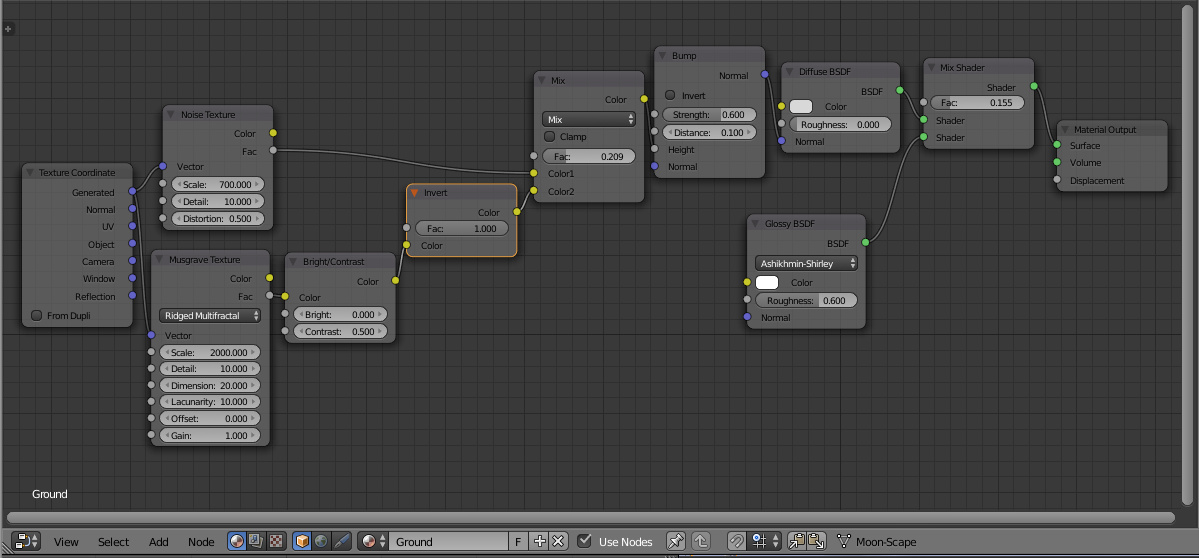
The ground model is just one subdivided plane. I did some sculpting for the craters and I have added a displace modifier with a noise texture. The amount of detail far and near is equal. I had to crank up the multires to get good results. So the far side has unnecessary detail, which is really not good for performance. Next time I would only subdivide the area near to the camera so that the multires won’t make the far field so unnecessary detailed. The texture is a combination of noise textures. If you are interested I can upload a screenshot of the node setup.
I suppose so. I have long spent efforts making my own attempts at realistic star-feilds, testing everything from photographs of flour thrown on black surfaces, to time consuming efforts in GIMP, to, more recently, rendering images from the inside of complex particle systems, mimicking galaxies in Blender, and they usually fail to look near as good as actual photographs. I am sure there is a way, though, and I suppose it also depends on the desired effect and style.
Thanks for the answer. I had been working on mostly lower resolution craters in Dynamic Paint, but, growing a bit unsatisfied with the typical results of that was curious. A node screenshot would be much appreciated.
I know this is finished projects, but I cannot help but suggest some type of ladder or telescoping walkway extending from the craft. It would add an interesting additional angle / line to the composition.
Regarding the stars, that´s a topic what I have tried first time in Blender. My first try, which I also included in this picture, was to create stars with a noise texture with high contrast. Of course it needs some post work to make it look great. But these stars are just random and it need more to create some thing like a milkyway effect.
Regarding the texture:
My texture does not make craters. But I guess over a displace modifer you can also make some, by using one noise texture (maybe a cloud texture) and some more contrast or maybe by using multiple displace modifiers. But I guess it don´t work so easy, because a crater is a bit more complex, because the shape is more complex. But I don´t know on what project you are working on so, maybe it is anyway not helpful
But maybe this node setup can be usefull somehow. Of course it can be improved, but it worked for me. The glossy at the end is maybe not realistic for a moon surface, but it made the look of the surface more dynamic.
Thanks.
Your tree and advice gave me some ideas, which I will use/test shortly. I had been using the noise texture base from Blender to add roughness, but it gave peculiar lines that followed the contours of the mesh. The cloud texture may work better.
Even though it does not make craters, It can form the regolith upon which craters can be otherwise placed, with normal maps or what have you. I was typically using glossy shaders, too, but giving all of the shaders rather higher ‘roughness’ settings. It seems to work in both arrangements, though. My project is (should be) in my signature, now.
Like the moonscape, blur near the edges is good. The earth is good to show but is too low resolution so is a bit pixellated, when the rest of the image is pin sharp.